Hunk a Junk
Sr Member
Here's my current build: the 1/350 TOS Enterprise.
I'm calling this build a "complete heresy" because I threw my original plans to replicate the Smithsonian restoration out the window and decided I needed to rethink my build (long story). Instead of trying to copy the studio model exactly, I decided to build my version as if it was a real starship, not a model of a model. I decided to make a hybrid of the original and the Remastered CG version (gasp). Essentially, a ship that looked like the 11-footer from a distance, but had layers of detail upon closer inspection. At least that's the idea. I know Matt Jefferies designed the ship to be completely smooth and uniform, but to me it loses some of its sense of scale when the exterior doesn't have some detail. If this idea makes your head explode, I guess I've done my job! cheers
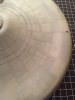
Prior to rethinking my plans, I'd already filled the gridlines and sanded everything mostly smooth. After priming, I could still see a hint of the lines and decided to leave it be. I'd be adding the grids back on lightly in pencil and the subtle indents would be a guide. When I changed plans, I looked at the Remastered CG ship and decided I liked the slightly raised panels all over the ship. Using plastic styrene sheet seemed too cumbersome to mold around curves, so I experimented and added the panels using foil adhesive tape from the home improvement store (the kind used for vent ducts). The foil is thin, it can be pressed smooth down to curves, and (so far) hasn't peeled up. I cut the panel shapes on a piece of glass and stuck them all over the hull. I then re-primed the ship to lock those suckers down and to even out the surface. You can see the panels up close, but when you step back they disappear.
The base coat is lightened Tamiya JN-Grey (as R2's original paint guide recommended) over the entire model. I then cut alternating and random panel shapes out of masking tape and stuck them all over the ship. I didn't want a Refit-style Aztec look, but something more random like on the CG version. It's a faux Aztec. I next sprayed Tamiya cockpit green with a bit of blue added. When I peeled up the tape, the results were... well, even I wanted to puke! It looked like weird sci-fi camouflage. But, I was committed (or should be) and I pressed on. Here's what it looked like.


I sprayed a couple other colors -- light blue and a greenish yellow -- to break things up a bit. I added the rust ring (which didn't look so pink in person). Then I used colored pencils and a mechanical pencil to add more random panel lines all over the place. Sort of like ILM's surface detail on the Refit for TWOK. I also added some light pastel pre-shading along the gridlines and around the bridge decks.


Once all the pencil lines were on, I sprayed a coat of Tamiya satin clear so that the pencil wouldn't bleed up through the next layers. I then oversprayed everything with a custom mix of lightened Tamiya JN-Grey with a little Light Blue added. I oversprayed the panels and pencil marks until they were faded enough so that if you squinted they'd disappear entirely. These are the results.


When I complete the final main assembly, I'll add one more light overspray to unify things and knock the detail back just a bit more. In person, the ship looks greener than it does in the pictures. I've also added some green pastel shading around the bridge decks and the lower sensor dome.


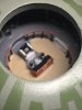
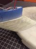
In the past few days I've been finalizing the lighting installation and adding some paint details. I glued the saucer section together and right now I'm working on the seam between the upper and lower saucer hull. I'll add more pictures in the next post.


I'm calling this build a "complete heresy" because I threw my original plans to replicate the Smithsonian restoration out the window and decided I needed to rethink my build (long story). Instead of trying to copy the studio model exactly, I decided to build my version as if it was a real starship, not a model of a model. I decided to make a hybrid of the original and the Remastered CG version (gasp). Essentially, a ship that looked like the 11-footer from a distance, but had layers of detail upon closer inspection. At least that's the idea. I know Matt Jefferies designed the ship to be completely smooth and uniform, but to me it loses some of its sense of scale when the exterior doesn't have some detail. If this idea makes your head explode, I guess I've done my job!
cheersPrior to rethinking my plans, I'd already filled the gridlines and sanded everything mostly smooth. After priming, I could still see a hint of the lines and decided to leave it be. I'd be adding the grids back on lightly in pencil and the subtle indents would be a guide. When I changed plans, I looked at the Remastered CG ship and decided I liked the slightly raised panels all over the ship. Using plastic styrene sheet seemed too cumbersome to mold around curves, so I experimented and added the panels using foil adhesive tape from the home improvement store (the kind used for vent ducts). The foil is thin, it can be pressed smooth down to curves, and (so far) hasn't peeled up. I cut the panel shapes on a piece of glass and stuck them all over the hull. I then re-primed the ship to lock those suckers down and to even out the surface. You can see the panels up close, but when you step back they disappear.
The base coat is lightened Tamiya JN-Grey (as R2's original paint guide recommended) over the entire model. I then cut alternating and random panel shapes out of masking tape and stuck them all over the ship. I didn't want a Refit-style Aztec look, but something more random like on the CG version. It's a faux Aztec. I next sprayed Tamiya cockpit green with a bit of blue added. When I peeled up the tape, the results were... well, even I wanted to puke! It looked like weird sci-fi camouflage. But, I was committed (or should be) and I pressed on. Here's what it looked like.
I sprayed a couple other colors -- light blue and a greenish yellow -- to break things up a bit. I added the rust ring (which didn't look so pink in person). Then I used colored pencils and a mechanical pencil to add more random panel lines all over the place. Sort of like ILM's surface detail on the Refit for TWOK. I also added some light pastel pre-shading along the gridlines and around the bridge decks.
Once all the pencil lines were on, I sprayed a coat of Tamiya satin clear so that the pencil wouldn't bleed up through the next layers. I then oversprayed everything with a custom mix of lightened Tamiya JN-Grey with a little Light Blue added. I oversprayed the panels and pencil marks until they were faded enough so that if you squinted they'd disappear entirely. These are the results.
When I complete the final main assembly, I'll add one more light overspray to unify things and knock the detail back just a bit more. In person, the ship looks greener than it does in the pictures. I've also added some green pastel shading around the bridge decks and the lower sensor dome.
In the past few days I've been finalizing the lighting installation and adding some paint details. I glued the saucer section together and right now I'm working on the seam between the upper and lower saucer hull. I'll add more pictures in the next post.