So I’ve got a new laser cutter and needed a project to learn how to use it.
I’d wanted to recreate the large mission patch seen in this publicity shot of Dr. Heywood R. Floyd for a while now and this was the perfect opportunity.
I wanted it to be the same size and 600mm / 2’ diameter appeared to be about right.

I’d recently seen a Presidential crest which had some relief to it and decided this was the look I was after.
I didn’t want it too deep and decided on producing it from layers of 1, 2 and 3mm Perspex / Plexiglas.
The usual problem with something of this vintage is good, clear reference. After scouring books and the net these are the best images I could find.

Image taken from the laser disc

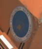
From original chest pack
 Image from the internet – unknown origin
The last one had the best resolution and looked very close to the original.
As a starting point I drew a full size circle in CorelDraw, imported the image and enlarged it to 600mm. At that size it wasn’t very sharp and the more I zoomed the fuzzier it became
If anyone knows who created the image please let me know so I can credit them.

I started with the sun rays but soon realised that just tracing what was there wasn’t going to work as a lot of the rectangles merged together and that the remainder were unevenly spaced apart. Suffering as I do from modelmakers OCD I couldn’t live with this so I started again. I eventually got it as close as I could and called it done.
The text was another problem as I had no idea what the font was. I asked a few graphic designers I work with but they couldn’t help either, and even the great site
http://typesetinthefuture.com/2001-a-space-odyssey/ didn’t have the answer.
Eventually I came across a font called Palatino Linotype which was available in the 60’s. It’s very close but still not perfect, leading me to alter some of the letters to get them as close as possible. If anyone knows the correct font I’d appreciate you letting me know so I can correct what I’ve done.
Although not in the original photograph I also added Discovery and Clavius Base to the drawing in case I decided to add them later.


Once everything was worked out I transferred the data to the machine and had it engrave the image to a sheet of 3mm acrylic (rear disc) and then it cut the circle from the sheet. I engraved everything to make it easier to position everything when it came to assembly.

Next from 2mm acrylic I cut the inner disc with all the projecting rays and after a bit of sanding gave it a coat of primer to see how it looked.

I planned for this disc just to sit on the one underneath and you would have seen the white and the yellow through the slots.
In the end I decided it would be more interesting if the rays and the stars were raised, so I cut all the infill pieces. It was a lot more work but I think it looks so much better.

Originally I cut it from clear material with the intention of spraying everything, but in the end it was easier to have the black and white areas as self coloured acrylic, so I cut most of again.
With only the blue and yellow to spray it came together quite quickly and then it was assembly time. This took quite a time because of the large number of pieces involved.


I still need to make some brackets for the rear so I can hang it on the wall and then I can photograph it properly. At the same time I'm going to do a few shots with the Discovery and Clavius text temporarily attached as well.
Hopefully I should get these last bits done this week and then I can hang it in my office.
I’d wanted to recreate the large mission patch seen in this publicity shot of Dr. Heywood R. Floyd for a while now and this was the perfect opportunity.
I wanted it to be the same size and 600mm / 2’ diameter appeared to be about right.
I’d recently seen a Presidential crest which had some relief to it and decided this was the look I was after.
I didn’t want it too deep and decided on producing it from layers of 1, 2 and 3mm Perspex / Plexiglas.
The usual problem with something of this vintage is good, clear reference. After scouring books and the net these are the best images I could find.
Image taken from the laser disc
From original chest pack
The last one had the best resolution and looked very close to the original.
As a starting point I drew a full size circle in CorelDraw, imported the image and enlarged it to 600mm. At that size it wasn’t very sharp and the more I zoomed the fuzzier it became
If anyone knows who created the image please let me know so I can credit them.
I started with the sun rays but soon realised that just tracing what was there wasn’t going to work as a lot of the rectangles merged together and that the remainder were unevenly spaced apart. Suffering as I do from modelmakers OCD I couldn’t live with this so I started again. I eventually got it as close as I could and called it done.
The text was another problem as I had no idea what the font was. I asked a few graphic designers I work with but they couldn’t help either, and even the great site
http://typesetinthefuture.com/2001-a-space-odyssey/ didn’t have the answer.
Eventually I came across a font called Palatino Linotype which was available in the 60’s. It’s very close but still not perfect, leading me to alter some of the letters to get them as close as possible. If anyone knows the correct font I’d appreciate you letting me know so I can correct what I’ve done.
Although not in the original photograph I also added Discovery and Clavius Base to the drawing in case I decided to add them later.
Once everything was worked out I transferred the data to the machine and had it engrave the image to a sheet of 3mm acrylic (rear disc) and then it cut the circle from the sheet. I engraved everything to make it easier to position everything when it came to assembly.
Next from 2mm acrylic I cut the inner disc with all the projecting rays and after a bit of sanding gave it a coat of primer to see how it looked.
I planned for this disc just to sit on the one underneath and you would have seen the white and the yellow through the slots.
In the end I decided it would be more interesting if the rays and the stars were raised, so I cut all the infill pieces. It was a lot more work but I think it looks so much better.
Originally I cut it from clear material with the intention of spraying everything, but in the end it was easier to have the black and white areas as self coloured acrylic, so I cut most of again.
With only the blue and yellow to spray it came together quite quickly and then it was assembly time. This took quite a time because of the large number of pieces involved.
I still need to make some brackets for the rear so I can hang it on the wall and then I can photograph it properly. At the same time I'm going to do a few shots with the Discovery and Clavius text temporarily attached as well.
Hopefully I should get these last bits done this week and then I can hang it in my office.