You are using an out of date browser. It may not display this or other websites correctly.
You should upgrade or use an alternative browser.
You should upgrade or use an alternative browser.
The Amazing Spider-man 2 - 3D Print Files/Pattern - FREE
- Thread starter kenlandrum
- Start date
spideynewb
New Member
Wow this is cool. Thanks for your hard work. I'll likely use your file to make a suit soon.
kenlandrum
Sr Member
Doesn't look like much, but I have been working on this thing.

Will start webbing tomorrow, along with soles, finger pads and web launcher button.
Little by little.
- - - Updated - - -
Thanks for the reference!
- - - Updated - - -
Today I was working on a version where the parts are separated by the actual seam lines... I gave up for now.
Will start webbing tomorrow, along with soles, finger pads and web launcher button.
Little by little.
- - - Updated - - -
Thanks for the reference!
- - - Updated - - -
could you also make your pattern where it can get crotch zippers like the real suit???i think you would have to separate the legs or add material i dunno i am a novice anyway just an idea....
Today I was working on a version where the parts are separated by the actual seam lines... I gave up for now.
tanman96
Well-Known Member
Well I loved your Rami file! But this one I'm a bit more excited about ;D Now on McLean's pattern of this suit, he has separated the blue sections according to how the movie suit appears to be constructed. Every "seam" where the brick pattern goes a different direction is a different piece. This also allows the creator to dye each piece so that it doesn't wash out. Also, he has the movie accurate zipper placement, which is two jacket zippers that go along the bottom of the belt, and one invisible zipper that goes up the small part of the back, stopping right below the red spider. Personally, I think this zipper placement is way more convenient than the U-zip, since it allows you to put the suit on like a shirt and pants. Even if you separated the suit at the bottom of the belt, and the rest was the same, it would allow the people who want to use the screen accurate placement (such as myself  ) to use it, and for those who don't want to, they can sew it back together and do the U-zip. Of course I don't want to be rude or demanding! Just my two cents!
) to use it, and for those who don't want to, they can sew it back together and do the U-zip. Of course I don't want to be rude or demanding! Just my two cents! kenlandrum
Sr Member
Well I loved your Rami file! But this one I'm a bit more excited about ;D Now on McLean's pattern of this suit, he has separated the blue sections according to how the movie suit appears to be constructed. Every "seam" where the brick pattern goes a different direction is a different piece. This also allows the creator to dye each piece so that it doesn't wash out. Also, he has the movie accurate zipper placement, which is two jacket zippers that go along the bottom of the belt, and one invisible zipper that goes up the small part of the back, stopping right below the red spider. Personally, I think this zipper placement is way more convenient than the U-zip, since it allows you to put the suit on like a shirt and pants. Even if you separated the suit at the bottom of the belt, and the rest was the same, it would allow the people who want to use the screen accurate placement (such as myself
Thanks, I know what you mean about the printed seam thing... kinda cheesy if you were to ask me. That's why today at work I had a print out of the ASM2 suit and I tried to figure out how to sep it out... I was able to sep the whole suit but I still had some problems with the butt area... I know what I have to do to get it right, but I just don't want to bail on this pattern to go that route just yet... maybe later when I have more time.... The good news is after looking at piles of reference I found several flaws with my current pattern and when I got home I fixed them all. It's not perfect, but I think it will look pretty darn good. Webs will be much quicker on this suit as they are not the flat, tapered, rounded style as on the Raimi suit.
I plan to use these patterns for displays, so I am not so concerned about zippers. They will go on the mannequin and stay.
cheers!
101mastersword
New Member


i thought i would bring more pictures just in case. the first has the soles on it also.
Last edited:
dungparker
Well-Known Member
When do you think faceshell file will be done , your work is so amazing
, your work is so amazing101mastersword
New Member
Hey! Today's my B-day!:cool
venomvsspidey11
Active Member
Heres a pic of the back zipper and gloves.

kenlandrum
Sr Member
hey, dose anyone think that the webshooter on the left (the one with the circle) is the one with the mp3. that circle may be a power switch as its not on the other shooter.
Sure looks like it to me too.
I guess I will have to model these for 3D print... thanks for the good reference!!
- - - Updated - - -
Soon. I worked on the overall shell Friday... will get back to it wary in the week. I'm on it!When do you think faceshell file will be done
- - - Updated - - -
View attachment 300038View attachment 300039 View attachment 300045
i thought i would bring more pictures just in case. the first has the soles on it also.
More great reference I had not seen yet.
Thanks!
quovadis0920
Sr Member
THis is looking nice! Keep it up ken!
101mastersword
New Member
More great reference I had not seen yet.
Thanks!
no problem
Last edited:
kenlandrum
Sr Member
Little by little...
Today's update.

Today's update.
Web_Slinger
Well-Known Member
That looks so awesome
Spideyboy31
New Member
I'm new to this website, i wanted to get a pro looking amazing spiderman 2 suit for a good price. How do i get one and how does this work?
Agent Coulson
Member
This is awesome Ken! Can't wait to see the finished project! :cool :thumbsup
Lunaman
Sr Member
Progress is looking wonderful, Ken.
One thing I'd like to add is that I believe (after seeing and hearing a lot of evidence) that the red on this pattern should be much deeper and cooler, certainly moreso than the red on the Raimi pattern. I've spoken to some people that saw the screen used suits in person, that one of the things that they said stood out most was how surprisingly dark the red was.
Most of the references people have been seeing for the suit are either retouched promotional shots, highly lit stills from the film, and full sunlight set photos, which all tend to blow out the color and make the suit look more like a primary red than a deep blood red. Also, red is a portion of the color spectrum that tends to overload sensors on many digital cameras and register as a lot hotter in color temperature than it actually is. The result is that most photos people share of the suit have it look like a bright primary red, though not because the suit IS a bright primary red.
Here, below are some of my favorite images that give credence to the color disparity.
In the first and second image, the film suit is shown with a bright primary red fabric right up next to it, which serves to anchor the red spectrum and plainly show just how much darker the suit color is than a standard "out of the bottle" red. The first picture has the outfit of the kid on his shoulders, while the second has a piece of red fabric (probably a kid's mask) in his hand.
The third photo is a set photo, but one that was taken with ambient natural light instead of in direct sunlight like most set photos (which usually blows out the color).
You can also get a sense of the deep color in this video where William Spencer met a fan on the set.
It's a little tough to nail the color because the suit was printed on a thick, slightly shiny/reflective red lycra, so it takes on a bit of the color of the surrounding light conditions. You can also see the depth of the red color in the comic con panel video, where the suit looks nearly burgundy.
Last edited by a moderator:
You should check out:
http://www.therpf.com/f78/my-amazing-spider-man-2-build-face-shell-lenses-208956/index2.html
Hes making the same thing so id be curious to see how yours turn out
http://www.therpf.com/f78/my-amazing-spider-man-2-build-face-shell-lenses-208956/index2.html
Hes making the same thing so id be curious to see how yours turn out
Attachments
kenlandrum
Sr Member
You should check out:
http://www.therpf.com/f78/my-amazing-spider-man-2-build-face-shell-lenses-208956/index2.html
Hes making the same thing so id be curious to see how yours turn out
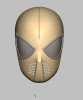
Yes, I have seen that. I am not sure I agree witht he way the nose goes to the mouth... from what Ive seen it doesn't seem as prominent.


Mine is coming out a little rounder there. You can really see it well in the first pic.
Similar threads
- Replies
- 1
- Views
- 662
- Replies
- 16
- Views
- 4,830
- Replies
- 11
- Views
- 1,196
- Replies
- 3
- Views
- 635