You are using an out of date browser. It may not display this or other websites correctly.
You should upgrade or use an alternative browser.
You should upgrade or use an alternative browser.
Defined Green Lantern Comic Rings
- Thread starter Gregatron
- Start date
Jack T Chance
Sr Member
I'll keep this as brief as I can for now... expect more posts later, as I think of them...
")
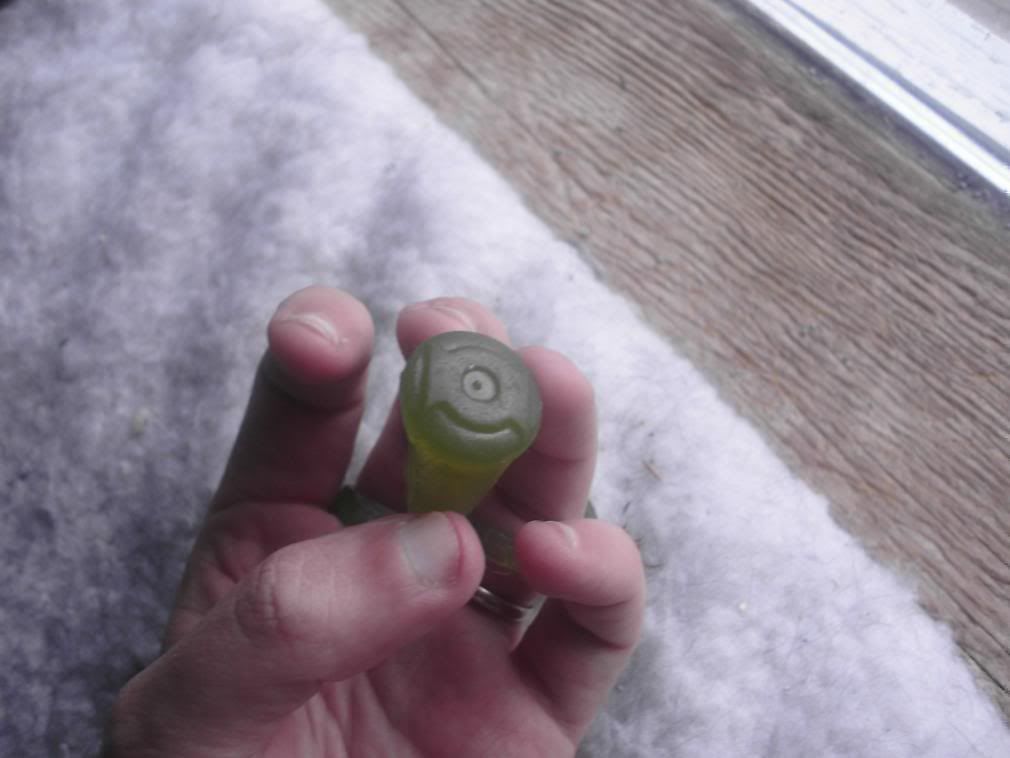
That picture also shows another major variation on the way Gil Kane drew the ring in the early days, with thick bars at top and bottom, and a thin circle in the middle. Back around 2000 or so, this inspired GL Super Fan and Costumer Leman Yuen to make some resin power ring replicas inspired by that design and sell them through the EmeraldDawn.Com website. This resulted in the first replica of the yellow power ring that I ever saw available for sale:
As you can see, his skill at casting translucent resin doesn't match up to newer ring makers such as customizedhero/BatJeepster, Zenix, and the like. But for the time, it was pretty good, and the only thing available. He supposedly only made 30 of the yellow rings, of which I have 4.
It was Gil Kane's design for the yellow ring that also inspired me to commission the centerpiece of my power ring collection, the ULTIMATE wearable power ring prop...
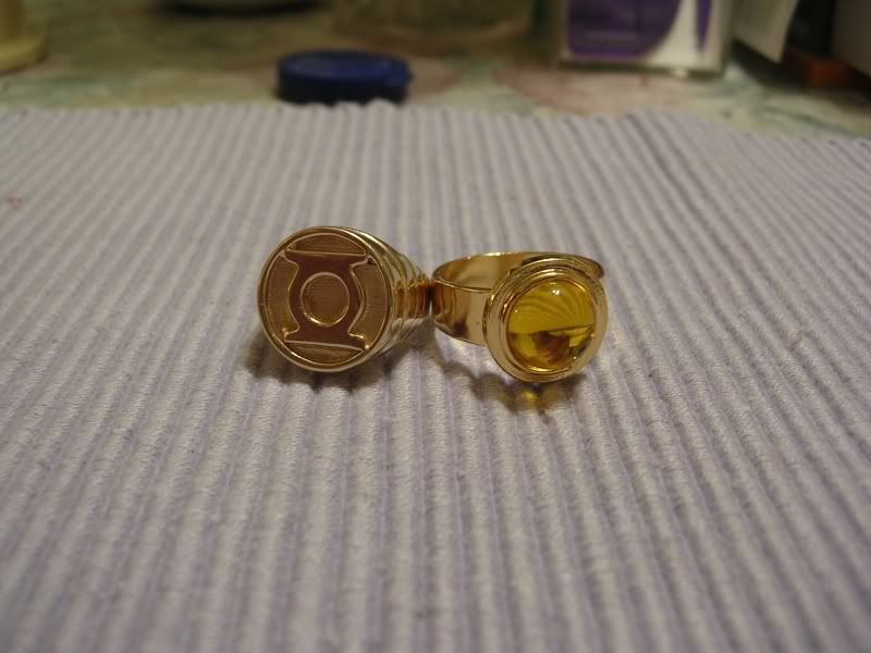
Sinestro's original yellow power ring, made out of 14K gold, back before the price of gold went through the roof!
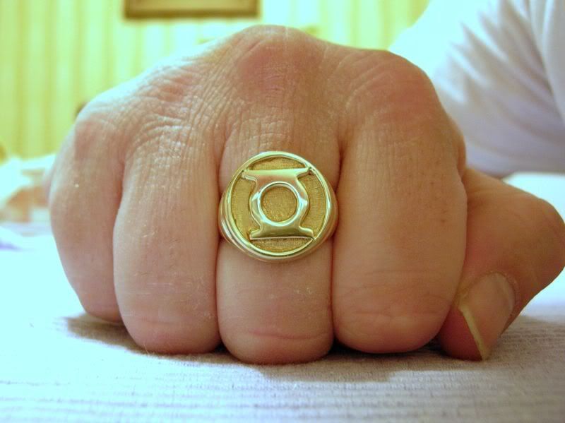
For fans of Sinestro and his Corps, this is the ultimate way to have a wearable power ring prop. But it's simply too costly for most nowadays. I paid $350 for mine when I got it, but it would now cost $700 OR MORE. Most fans these days would have to settle for a gold-PLATED ring instead. :unsure
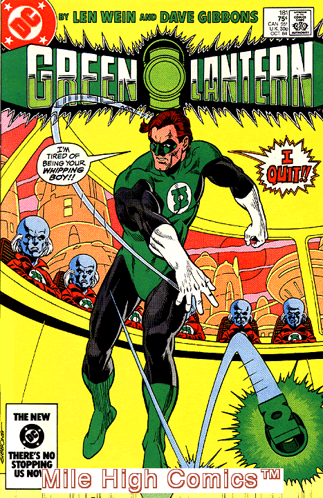
^Cover to Green Lantern (Volume 2) # 181... the first issue of GL I ever purchased! And how could you NOT pick it up with that cover? That was something that NEVER happened in a superhero comic!!!thumbsup
Basically, the "chunk" ring is now RIBBED... for her pleasure? :lol
And of course DC Direct quickly cranked out a crappy replica of it... looks just like the standard chrome-plated chunk ring, but with the added ridges on the side. And it costs like 2-3 times more than the standard chunk ring, probably because it comes in a fancy box! :lol
Here's the "old" Hal ring that RPFer Djinn owns:
It has a rougher texture and a slightly less metallic look. The one I bought from him (which I really need to photograph) is from his most recent run, and has the finish I was waiting for, a smoother, glossier, much more metallic look, similar to what you see on the Mag-Lites. BEAUTIFUL ring, the best wearable rings ever! When he gets around to doing another run, ORDER ONE! You won't regret it!thumbsup
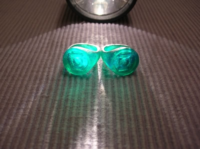
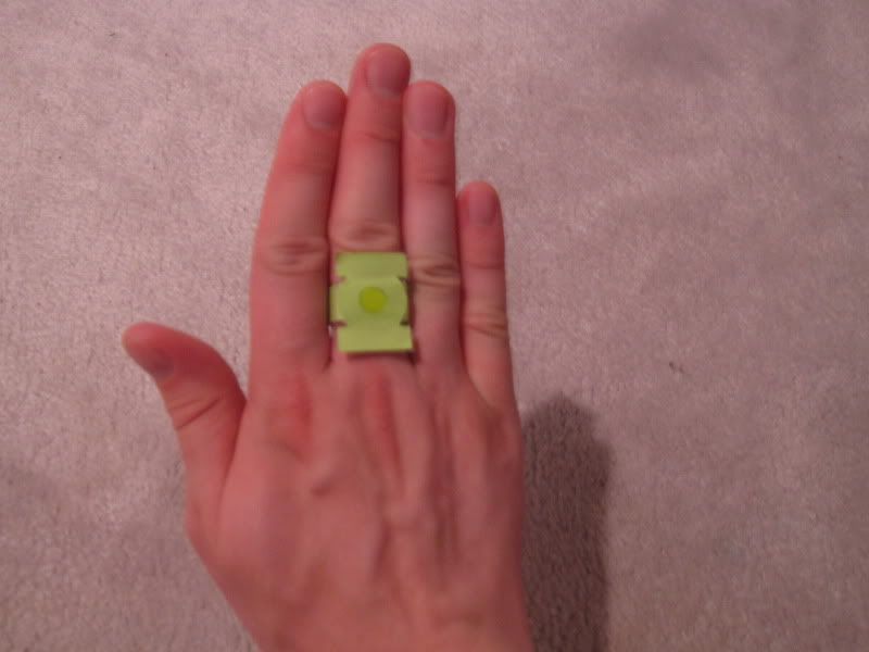
He also had a run where the anodizer did a much lighter color, more of a "lime" green that reminds people of the coloring seen in some of the earlier comics. Here's the entire batch in that color, in which you can see both the "old" Hal and "new" Hal styles:
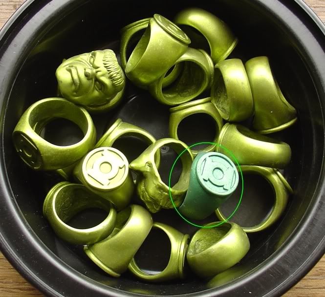
Mixed in towards the center is the other green finish, like Djinn owns. More of an emerald green. Some have described the texture as making the ring look more extraterrestrial in nature, so some like it.
After searching for years, I was FINALLY able to add one to my collection just last month, when Megatron found out he still had an old, imperfect prototype in my size!
So, here's my V2 anodized aluminum ring...
Those pictures were taken by Megatron. It looks darker in person than in those pictures, I figure his flash is really bright. Here's a quick pic I snapped with my cell phone camera, using its flash:
I'd thought about adding a light green, cabochon style gem to the center, but decided against it given how rare these rings are. But if Megatron ever does another run in this style, I'm going to suggest adding the center stone. :cool
I saved the pics to my hard drive, but these haven't been available for years... still, might work for showing Megatron what you want.
Which reminds me, somewhere in all that, you complained about "squashed" symbols. Again, artistic license from the hand guiding the pencil. The DC Direct "Gil Kane" style ring with the "squashed" symbol seems as though it was partly inspired by the artwork of Mark D. Bright...
this is from Green Lantern: Emerald Dawn...

So, from that point forward, the ring doesn't HAVE to look like the ring you see as my avatar... it can be a signet style ring, more of a wristband than a ring, it can be an F-SHARP BELL, it can be a pair of sunglasses, whatever suits the preferences and/or needs of the wearer. :cool
And there's a few major variations of the rings that you didn't list yet...
I first hit upon the idea of anodized aluminum as the best option for that YEARS ago... I don't remember exactly how many, but the thought was inspired by seeing Mag-Lite brand flashlights and other trinkets (keyrings, etc) with an anodized aluminum finish in a green color. I was not yet a member of the RPF in 2002 when Megatron did his very first run of anodized aluminum Green Lantern Power Rings, so I missed out on that run... but more on that topic later!The recent GREEN LANTERN movie has resparked my interest in the comics. I've been a lifelong GL fan, and it kind of amazes me that there have been relatively few ring replicas that are fairly true to the comic designs. I have several of them--the Blackest Night promo, the 1990 promo, etc., but none of them have really scratched that itch to have a high-quality, comic-accurate, wearable GL ring.
I love my modded TRU Movie ring, but that's, well, the MOVIE ring, and my first love is the comic. There's an elegance to the comic rings. I get why they went with the weathered crystal/metal look for the movie, but I prefer the solid green metal style of the comics.
There's even an interpretation or 2 of that ring that you've missed, but more on that later....Of course, there have been countless artistic interpretations over the years, but three basic designs have been used over the years (aside from Alan Scott's and some other variants for the very non-human GLs):
* The original/Hal Jordan style.
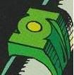
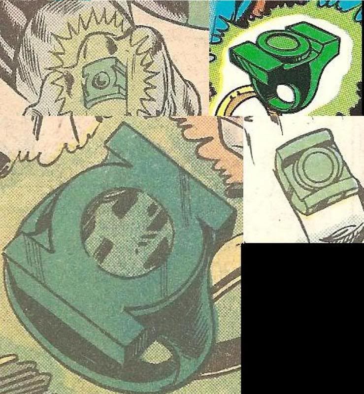
Also, don't forget that Gil Kane also drew Sinestro's original yellow power ring as looking the same as the GL ring, just made of "yellow metal"...Gil Kane's original version of Hal Jordan's ring was essentially a simple ring band (akin to a wedding ring band--no detailing, and the same shape/width all the way 'round), with a disc on top emblazoned with the GL symbol. The symbol, of course, went through many, many evolutions over the years, from the original, more complex design, to the classic version used for licensing, to the recent modification of that design (with the slanted sides on the top and bottom).
That picture also shows another major variation on the way Gil Kane drew the ring in the early days, with thick bars at top and bottom, and a thin circle in the middle. Back around 2000 or so, this inspired GL Super Fan and Costumer Leman Yuen to make some resin power ring replicas inspired by that design and sell them through the EmeraldDawn.Com website. This resulted in the first replica of the yellow power ring that I ever saw available for sale:
As you can see, his skill at casting translucent resin doesn't match up to newer ring makers such as customizedhero/BatJeepster, Zenix, and the like. But for the time, it was pretty good, and the only thing available. He supposedly only made 30 of the yellow rings, of which I have 4.
It was Gil Kane's design for the yellow ring that also inspired me to commission the centerpiece of my power ring collection, the ULTIMATE wearable power ring prop...
Sinestro's original yellow power ring, made out of 14K gold, back before the price of gold went through the roof!
For fans of Sinestro and his Corps, this is the ultimate way to have a wearable power ring prop. But it's simply too costly for most nowadays. I paid $350 for mine when I got it, but it would now cost $700 OR MORE. Most fans these days would have to settle for a gold-PLATED ring instead. :unsure
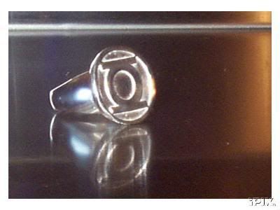
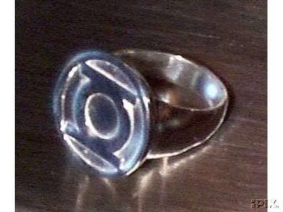
This is my all-time favorite version of the ring, probably due to it being what Hal was wearing in 1984 when I first picked up the book. In fact, that ring on the left looks very familiar...* The "Version 2" Corps style.
Mike Grell's 1970s redesign eliminated the disc-on-band look, and went with a 3-D version of the GL symbol (minus the circle surrounding the symbol) stuck on top of a band. This version also went through many variations, until it stabilized under the hands of artists like Joe Staton and Dave Gibbons.
The only real variation of this design is that some versions feature a center gem (depicted as either flat and flush with the GL symbol, or a dome-shaped gem protruding from the face of the symbol, as in the last image of the three seen below).
^Cover to Green Lantern (Volume 2) # 181... the first issue of GL I ever purchased! And how could you NOT pick it up with that cover? That was something that NEVER happened in a superhero comic!!!
thumbsup
There's a new variation of this, the "Honor Guard" ring that's been seen in the comics recently:* The "chunk" style.
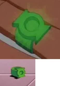
This is a distinct variant of the V2--on this one, the GL symbol blends into the band, with the grooves going all the way around the band (or not, in some cases). The GL movie ring follows this style, despite its being the least-seen of the three main types.
Basically, the "chunk" ring is now RIBBED... for her pleasure? :lol
And of course DC Direct quickly cranked out a crappy replica of it... looks just like the standard chrome-plated chunk ring, but with the added ridges on the side. And it costs like 2-3 times more than the standard chunk ring, probably because it comes in a fancy box! :lol
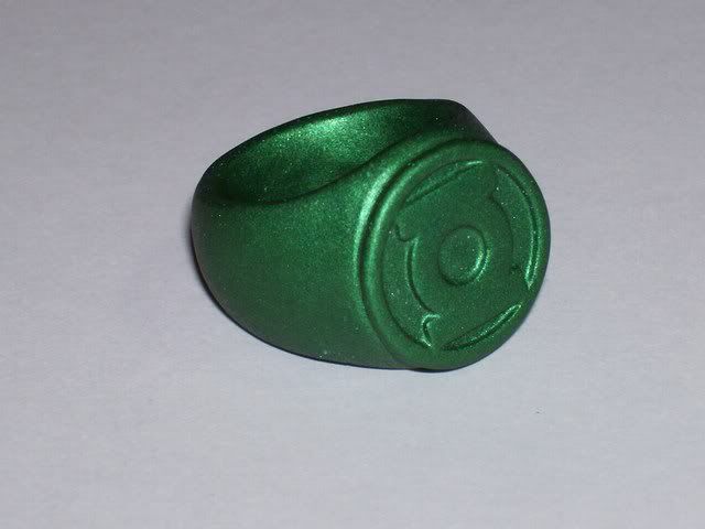
While it's not the "disc on band" construction you like, Megatron's most recent runs HAVE been the signet style rings, both "old" Hal and "new" Hal/Corps designs, in anodized aluminum!My "perfect" GL rings would go something like this:
Hal: Anodized metallic green metal ring. Two-part construction (GL symbol-disc atop simple band). No two-tone color scheme for inset portions of symbol.
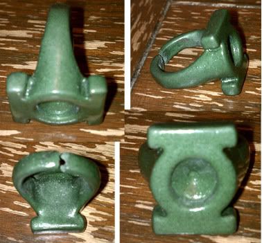
Here's the "old" Hal ring that RPFer Djinn owns:
It has a rougher texture and a slightly less metallic look. The one I bought from him (which I really need to photograph) is from his most recent run, and has the finish I was waiting for, a smoother, glossier, much more metallic look, similar to what you see on the Mag-Lites. BEAUTIFUL ring, the best wearable rings ever! When he gets around to doing another run, ORDER ONE! You won't regret it!
thumbsupHe also had a run where the anodizer did a much lighter color, more of a "lime" green that reminds people of the coloring seen in some of the earlier comics. Here's the entire batch in that color, in which you can see both the "old" Hal and "new" Hal styles:
Mixed in towards the center is the other green finish, like Djinn owns. More of an emerald green. Some have described the texture as making the ring look more extraterrestrial in nature, so some like it.
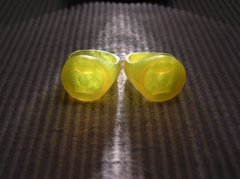
Which is exactly what Megatron produced in his very first run of anodized rings back in 2002!V2: Anodized metallic green metal ring. Two-part construction (3-D GL symbol atop a simple band). One version without a gem, and the other with a lighter, lime-green-ish "dome" gem.
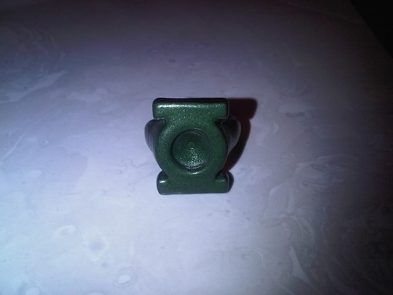
After searching for years, I was FINALLY able to add one to my collection just last month, when Megatron found out he still had an old, imperfect prototype in my size!
So, here's my V2 anodized aluminum ring...
Those pictures were taken by Megatron. It looks darker in person than in those pictures, I figure his flash is really bright. Here's a quick pic I snapped with my cell phone camera, using its flash:
I'd thought about adding a light green, cabochon style gem to the center, but decided against it given how rare these rings are. But if Megatron ever does another run in this style, I'm going to suggest adding the center stone. :cool
My favorite will always be the Version 2, as drawn by Dave Gibbons and the other artists of the mid-'80s. But seeing some of the earlier drawings of it from the late '70s, I definitely see where some of the inspiration for the movie's ring comes from. :coolThoughts? What are your favorite GL ring styles? What artists have drawn your favorite rings? Do you like some of the really far-out styles of the alien GL rings?
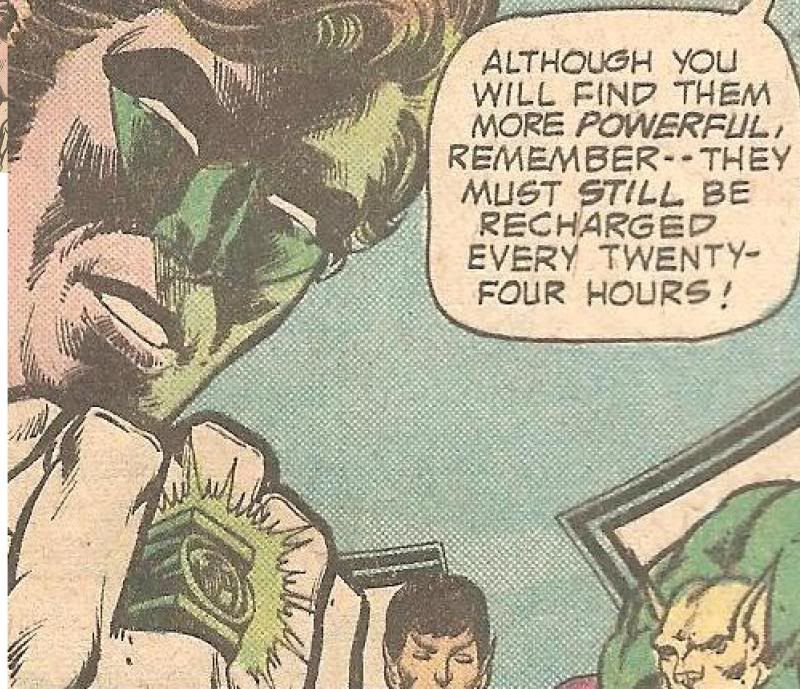
Megatron is the only one making anodized aluminum rings, and he doesn't make them very often. On the rare occasion when he does a run, you HAVE to get in on the run, or you can literally be waiting YEARS for another run! Right now, he's on orders from his Uncle Sam, so it's going to be awhile before he can do any runs of ANYTHING, not just GL rings. :unsureMost importantly, when and how will the definitive comic-style rings be made, and by whom? It's really amazing that such relatively simple designs have never quite been done justice. I think a two-piece construction on the Hal and V2 style rings would make the task easier. Although, as noted, Megatron's signet-style rings look really sweet.
Yep. Pretty much every artist has done their own interpretation of the ring. And for the record, I HATE the latest "official" ring shape, which DC Direct has used in the last couple years for all the current PVC promo rings, their official light-up ring set, AND their most recent high-end metal ring prop set, done as part of the Justice League Trophy Room line. It's the most retarded shape I've EVER seen for a signet ring! And the thicker they make the face, the more ridiculous it looks! So the light-up rings, with added thickness to accomodate the LED and battery, look even WORSE. :thumbsdownYeah, there are a lot of variations. The GL symbol itself went through many, many evoultions. Even though the symbol we know was established fairly early on (although it was often depicted with a green center circle instead of white), later artists like Neal Adams continued to tinker with it.
Interesting side note... several years ago, there was a guy on eBay selling metal rings with the design you prefer. He didn't stick around long. I have a feeling he was just recasting DC Direct's sculpt. They may have sent him a C&D order.As noted, I prefer the "disc" look to the true signet ring, since that's what Kane drew.
I saved the pics to my hard drive, but these haven't been available for years... still, might work for showing Megatron what you want.
I have no skills in that regard, plus, this is all just ARTISTIC LICENSE on the part of the artists. Officially, there's the "old" signet style ring, the Version 2 ring, the "chunk" ring, and the "new" signet style ring. Different artists just draw them different ways.Someone really should create a visual flowchart of all the ring variants, so that some kind of concensus could be reached on the best versions.
Which reminds me, somewhere in all that, you complained about "squashed" symbols. Again, artistic license from the hand guiding the pencil. The DC Direct "Gil Kane" style ring with the "squashed" symbol seems as though it was partly inspired by the artwork of Mark D. Bright...
this is from Green Lantern: Emerald Dawn...
I hadn't even seen the thread until you PMed me about it! :lolAnd I am shocked that Jack T. Chance has not chimed in here!
And the biggest improvement, which explains much of the seeming inconsistency afterwards, was that the ring's form could be ALTERED by its wearer! In one issue, Hal disguised his ring as a pair of SUNGLASSES to go undercover! :lolA few years after GREEN LANTERN/GREEN ARROW was cancelled, the series was relaunched. Mike Grell redesigned the power rings, with the in-universe reason being that these were new-and-improved models.
So, from that point forward, the ring doesn't HAVE to look like the ring you see as my avatar... it can be a signet style ring, more of a wristband than a ring, it can be an F-SHARP BELL, it can be a pair of sunglasses, whatever suits the preferences and/or needs of the wearer. :cool
Check it out! You can see the Vulcan GL in that image! \\//,
Bottom left looks the closest to Megatron's sculpt. :cool
And there's a few major variations of the rings that you didn't list yet...
- The Super Friends version, white disc & band with green logo on face.
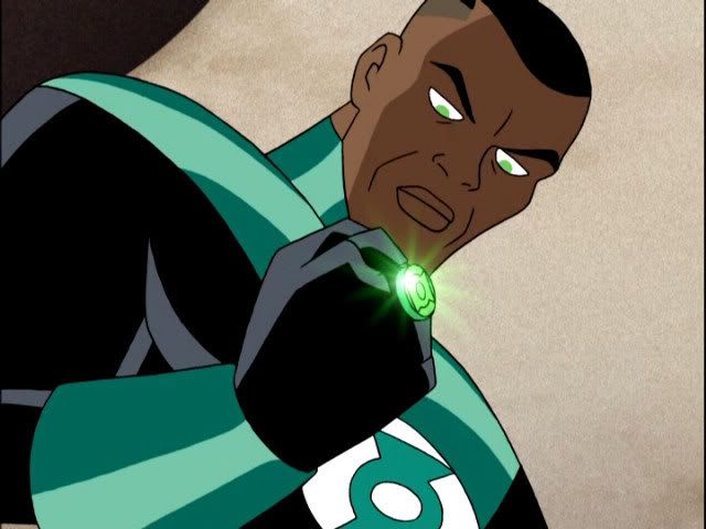
- Kyle Rayner's ring from Superman the Animated Series:
- John Stewart's ring from Justice League:
- The ring as seen in Green Lantern: First Flight and Green Lantern: Emerald Knights:
- The power ring from the upcoming Green Lantern the Animated Series:
Last edited:
Jack T Chance
Sr Member
Here's DC Direct's craptacular Honor Guard Ring replica...

Rather underwhelming, wouldn't you say?
Rather underwhelming, wouldn't you say?
I knew ya wouldn't let me down, Jack! Welcome to the thread!
Yeah, I'm frothing at the mouth for another Megatron run. Hopefully more in my preferred Gil Kane/Mark Bright style, but I'd also love to see a V2. It would also be cool to have the option of installing a gem in the V2, or leaving the center hole open. Recently got my finger sized, so now it's a waiting game...
And, like you, I also love the V2, specifically as drawn by Gibbons and Staton. That # 181 cover is an all-time favorite of mine.
And, yeah, that Megatron V2 is sweet. My only real issue is that the center of the symbol blends into the band, which kinda makes it a V2/chunk hybrid. For me, a true V2 would have a separate symbol piece attached to a band.
And I really love the look of that eBay guy's rings! While it does look like a modified DCD recast, that particularly look (off-model symbol aside) is pretty much my grail ring (aside from a V2).
Last edited:
Wicked
Active Member
Hal's signet style ring (as from that Emerald Twilight cover) and the lantern shaped rings with the domed gems have always been my personal favorites. G'nort's band ring as well I suppose. That would be kind of a cool one to make that I imagine not many people have. Come to think of it I wouldn't mind having a light up model of Mogo for that matter.
timelordjedi777
Sr Member
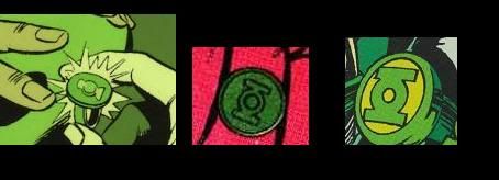
I scanned some. The first two are Alan Scott's. One is an older design.
The third is Kyle's and so is the last one but from a more recent book.
]


The third is Kyle's and so is the last one but from a more recent book.
]
Last edited:
Jack T Chance
Sr Member
The second one looks like the symbol Alan wore when the Editors/Writers had him de-age himself, revamp his costume, and call himself "Sentinel".I scanned some. The first two are Alan Scott's. One is an older design.
The third is Kyle's and so is the last one but from a more recent book.
View attachment 58883
View attachment 58884
View attachment 58885
View attachment 58886
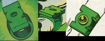
At times, Kyle seems to have been shown with a "chunk" style ring, too, such as in this image:

And Jim Lee redesigned his ring at one point, when he also redesigned Kyle's costume.
But I always just came back to the Version 2 ring's form-altering ability as the explanation! Given how often Kyle redesigned his costume, I just explained it as him tinkering around with the look of his ring, too!
I do wonder if it would be possible to depict the inset areas of the Jordan ring as the lighter green tone. I really do like the two-tone look of the Mark Bright ring. The symbol stands out more that way.
Really, the single-tone ring of the Kane era and the two-tone ring from the pre-"Emerald Twilght" days could be considered two distinctive ring styles rather than mere artistic interpretations.
Also, I agree that the height of the recent promo rings is ridiculous. That said, I do love my Blackest Night ring, if only as a placeholder. The metallic green color is pretty much exactly what my ideal ring would have.
I think a mod of the BN ring would be pretty easy, if one were to cut off and shorten the disc and make it closed-back. It would need repainting after the mods, of course.
I also think the old glow-in-the-dark V2-style promo ring would be an east mod--just fix the slanted top/bottom on the GL symbol piece, repaint the the whole thing a metallic green, and replace the GITD "gem" with a real gem.
Last edited:
Honus
Sr Member
I did a small run of GL rings back in late 2003/early 2004. They were cast sterling silver with a painted finish. The castings were fairly hefty. Painting them was a PITA as it had a metallic base coat followed by a transparent green and then clear coat.
Kyle ring


Hal ring


Alan ring


I also did a tutorial shortly thereafter that showed how the rings were made and then revised/republished it later to show a glowing version.
http://www.instructables.com/id/How-to-make-a-Green-Lantern-ring--including-a-glow/

Kyle ring
Hal ring
Alan ring
I also did a tutorial shortly thereafter that showed how the rings were made and then revised/republished it later to show a glowing version.
http://www.instructables.com/id/How-to-make-a-Green-Lantern-ring--including-a-glow/
Jack, while I did not realize that they had actually made it part of the story that the rings can change shape, I always took this for granted. Not only does it explain the different styles of the rings, it also explains how the rings always fit whoever is wearing them. The rings must size themselves to the current wearer.
And I will add my vote to how rediculous the height of the recent promo rings looks. If it werent for that they would be pretty decent.
Honus, I stumbled across your tutorial a few years ago and have been wanting to make a ring ever since.
And I will add my vote to how rediculous the height of the recent promo rings looks. If it werent for that they would be pretty decent.
Honus, I stumbled across your tutorial a few years ago and have been wanting to make a ring ever since.
knightwing316
Active Member
Wow, I go away for a few days and the thread explodes. Alright gentlemen, here's what I have so far...

If any of them don't look right, let me know and i'll adjust them.
More symbols to come.
If any of them don't look right, let me know and i'll adjust them.
More symbols to come.
knightwing316
Active Member
Update...

timelordjedi777
Sr Member
I love that Kyle ring Honus. I've always wanted one that I could wear.
Jack T Chance
Sr Member
Alright, time to move on to the GL Corps ring's "evil" opposite number...
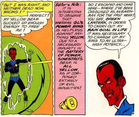
THE YELLOW POWER RING!
Originally created by the Weaponers of Qward from the Anti-Matter Universe just for Sinestro, the original Yellow Power Ring, as mentioned before, looked IDENTICAL to the GL Corps Power Rings of the day, except that it was made out of the yellow metal Qwardamite... meaning it would have looked like a ring made of either gold or brass. As various artists drew it throughout the '60s & '70s, we can expect that similar variations were seen as were seen with the GL ring in those days. Sometimes looking like a disc attached to a plain band, sometimes looking more like a proper signet ring, etc...

At some point in the 1970s, the lantern symbol was removed from the face, and was replaced by a yellow, hemisphere-shaped gem. This is Version 2 of the yellow power ring, as seen drawn by Neal Adams in Green Lantern/Green Arrow, and was continually seen in the comics from that point onward. It is still even occasionally seen to this day. The band/setting is drawn different ways by different artists, but it's always a plain gold band & setting with a round yellow gem.

In this recent homage cover, Hal Jordan can be seen wearing some Version 2 yellow rings... apparently that design is still in use amongst the Sinestro Corps members...
In the late '80s, when the comic was about to be canceled, Sinestro was put to death by the GL Corps. A few years later, Guy Gardner got his hands on the Version 2 ring after he was forced to give up his GL ring, and used the yellow ring to be a hero on his own terms. There was at least a panel or 2 where Guy's stylized "G" symbol could be seen under the gem, creating a new variation of the yellow ring, but I've been unable to find any scans of it. :unsure
The Version 2 ring later ended up being used briefly by the villainess known as Fatality, before the Qwardians chose Alex Nero as their new champion.
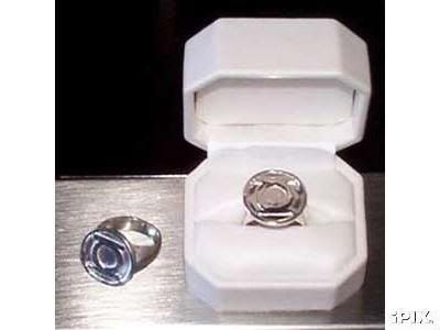
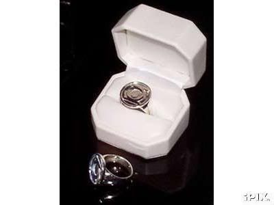
DC Direct's first high-end yellow power ring prop was the Version 2 ring. It was offered twice, once packaged with a mini-bust of Sinestro, and the second time included in the Planet Krypton Power Ring Set. Here it is side-by-side with my 14K gold Version 1 Yellow Power Ring:
At times, some of the artists have drawn the version 2 ring as a plain, unadorned signet ring, but that only happens occasionally. It's generally accepted that there should be a yellow gem there.
Then came GL: Rebirth and Sinestro's return from his (totally faked) death. In short order, Sinestro re-asserted control over the Weaponers of Qward, and began building his own Corps, allied with Parallax!
As such, the Sinestro Corps were issued yellow power rings bearing Parallax's symbol, the symbol of FEAR...
This is DC's "official" design for the Sinestro Corps Power Ring, with that godawful shape I can't stand... AKA Yellow Power Ring Version 3:

But other variations have been seen, including the "disc on band" design that Gregatron likes so much:


...which has also been seen with the recessed area colored black, as has occasionally been seen on the GL Corps rings, as well...

And there's been one or 2 other variations besides...

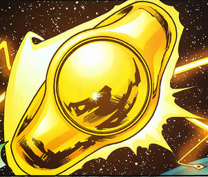
But my absolute favorite variation is the one that was revealed to the world last month...


:love
Oh, and in the animated film Green Lantern: First Flight, the Yellow Power Ring seen there is a variation on Version 1... it's identical in design to the First Flight GL Corps Power Rings, just colored yellow. Even though First Flight's Sinestro wears the Sinestro Corps uniform once he puts on the yellow ring, the Weaponers of Qward didn't put the Fear symbol on the yellow ring they made for him.
EDIT: And then there's Super Friends... yes, the classic Saturday morning cartoon that most of us grew up on! Boy, didn't they have fun mucking about with stuff? :lol
Firstly, they did something that had apparently never been done prior to that: It seems to be Super Friends that was responsible for making Sinestro a SOUTH PAW! He was always RIGHT-HANDED in the comics, but then the animators moved the ring to his left hand! :rolleyes
And apparently they felt the power rings looked better with the symbol in a contrasting color, because they painted the lantern symbol on his ring BLUE...

...I guess to coordinate with his outfit?
When DC Direct released their line of figures based on Super Friends, they got Sinestro's ring completely wrong.... they painted the symbol GREEN.
THE YELLOW POWER RING!
Originally created by the Weaponers of Qward from the Anti-Matter Universe just for Sinestro, the original Yellow Power Ring, as mentioned before, looked IDENTICAL to the GL Corps Power Rings of the day, except that it was made out of the yellow metal Qwardamite... meaning it would have looked like a ring made of either gold or brass. As various artists drew it throughout the '60s & '70s, we can expect that similar variations were seen as were seen with the GL ring in those days. Sometimes looking like a disc attached to a plain band, sometimes looking more like a proper signet ring, etc...
At some point in the 1970s, the lantern symbol was removed from the face, and was replaced by a yellow, hemisphere-shaped gem. This is Version 2 of the yellow power ring, as seen drawn by Neal Adams in Green Lantern/Green Arrow, and was continually seen in the comics from that point onward. It is still even occasionally seen to this day. The band/setting is drawn different ways by different artists, but it's always a plain gold band & setting with a round yellow gem.
In this recent homage cover, Hal Jordan can be seen wearing some Version 2 yellow rings... apparently that design is still in use amongst the Sinestro Corps members...
In the late '80s, when the comic was about to be canceled, Sinestro was put to death by the GL Corps. A few years later, Guy Gardner got his hands on the Version 2 ring after he was forced to give up his GL ring, and used the yellow ring to be a hero on his own terms. There was at least a panel or 2 where Guy's stylized "G" symbol could be seen under the gem, creating a new variation of the yellow ring, but I've been unable to find any scans of it. :unsure
The Version 2 ring later ended up being used briefly by the villainess known as Fatality, before the Qwardians chose Alex Nero as their new champion.
DC Direct's first high-end yellow power ring prop was the Version 2 ring. It was offered twice, once packaged with a mini-bust of Sinestro, and the second time included in the Planet Krypton Power Ring Set. Here it is side-by-side with my 14K gold Version 1 Yellow Power Ring:
At times, some of the artists have drawn the version 2 ring as a plain, unadorned signet ring, but that only happens occasionally. It's generally accepted that there should be a yellow gem there.
Then came GL: Rebirth and Sinestro's return from his (totally faked) death. In short order, Sinestro re-asserted control over the Weaponers of Qward, and began building his own Corps, allied with Parallax!
As such, the Sinestro Corps were issued yellow power rings bearing Parallax's symbol, the symbol of FEAR...
This is DC's "official" design for the Sinestro Corps Power Ring, with that godawful shape I can't stand... AKA Yellow Power Ring Version 3:
But other variations have been seen, including the "disc on band" design that Gregatron likes so much:
...which has also been seen with the recessed area colored black, as has occasionally been seen on the GL Corps rings, as well...
And there's been one or 2 other variations besides...
But my absolute favorite variation is the one that was revealed to the world last month...
:love
Oh, and in the animated film Green Lantern: First Flight, the Yellow Power Ring seen there is a variation on Version 1... it's identical in design to the First Flight GL Corps Power Rings, just colored yellow. Even though First Flight's Sinestro wears the Sinestro Corps uniform once he puts on the yellow ring, the Weaponers of Qward didn't put the Fear symbol on the yellow ring they made for him.
EDIT: And then there's Super Friends... yes, the classic Saturday morning cartoon that most of us grew up on! Boy, didn't they have fun mucking about with stuff? :lol
Firstly, they did something that had apparently never been done prior to that: It seems to be Super Friends that was responsible for making Sinestro a SOUTH PAW! He was always RIGHT-HANDED in the comics, but then the animators moved the ring to his left hand! :rolleyes
And apparently they felt the power rings looked better with the symbol in a contrasting color, because they painted the lantern symbol on his ring BLUE...
...I guess to coordinate with his outfit?
When DC Direct released their line of figures based on Super Friends, they got Sinestro's ring completely wrong.... they painted the symbol GREEN.
Last edited:
avianoguitarist
Active Member
My favorites are the ones that came out as promos with the Blackest Night comics, then as a complete set. I didn't like the movie version at first, but it's growing on me.
I'll see if I can dig up an image of Gardner's yellow ring with his symbol on it.
Should we also cover the power batteries in this thread, maybe?
(As an editorial aside, I really hate the idea of the GL symbol being stamped onto the power batteries, like it is on the DCD replicas. Makes no sense whatsoever, since the lanterns are what the stylized GL symbol represent! It's in the same vein as the SUPERMAN RETURNS costume being practically wallpapered with S-shields.)
knightwing316
Active Member
I don't see why we shouldn't cover the batteries as well, they are just as iconic as the symbols and rings. I'll take a shot at modeling them as well.
Oh and after I get the symbols designed, i'll start turning them into rings.
Oh and after I get the symbols designed, i'll start turning them into rings.
Last edited:
Similar threads
- Replies
- 0
- Views
- 941
- Replies
- 0
- Views
- 508
- Replies
- 2
- Views
- 1,173