Original Time Bandits map fold-out in new Criterion Blu Ray

dcarty

Sr Member
RPF PREMIUM MEMBER
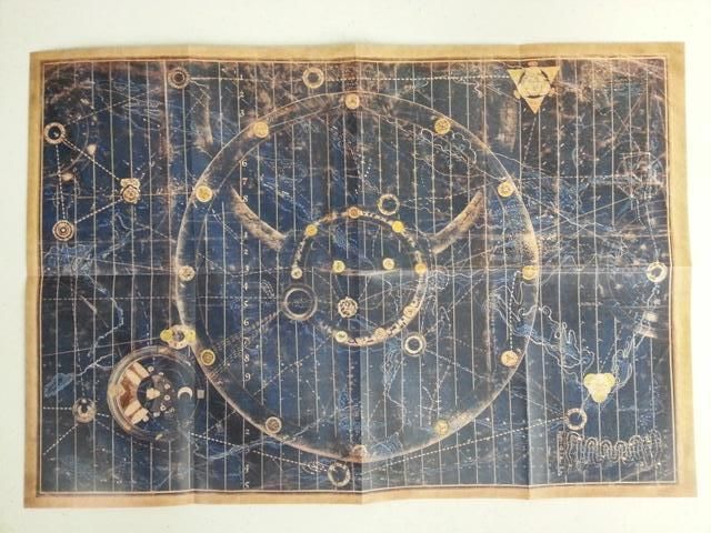
It's about time they did this and a wonder that someone hadn't done it before. The new Criterion Blu-Ray transfer of Time Bandits is out today and the booklet inside folds out to a 18 1/2" x 12 3/4" Map of the Universe.

It is, apparently, a scan of an original map as its use is credited to the Harrison family.

TimeBanditsMapCriterionBR.jpg


Enjoy!

Dave C
 
Last edited:
Be interesting to see how it matches the fan made versions

I'm guessing that this is just a larger version of the scan that accompanied the older DVD. At the time, I was the first person to make an "truly" accurate canvas version based on that scan. (My first ever prop run on the RPF.. around 2007-2008-ish?). Previous versions by (amongst others) Kapow, were largely based on screenshots. These days, RPF member jheilman sells a similarly accurate version made from the same (I think) source.

Maybe a few of the really tiny details could be clarified in that slightly larger version but it looks like the writing is missing on top- which is one of the parts that has always been a mystery. That could of course also mean that it's one of the other copies or that it has been retouched to look "better" since the borders look more even. (The clocks are missing too of course.)
 
Last edited:
micdavis and kapow were the granddaddys of these maps here with one from mike being presented to the man himself Terry Gilliam.

I'm in strictly because its time bandits and a criterion release.

Screw the map already have a few! :lol
 
joatrash, is it possible to use this source and add the writing from the smaller fold-out map and then transfer all of it onto canvas to have a definitive 100% accurate version of the Hero map??
 
joatrash, is it possible to use this source and add the writing from the smaller fold-out map and then transfer all of it onto canvas to have a definitive 100% accurate version of the Hero map??

You will not get a 100% accurate version in any way- even if you had the actual map in front of you. Do a search in the forum for jheilman's map. I think he still makes them and they are very nice and about as close to accurate as you can get. (I stopped making my version years ago since printing on canvas is a lot cheaper in the US... or at least it was 5-6 years ago!)
 
Last edited:
Hey Gang,

I don't know who has the most accurate reproductions of this map these days. Years and years ago, that map was what drew me to the RPF. Now today, there are pretty good online digital fabric printers that can produce some pretty nice stuff. I am a costume design student and have been playing around with samples from a couple vendors for a possible Hawaiian shirt project.

I think if someone has recreated a high enough resolution digital file for the map artwork, or a vector, printing to canvas would not be too difficult. anyone know off the top of their heads the actual dimensions of the screen used map?

JoshBot-
 
Plus this map is more finished off than the smaller fold-out. There are larger off white borders on this one but they are not the original borders to the map. Also of course no left side clock panel. Why the heck was the left clock panel cut off after filming anyhow??
 
Last edited:
Plus this map is more finished off than the smaller fold-out. There are larger off white borders on this one but they are not the original borders to the map. Also of course no left side clock panel. Why the heck was the left clock panel cut off after filming anyhow??
 
Plus this map is more finished off than the smaller fold-out.

Finished off? After looking at them a bit more, this latest one seems a bit simpler than the previous one. The older version was a lot more weathered, but it also had a lot more color in the symbols. The older one seems to have at least a couple closeup shots in the film from what I can tell at a quick glance.
 
Yes the borders are all different. They added that thick beige border around it. Instead of the clock panels on each side. This is of the map at the end of the film that gets rolled up right before the end credits. You are right though the colors are washed out and not as bright as they should be. It is like they touched the coloring up on it.
 
Just got my copy man the map is gnarly, color looks all drained out.

Man oh man the transfer of the film on the other hand is BEAUTIFUL!!
 
This is of the map at the end of the film that gets rolled up right before the end credits.

There appear to be a few differences to it in the small details (besides the colors and cropped borders), plus there is at lease one visible crease on in the capture that isn't there on the criterion.

tbmaproll.jpg

Kinda reminds me that i still need to get this in HD.
 
Yeah exactly joatrash. True about the crease. Oh and yes that is what I mean unfortunately the colors on this scan have been washed out for some strange reason. And for some other strange reason they chose not to scan the clock panels and just create that beige border around the map. However, the map insert does have a beauty of it's own despite these strange differences.
 
This thread is more than 9 years old.

Your message may be considered spam for the following reasons:

  1. This thread hasn't been active in some time. A new post in this thread might not contribute constructively to this discussion after so long.
If you wish to reply despite these issues, check the box below before replying.
Be aware that malicious compliance may result in more severe penalties.
Back
Top