Time Bandits Map of the Universe

Indeed, some very fine detecting!

I can't stop by being amazed at what kind of long-lost information we can find as time goes on. A few years ago, finding these kinds of obscure references would have been extremely difficult.

From the looks of it, they used several of Fludd's images. Some of the spherical images match the ones on the map:
http://bildgeist.com/robert-fludd-utriusque-cosmi-rosicrucianism/

It's perfectly logical that they would have used existing like this, since Fludd's images are public domain and also taking into account that the original map would have been silk-screened with plates made from originals that were cut'n'pasted, then photographed onto celluloid. They would have had at least one plate for the blue, then either made separate ones for the other colors or did those by hand. (Certain elements also bear evidence of possible airbrushing, such as the fading around the large rings.)
 
Thanks, everyone!

From the looks of it, they used several of Fludd's images. Some of the spherical images match the ones on the map:
http://bildgeist.com/robert-fludd-utriusque-cosmi-rosicrucianism/

It's perfectly logical that they would have used existing like this, since Fludd's images are public domain and also taking into account that the original map would have been silk-screened with plates made from originals that were cut'n'pasted, then photographed onto celluloid. They would have had at least one plate for the blue, then either made separate ones for the other colors or did those by hand. (Certain elements also bear evidence of possible airbrushing, such as the fading around the large rings.)

Yeah, I noticed that too, and I've ordered a book from Amazon on Robert Fludd. I'm looking for reference books that would all be available circa 1979/1980, since that is likely when the map was being designed and fabricated. It looks to me like all those circular designs of Fludd's are used for the "portals."

And I agree with your second point as well, which is the basis for my searching and searching, and trying to narrow in on the central concept or theme the map revolves around. For instance: I'm finding a lot of familiar items in looking through hermetic philosophy and alchemy, but I also recognize some astrological symbols as well.

Question for you, JOATRASH FX, or for anyone, what makes you think it was silk-screening? Rather than some other pre-computer transfer method?

(I'm almost done with all the blue squiggles... hours of digital tracing, printing, then re-tracing with pen and ink! But I think it's going to look very nice.)
 
Last edited by a moderator:
Question for you, @JOATRASH FX, or for anyone, what makes you think it was silk-screening? Rather than some other pre-computer transfer method?

(I'm almost done with all the blue squiggles... hours of digital tracing, printing, then re-tracing with pen and ink! But I think it's going to look very nice.)

Well, since the transfer of Fludd's symbols is so "exact", the simplest method that would have been available at the time (as far as I can remember... was a kid in the 70's, lol) would have been to cut out the pieces, make a collage and then transfer them to photo-film. From there, they would have either transferred onto a screen print frame or, as an alternative, maybe a copper plate and then done the print that way, but since it was printed on fabric, you need more paint to soak in, therefore a screen transfer method would make more sense.

It's still very possible that a lot of the coloring (oranges, yellows and so forth) was done by hand since there are only a few spots. The squiggly lines, grid patterns and even the (seemingly airbrushed) gradients could have been painted directly onto a second photo-film.

Another small thing that kinda makes me thing it was silk-screened is that if you look at the circular symbols, some of them are a little "messy", which kind of suggests that too much paint might've gone through the screen. But that it's pure speculation. I could very well be wrong about the whole thing, since I'm not an expert on what other methods might've been available, but since photographic plates and such were used a lot when doing layout and print, it kind of feels plausible.
 
Yes I always heard that both maps where drawn and colored by hand onto the canvas although nothing has ever been confirmed. Also what do you guys think? Is the map on canvas or linen??
 
One of these days, one of you will produce a map that is "too good," and then you know who will come a' knockin'!
Time Bandits This-isnt-a-School-Outing.png
 
I agree, its always been a film I loved, but for some reason when I think about props i want, it never pops up.... until now!

I used to daydream and draw it in class, hiding it under my desk, at the back of the classroom when I was a kid in the early 80s. Much like most props and replicas, or even the RPF itself, never could I have dreamed that I would one day own, let alone make, an accurate copy of it.
 
Great find on the source of some of those graphics. Looking forward to seeing your progress. My map journey really began in 2001 following RPF member Kapow's recreation. Adam Savage contributed some design work to that one if I recall. When it was complete, I couldn't afford one. Six years later, and with more reference material gathered, I began my own. I think it took 3-4 months in Photoshop. I did hand draw everything in separate layers on top of my reference images. Massive file back then. Today, not so much. Adam contacted me and gave some advice on varying the background to add depth and suggested more variety in the clock designs. He has purchased a number of these for himself and as gifts. Very enthusiastic and generous guy. But, you all know that.

The original props were created by Bernard Allum. I tracked him down years ago and we corresponded a bit. More recently, I was contacted by the author of this article http://www.madnesshub.com/2017/08/the-100-greatest-props-in-movie-history.html
He was looking for info on the origins of the map. I shared what I had and he also located Bernard. You can read the info at the link. Yes to silk screening, and yes to hand painting. He also mentions other reference books if you can track those down? Bernard remembers the sizing as 120cm x 70cm. That would be 47.24" x 27.56". But, he also says he cut holes in the maps for the dwarves to jump through, so take his recollection with a grain of salt? To me, Bernard only mentioned the original was A1 size, which is 33.1" x 23.4". Height would be very close to what most have replicated, but too narrow. Unless he's talking the main map minus the clock panels??

I do not have the TB blu-ray yet. Would be curious to see the foldout since it's sounds like it's the Harrison map, the one used for the credits. I replicated the filming map since, at the time, that had the best reference material. But I have never been tempted to rework mine. I made several rounds of tweaks in the first year or so, but it's been locked since about 2008.

I have made comparisons between mine and others in the past. It's interesting to see the different interpretations of the reference material. Kapow's was similar in detail to mine, but differed wildly in color. Joatrash's map does have a more hand-painted look. Chris_s' map looks very nice.

One suggestion I would make is to avoid using the airbrush tool or smooth gradients. Personally, I just think airbrushing looks out of place on an ancient map. I laid down a solid color first, then slowly ate away at it with a custom brush on the eraser tool until I achieved the gradient look I liked. Took forever, but I think it really helps sell the look. Your mileage may vary.

Good luck. You are off to a wonderful start and you have some references that we never knew existed. It should blow us away when done!
 
I have one of the old micdavis maps...

36675258746_509bb2005b_z.jpg


Been years, and I still haven't been able to bring myself to distress it to make it accurate-er to the film. I'm looking forward to seeing where you end up with yours. May want a second. :behave
 
Great find on the source of some of those graphics. Looking forward to seeing your progress. My map journey really began in 2001 following RPF member Kapow's recreation. Adam Savage contributed some design work to that one if I recall. When it was complete, I couldn't afford one. Six years later, and with more reference material gathered, I began my own. I think it took 3-4 months in Photoshop. I did hand draw everything in separate layers on top of my reference images. Massive file back then. Today, not so much. Adam contacted me and gave some advice on varying the background to add depth and suggested more variety in the clock designs. He has purchased a number of these for himself and as gifts. Very enthusiastic and generous guy. But, you all know that.

The original props were created by Bernard Allum. I tracked him down years ago and we corresponded a bit. More recently, I was contacted by the author of this article http://www.madnesshub.com/2017/08/the-100-greatest-props-in-movie-history.html
He was looking for info on the origins of the map. I shared what I had and he also located Bernard. You can read the info at the link. Yes to silk screening, and yes to hand painting. He also mentions other reference books if you can track those down? Bernard remembers the sizing as 120cm x 70cm. That would be 47.24" x 27.56". But, he also says he cut holes in the maps for the dwarves to jump through, so take his recollection with a grain of salt? To me, Bernard only mentioned the original was A1 size, which is 33.1" x 23.4". Height would be very close to what most have replicated, but too narrow. Unless he's talking the main map minus the clock panels??

I do not have the TB blu-ray yet. Would be curious to see the foldout since it's sounds like it's the Harrison map, the one used for the credits. I replicated the filming map since, at the time, that had the best reference material. But I have never been tempted to rework mine. I made several rounds of tweaks in the first year or so, but it's been locked since about 2008.

I have made comparisons between mine and others in the past. It's interesting to see the different interpretations of the reference material. Kapow's was similar in detail to mine, but differed wildly in color. Joatrash's map does have a more hand-painted look. Chris_s' map looks very nice.

One suggestion I would make is to avoid using the airbrush tool or smooth gradients. Personally, I just think airbrushing looks out of place on an ancient map. I laid down a solid color first, then slowly ate away at it with a custom brush on the eraser tool until I achieved the gradient look I liked. Took forever, but I think it really helps sell the look. Your mileage may vary.

Good luck. You are off to a wonderful start and you have some references that we never knew existed. It should blow us away when done!
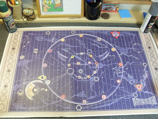
Do you know if the actual map was made of canvas or linen?
 
Allum says canvas, so that's all I can go on. That said, it was probably nothing like the inkjet coated canvas we are printing on today. Likely uncoated and thinner. I remember artists' canvas back in college. Probably something like that?
 
Allum says canvas, so that's all I can go on. That said, it was probably nothing like the inkjet coated canvas we are printing on today. Likely uncoated and thinner. I remember artists' canvas back in college. Probably something like that?

Yes it was canvas. I read the article. In the article like you stated he says the measurement of the map was 120cm x 70 cm. He also talks about the clock panels so I'm sure that measurements include both clock panels.
 
.....Joatrash's map does have a more hand-painted look. ....

That's probably because almost everything except the Fludd diagrams was hand-drawn with a Wacom pen over the original, rough scan. Even the shifting blue tones in the base were drawn with broad hand strokes. (Some of the symbols were actually sharpened that way too.)
 
I have got to pick up one of yours and a “Marvel” banner soon! :thumbsup


It would be fun to spread out every version of the map on a big table to compare and contrast. Unfortunately, I cannot afford to buy them all. :)
 

Your message may be considered spam for the following reasons:

If you wish to reply despite these issues, check the box below before replying.
Be aware that malicious compliance may result in more severe penalties.
Back
Top