DD28
Well-Known Member
First of all let me state that this is not the only way, or even the best or most efficient way of working, but it is the way I do it.
Secondly I would suggest you work through some of the tutorial movies that Xara has produced (available from the Help Menu, they cover all the main functions of the software, and it will familiarize you with how the software works.
I will set out some of the notations I will be using throughout this tutorial.
LC = Left Click of the Mouse Button
RC = Right Click
Context Menu = Pop-up menu when you press the Right Mouse Button
File>Save = Menu Option tree i.e. File Menu, then select Save
Control Point = Vector Drawings are made up of lines drawn between control points, think of a dot-to-dot where you create the dots and Xara draws the lines.
Control Handles = When drawing lines in a vector package curves are adjusted using the Control Handles they are thin lines extending from the Control Points with hollow squares at the ends.
Drag Handles = Black squares that denote the imaginary box that surrounds an object when you LC on it, there are 8 drag handles one on each corner and one on each side
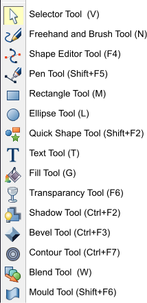
Here are the tools as seen down the left hand edge of the screen
OK so onto the tutorial.
Create a new document File>New>A4 Landscape.
Load in the reference image by either Pasting it into the document, dragging and dropping, or using File>Import.
If you know the dimensions of the prop scale the image to the correct dimensions. In this tutorial I haven’t bothered, but it isn't really an issue as it can be scaled when we have finished.
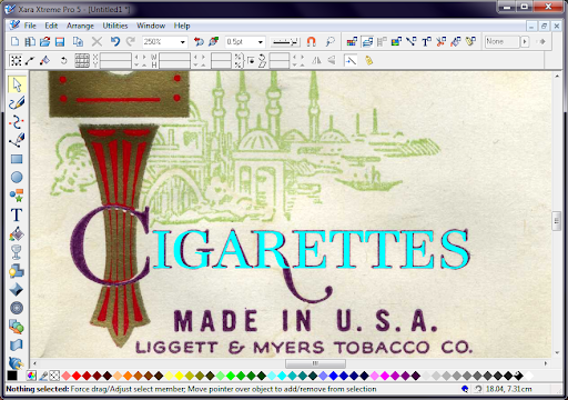
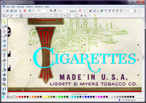
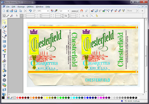
For this tutorial we will be recreating this Chesterfield Cigarette Packet – image supplied by Brigandia36 – Thanks.
I scaled the image to fit the page area.
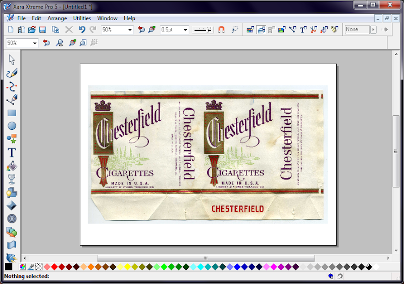
Once you have the image where you want it, lock it into position. Open the Object Gallery

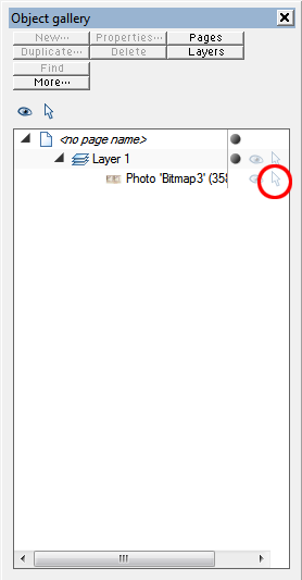
LC the triangle next to Layer 1, then LC the white arrow (Circled in the image above) to change it to a pad lock. The image is now locked so you will not accidentally select it when drawing.
The order in which you tackle each of the elements is unimportant, so I don't always do things in a set order.
I try to identify the fonts before I start, this will determine how much work I will need to do, I use both, www.identifot.com and www.myfont.com/WhatTheFont and then check if I either have it (I'm a bit of a fontaholic) or find a close match of one of the free font sites like dafont.com.
I couldn't find an exact match to the fonts as you can see here.
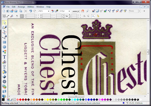
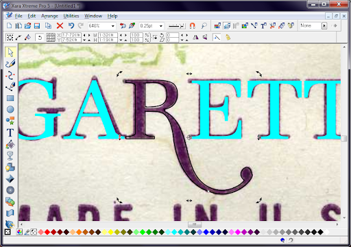
I decided to start with the Cigarette lettering, once I found a suitably close font I converted it to editable shapes Arrange>Convert to Editable Shapes (Ctrl+Shift+S) then I had to ungroup them so I could edit each letter individually Arrange>Ungroup (Ctrl+U).
I stretched each letter to best match the reference image, click on each letter and use the Drag Handles to stretch it as close as possible.
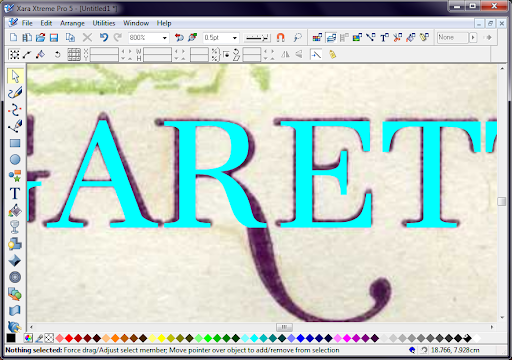
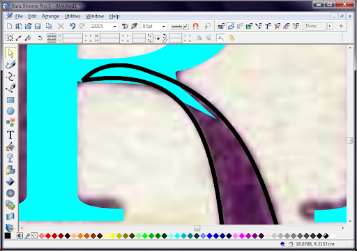
The biggest change would be to the R, so I started out by using the Shape Editor Tool (F4) to draw the extended leg. The shape tool works by defining points that will be joined by lines, by default the lines will be straight, how I work is that I draw two points then if you move the cross cursor over the line it changes to a large white arrow pointer, LC the line and drag it to form a curve, at the ends of the line you will now see Control Handles (thin lines with squares at the end). You can use the control handles to also modify the curve of the line, it does take practice to get the hang of drawing curves this way, but once you do you can generate any curve. I continued drawing the leg of the R in this way.
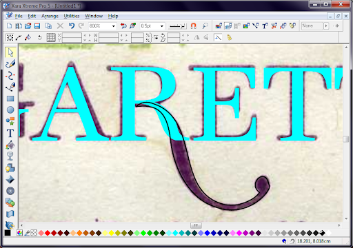
I switched back to the Selection Tool (V) and selected the letter R, then switched back to the Shape Editor Tool (F4), this displays the control points for the shape. Holding down Ctrl I clicked each of the control points in the leg of the R (they change from solid square to hollow square when selected)
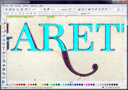
Then press Delete.
Next I merged the the two shapes together, using the Selection Tool (V) select both the R and the new Leg by Shift+LC each one, then either RC and select Combine Shapes>Add Shapes or Arrange>Combine Shapes> Add Shapes (Ctrl+1). As the Leg was drawn after the R the combined shape will take on the attributes of the object that was at the top of the stack.
Using the same method of selecting each letter and adjusting the control points, this is what I ended up with.
Next I struck lucky with the font for Made in U.S.A., I already had it. The only problem was the spacing.
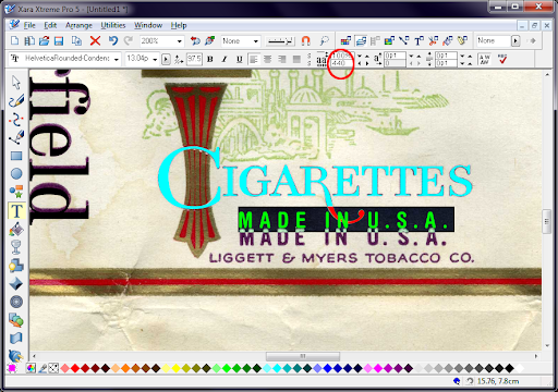
To correct the spacing, I used the Type Tool and selected all the text then adjusted the Tracking to 440, actually all I did was press the little black arrows next to the box until it looked right.
I used the same font again for the LEGGIT & MYERS however the ampersand (&) wasn't correct, so instead of trying to adjust the existing one I decided to redraw it from scratch.
Setting the line width to 1pt (see below) I used the Shape Editor tool to construct the “&” from a line, instead of tracing the profile.
The only problem was that the ends of the lines and the Joints where the control points are were too straight, they needed to be rounded. I opened up the Line Gallery.
And changed the line setting to Round join and Round cap.

Then just to keep things tidy, I converted the line into a shape, the main reason for this is that Xara has 2 colour properties for each shape one for line and one for fill. If I kept this as a line when I came to change the fill colour of the text later, the ampersand would not change as it has no fill because it is not a solid shape, just a line. To convert a line to a shape use Arrange>Convert line to shape. I then grouped the text and the drawn ampersand together, so if I come to move it they will stay together, using the Selection Tool click both objects the Arrange>Group Ctrl+G.
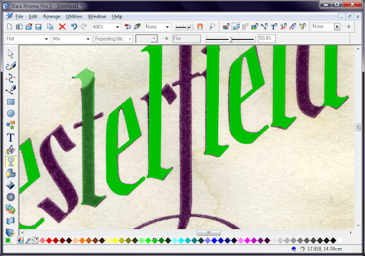
Using the Shape Editor Tool, I drew the design behind the C, you may have noticed I use bright contrasting colours this is simply so I can tell what parts of the design I have done. As you will notice the shape behind the C is actually above the C when finished, so I needed to send it behind the C, I grouped all the parts of the shape together then used Arrange> Move Backwards (Shift+Ctrl+B) to move it to the right level.
Most of the rest of the design is done the same way, I will now just show some of the other tools and techniques I use to create props.
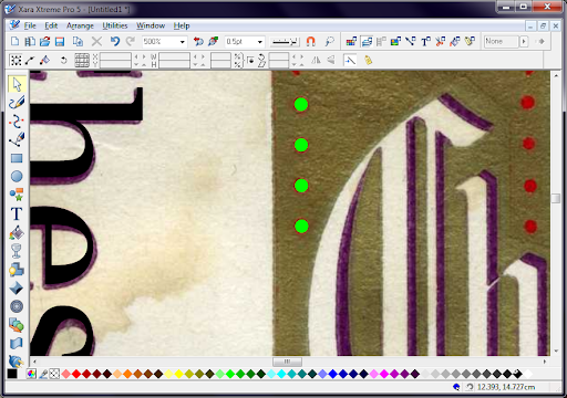
One very useful feature is the Blend Tool (W), I used it on the red dots in the gold square, all you do is simply draw two shapes (in this case two identical circles) and then using the Blend tool LC one object, then draw a line to the second object and release.
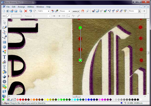
As a default Xara will create a 5 step blend between the two objects

Simply change the number of steps to the what you require, in this case 2.
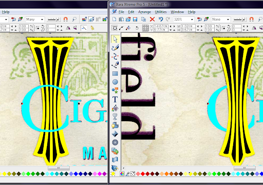
Another handy feature is being able to clone objects, the easiest way to do this is using the Selection Tool, LC an object the drag it to where you want to the copy, then without releasing the left button, RC, you can repeat this as many times as you need, I did this with the “e” of Chesterfield.

Another time saving technique I use is looking for shapes that are repeated, for example in this projects I recreated the letter “l” then cloned it onto other letters that are similar but will just need a little alteration.
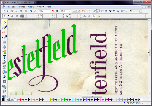
The only downside with doing this is that you can no longer see the original design, however what I do is use the Transparency Tool (F6) to temporarily make the object transparent and then edit the shape until it matches the original.
Eventually I ended up with this.
Once I was happy with the designed elements, I changed the colours. To start with I created a custom named colour, it's a useful feature, because if you need to adjust the colour of lots of objects, rather than select them all individually and changing the colour, you can simply edit the named colour and all objects in the document will change automatically.
First open the Colour Editor, make sure you have no object selected.
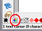
Then select the colour in whichever way you choose, I try to use colour directly off the original by using the Colour picker tool (Looks like an eye dropper) and LC a colour in the document.
Then you need to select the New Named Colour icon (see below) and then give the colour a name.
Named colours are listed in the colour track from the left, they are easy to spot as they are square rather than diamond shaped.
Select all the objects that should be the colour you named and the LC the named colour, this will change the fill colour, incidentally if you Shift+LC a colour it sets the line colour.
If at a later time, you wish to change the named colour, simply RC the colour on the colour track and choose Edit... from the context menu, then set the new colour.
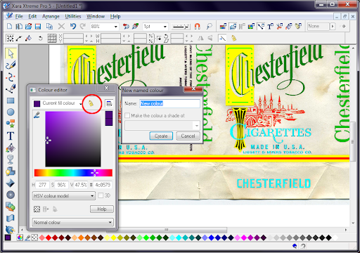
The next task was the Gold texture, for this I decided to use a Bitmap Fill. First I needed a suitable gold texture, so I looked online to see what I could find. Once located I simply copied the texture (Ctrl+C) and pasted it directly in Xara, which will ask you how you want it inserting into the document, just select bitmap.
Once in the document you can use the bitmap as a fill, simply select the item you want to fill, then select the Fill Tool (G) then from the menu at the top choose Bitmap Fill, this will change the fill of the object to the default Xara Pattern, see below.
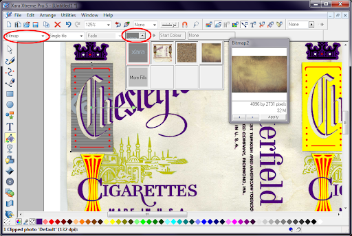
Then chose the Bitmap Name dropdown (see above) and select the Gold Texture.
For more information on Bitmap fills refer to Xara's movies they will explain it a LOT better than me.
All that was left to do then was draw the background shape and fill it with a cream colour.
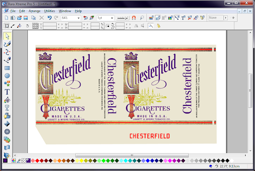
Done.
Finished Design

Hopefully I've explained myself properly, and it will be of use to someone, most of the techniques I use, will work in any vector drawing package, just the specific commands and tools will be different.
Funnily enough it took a LOT longer to write this tutorial than it did to create the prop in the first place.
Peter
Secondly I would suggest you work through some of the tutorial movies that Xara has produced (available from the Help Menu, they cover all the main functions of the software, and it will familiarize you with how the software works.
I will set out some of the notations I will be using throughout this tutorial.
LC = Left Click of the Mouse Button
RC = Right Click
Context Menu = Pop-up menu when you press the Right Mouse Button
File>Save = Menu Option tree i.e. File Menu, then select Save
Control Point = Vector Drawings are made up of lines drawn between control points, think of a dot-to-dot where you create the dots and Xara draws the lines.
Control Handles = When drawing lines in a vector package curves are adjusted using the Control Handles they are thin lines extending from the Control Points with hollow squares at the ends.
Drag Handles = Black squares that denote the imaginary box that surrounds an object when you LC on it, there are 8 drag handles one on each corner and one on each side
Here are the tools as seen down the left hand edge of the screen
OK so onto the tutorial.
Create a new document File>New>A4 Landscape.
Load in the reference image by either Pasting it into the document, dragging and dropping, or using File>Import.
If you know the dimensions of the prop scale the image to the correct dimensions. In this tutorial I haven’t bothered, but it isn't really an issue as it can be scaled when we have finished.
For this tutorial we will be recreating this Chesterfield Cigarette Packet – image supplied by Brigandia36 – Thanks.
I scaled the image to fit the page area.
Once you have the image where you want it, lock it into position. Open the Object Gallery
LC the triangle next to Layer 1, then LC the white arrow (Circled in the image above) to change it to a pad lock. The image is now locked so you will not accidentally select it when drawing.
The order in which you tackle each of the elements is unimportant, so I don't always do things in a set order.
I try to identify the fonts before I start, this will determine how much work I will need to do, I use both, www.identifot.com and www.myfont.com/WhatTheFont and then check if I either have it (I'm a bit of a fontaholic) or find a close match of one of the free font sites like dafont.com.
I couldn't find an exact match to the fonts as you can see here.
I decided to start with the Cigarette lettering, once I found a suitably close font I converted it to editable shapes Arrange>Convert to Editable Shapes (Ctrl+Shift+S) then I had to ungroup them so I could edit each letter individually Arrange>Ungroup (Ctrl+U).
I stretched each letter to best match the reference image, click on each letter and use the Drag Handles to stretch it as close as possible.
The biggest change would be to the R, so I started out by using the Shape Editor Tool (F4) to draw the extended leg. The shape tool works by defining points that will be joined by lines, by default the lines will be straight, how I work is that I draw two points then if you move the cross cursor over the line it changes to a large white arrow pointer, LC the line and drag it to form a curve, at the ends of the line you will now see Control Handles (thin lines with squares at the end). You can use the control handles to also modify the curve of the line, it does take practice to get the hang of drawing curves this way, but once you do you can generate any curve. I continued drawing the leg of the R in this way.
I switched back to the Selection Tool (V) and selected the letter R, then switched back to the Shape Editor Tool (F4), this displays the control points for the shape. Holding down Ctrl I clicked each of the control points in the leg of the R (they change from solid square to hollow square when selected)
Then press Delete.
Next I merged the the two shapes together, using the Selection Tool (V) select both the R and the new Leg by Shift+LC each one, then either RC and select Combine Shapes>Add Shapes or Arrange>Combine Shapes> Add Shapes (Ctrl+1). As the Leg was drawn after the R the combined shape will take on the attributes of the object that was at the top of the stack.
Using the same method of selecting each letter and adjusting the control points, this is what I ended up with.
Next I struck lucky with the font for Made in U.S.A., I already had it. The only problem was the spacing.
To correct the spacing, I used the Type Tool and selected all the text then adjusted the Tracking to 440, actually all I did was press the little black arrows next to the box until it looked right.
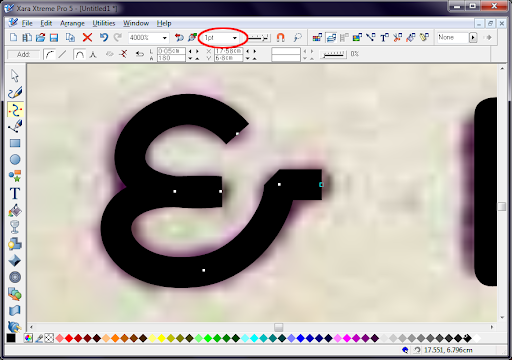
I used the same font again for the LEGGIT & MYERS however the ampersand (&) wasn't correct, so instead of trying to adjust the existing one I decided to redraw it from scratch.
Setting the line width to 1pt (see below) I used the Shape Editor tool to construct the “&” from a line, instead of tracing the profile.
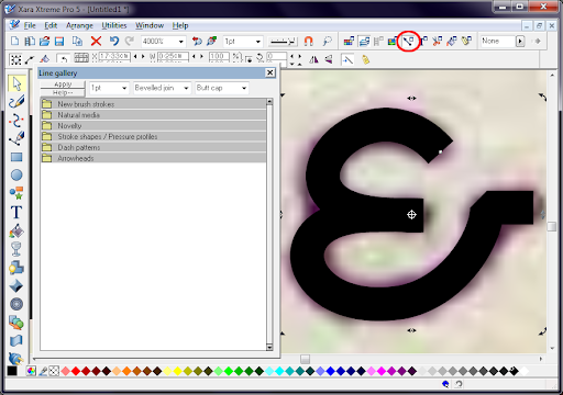
The only problem was that the ends of the lines and the Joints where the control points are were too straight, they needed to be rounded. I opened up the Line Gallery.
And changed the line setting to Round join and Round cap.
Then just to keep things tidy, I converted the line into a shape, the main reason for this is that Xara has 2 colour properties for each shape one for line and one for fill. If I kept this as a line when I came to change the fill colour of the text later, the ampersand would not change as it has no fill because it is not a solid shape, just a line. To convert a line to a shape use Arrange>Convert line to shape. I then grouped the text and the drawn ampersand together, so if I come to move it they will stay together, using the Selection Tool click both objects the Arrange>Group Ctrl+G.
Using the Shape Editor Tool, I drew the design behind the C, you may have noticed I use bright contrasting colours this is simply so I can tell what parts of the design I have done. As you will notice the shape behind the C is actually above the C when finished, so I needed to send it behind the C, I grouped all the parts of the shape together then used Arrange> Move Backwards (Shift+Ctrl+B) to move it to the right level.
Most of the rest of the design is done the same way, I will now just show some of the other tools and techniques I use to create props.
One very useful feature is the Blend Tool (W), I used it on the red dots in the gold square, all you do is simply draw two shapes (in this case two identical circles) and then using the Blend tool LC one object, then draw a line to the second object and release.
As a default Xara will create a 5 step blend between the two objects
Simply change the number of steps to the what you require, in this case 2.
Another handy feature is being able to clone objects, the easiest way to do this is using the Selection Tool, LC an object the drag it to where you want to the copy, then without releasing the left button, RC, you can repeat this as many times as you need, I did this with the “e” of Chesterfield.
Another time saving technique I use is looking for shapes that are repeated, for example in this projects I recreated the letter “l” then cloned it onto other letters that are similar but will just need a little alteration.
The only downside with doing this is that you can no longer see the original design, however what I do is use the Transparency Tool (F6) to temporarily make the object transparent and then edit the shape until it matches the original.
Eventually I ended up with this.
Once I was happy with the designed elements, I changed the colours. To start with I created a custom named colour, it's a useful feature, because if you need to adjust the colour of lots of objects, rather than select them all individually and changing the colour, you can simply edit the named colour and all objects in the document will change automatically.
First open the Colour Editor, make sure you have no object selected.
Then select the colour in whichever way you choose, I try to use colour directly off the original by using the Colour picker tool (Looks like an eye dropper) and LC a colour in the document.
Then you need to select the New Named Colour icon (see below) and then give the colour a name.
Named colours are listed in the colour track from the left, they are easy to spot as they are square rather than diamond shaped.
Select all the objects that should be the colour you named and the LC the named colour, this will change the fill colour, incidentally if you Shift+LC a colour it sets the line colour.
If at a later time, you wish to change the named colour, simply RC the colour on the colour track and choose Edit... from the context menu, then set the new colour.
The next task was the Gold texture, for this I decided to use a Bitmap Fill. First I needed a suitable gold texture, so I looked online to see what I could find. Once located I simply copied the texture (Ctrl+C) and pasted it directly in Xara, which will ask you how you want it inserting into the document, just select bitmap.
Once in the document you can use the bitmap as a fill, simply select the item you want to fill, then select the Fill Tool (G) then from the menu at the top choose Bitmap Fill, this will change the fill of the object to the default Xara Pattern, see below.
Then chose the Bitmap Name dropdown (see above) and select the Gold Texture.
For more information on Bitmap fills refer to Xara's movies they will explain it a LOT better than me.
All that was left to do then was draw the background shape and fill it with a cream colour.
Done.
Finished Design
Hopefully I've explained myself properly, and it will be of use to someone, most of the techniques I use, will work in any vector drawing package, just the specific commands and tools will be different.
Funnily enough it took a LOT longer to write this tutorial than it did to create the prop in the first place.
Peter
")