thegreatgalling
Master Member
Re: The Shawshank Redemption, Andy's posters WIP, advice and opinions needed
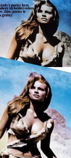
While I don't think its fair to hold you to a small, blury screencap, maybe this would help:

To me, it seems like the one in the movie was even a tad darker, but also Raquel's face still had some more red or cyan in it, as you can still make out the auburn in her hair.
Also, it might be just do to sizing, but it appears your pics are slighty smooshed vertically.
Here's another one with your pic at the bottom, skewed to roughly match the screencap:
Again, just a tad more fleshy in the movie posters skin. It could be a touch more red/cyan or even yellow too. You can particularly see the touch of red on her chest bone.
Finally, this also shows the darkness of her cheeks in the first one as opposed to the bottom one.
All in all, your nearly there man.
While I don't think its fair to hold you to a small, blury screencap, maybe this would help:
To me, it seems like the one in the movie was even a tad darker, but also Raquel's face still had some more red or cyan in it, as you can still make out the auburn in her hair.
Also, it might be just do to sizing, but it appears your pics are slighty smooshed vertically.
Here's another one with your pic at the bottom, skewed to roughly match the screencap:
Again, just a tad more fleshy in the movie posters skin. It could be a touch more red/cyan or even yellow too. You can particularly see the touch of red on her chest bone.
Finally, this also shows the darkness of her cheeks in the first one as opposed to the bottom one.
All in all, your nearly there man.
Last edited:

")

