I think whenever we watch our favorite science fiction shows we like to debate “what they got right and what they got wrong”. Since I am trying to expand the discussion about “The Ark” I am going to take a slightly different and less contemptuous approach. I would like to speculate how the show might extrapolate on some of their ideas to extend the canon.
My first attempt at adding to the story is the ration box. This futuristic lifeboat story includes the necessity of rationing food and water. Meals are limited to 500 calories and an unspecified quantity of water twice a day. This message discusses the food box. As a prop the box appears as; a wrapped, five-sided (think Japanese sake cup with four sides and a bottom), rigid, open top box, which contains a flat, square ration. The ration looks a little like a very thin piece of honey comb. The box looks like thick-walled white cardboard and the wrapper a piece of paper cardstock. The wrapper starts by going down the front face of the box, around the bottom, up the back, across the top and finally back down over itself in the front to the bottom. The wrapper is slight wider than the box so it extends over the sides of the box as if to seal-in the contents. Crew members are seen eating the wafer-like ration – but the “experience” ends there.
I would extend the “storyline”. Since all shipboard resource are limited we cannot have food packing just for the purpose of packaging. I believe all packaging would be edible. We have several simple examples that have been around for centuries such as the ice cream cone and the hot dog bun. The box could be based on the already available “edible coffee cup” which is made of grain products such as oats and wheat. They are very much like an ice cream cone themselves. We just need to “bleach” them white. My first thought was the box seemed too tall, and thus too wasteful to hold the short wafer. But adding the concept of calorie intake, I can “understand” the box size would have been adjusted to achieve the 500 number.
There are also existing examples of edible hamburger wrappers. However since I was already in a Japanese frame of mind my wrapper would be edible rice paper with squid-ink printing for a little seasoning, flavor, and health benefits. The water ration did not receive much exposure in this episode so I have more creative license until we see more. There is a simple clear cylinder with a silver-colored lid sitting on the galley counter-top. I would dispense liquid in a container made of lollipop candy. Again an existing product and a perfectly acceptable dessert and caloric option.
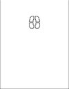
One question I had was the graphic used on the wrapper. What is that? So of course I had to have an answer - at least for myself. Upon closer examination I found that this is a motif which the art director seemed to like and thus used it more than once in the set dressing. The four-element pattern is used on the top of ration box wrapper. It is also the pattern used on the pressure doors of the bays and airlocks which seal the hallways to prevent atmosphere loss. There may be other reuses of this pattern so if you spot any, please let me know.
But why is this graphic used on both ration boxes and doors? My explanation, without any special insight to the show's creative process, is this is like a Chinese ideogram. As Earth's population grew and cultures intermingled certain universal concepts came to be represented by pictographs instead of words in just one language. So my translation of this symbol is “open here to unseal”.
When first presented with the ration, Crew member “Jasper Dades” comments that it must be a jewelry box containing an engagement ring. So with Saint Valentines Day (and Japan's White Day) approaching here is the pictograph you can print for your own gift “sealing paper”. In the attachment I have it displayed upside down.