rene007
Well-Known Member
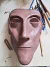
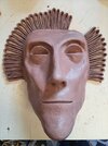
a better one?this here?
a better one?this here?
Many thanks rene007 look forward to seeing your mask.a better one?
The sepia color is not suitable for the 40/50 period, B&W is much better.a better one?
so better these ones?The sepia color is not suitable for the 40/50 period, B&W is much better.
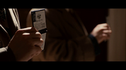
I changed the photograph on the credentials, because it's now more screen accurateHere this is one of my replica props
Here is my first attempt to make the US Deputy Marshal badge in Resin. Is really not perfect yet, but I think I could make it better.I changed the photograph on the credentials, because it's now more screen accurate
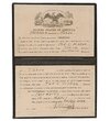
Not accurate, your photo is too small,on the screen used the photo covers the U of United, and the Cred is filled in freehand not with writing from the net.I changed the photograph on the credentials, because it's now more screen accurate
larger it will go over the UNot accurate, your photo is too small,
I used a script font, because my handwriting will not look wellNot accurate, your photo is too small,on the screen used the photo covers the U of United, and the Cred is filled in freehand not with writing from the net.
") .
.here comparedI used a script font, because my handwriting will not look well
The type of script font I used a similar one as it is on an original credentials sample.
I don't like it if the Picture covers the U but on these credentials it really is.
Unfortunately is that ID just 2 seconds visible in the movie and not really clear in what it shows.
Maybe I will change the photograph and handwriting script, or maybe not . . .
I will see.
This is your handwriting or a net fonthere compared
net fontThis is your handwriting or a net font

![20210506_181921[1].jpg](https://therpf-f28a.kxcdn.com/forums/data/attachments/1098/1098381-04123a0164834b4e5d5ce5597b61b02b.jpg)
![20210506_181915[1].jpg](https://therpf-f28a.kxcdn.com/forums/data/attachments/1098/1098383-bd2480b0971df5fa1d9b894fbf156d80.jpg)


![20210613_192020[1].jpg](https://therpf-f28a.kxcdn.com/forums/data/attachments/1109/1109522-0523f30c030aa6d2feda1ff4d1056b4f.jpg)
![20210613_192134[1].jpg](https://therpf-f28a.kxcdn.com/forums/data/attachments/1109/1109523-ded75aa0115eb8678008c83890121e21.jpg)
![20210613_192142[1].jpg](https://therpf-f28a.kxcdn.com/forums/data/attachments/1109/1109524-506ae97642ef3a7a1665c8b5bd5c7bde.jpg)
![20210626_201530[1].jpg](https://therpf-f28a.kxcdn.com/forums/data/attachments/1113/1113252-0abe507898923181291f583f824a6a6c.jpg)