Thank you to all for the various files.
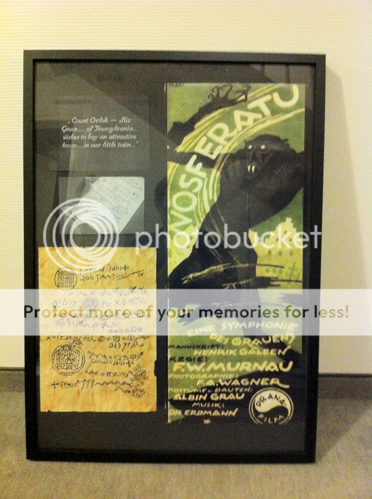
I used a similar layout to XMR1's on page 2 for my daughters secret Santa. The limit is supposed to be £20 but I think I went a little over, but not by much. The poster was ordered from overseas and the frame was a cheap one from HMV.
A more professional frame would have been better as the cheap frame would not take thick frame card stock. I had to use thin card. Also, I could not find any of suitable size so ended up joining together two smaller sheets. Hence the need to move the movie poster to the left hand side as I stuffed up the join and had to cover it up.
I would have preferred using thicker card stock for the movie stills, but in order to keep costs down I used what I had handy. I also miss judged the allowance for the frame so they are not perfectly central.
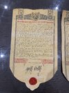
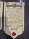
The letter was printed on parchment like paper then aged using tea bags. I damped down the edges then lightly tore to make it look more worn
I'm not 100% happy with it, but then I can see all the mistakes. I'm sure she'll be thrilled.
View attachment 851076