RatTU
New Member
This project began when I ruined a brand new Canson XL drawing pad by dropping a cup of coffee on it. Originally I was just going to use the ruined paper for some watercolors, but the more I looked at the final "distressed" product, the more I was reminded of the Evil Dead Necronomicon, thus... a project was born. It's a little bit of a hybrid of all of them - but obviously took the most influence from Evil Dead 2.
For anyone that might like to replicate the look, each page got sent through the following steps: Strong instant coffee bath, dripped and trailed with Oak Gall ink (lots of particulate matter in the ink gave it a "moldy" look), misted with Everclear (creates a marbled resist effect), sprinkled with salt (creates hot spots where color either resists or concentrates), dripped with dragon's blood ink (dragon's blood resin dissolved in denatured alcohol, a rust-orange color).

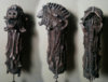
About here is where I decided to turn these into a Necronomicon. Just slightly too late to have NOT sliced each page into a too-small section, but that's fine (more on that later). My next step was to take the ruined backing board from the drawing pad, and cut it to cover size. I see a lot of people using clay, and some going so far as to sculpt and cast latex versions. I am not that fancy by any means, so I went with what I had on hand: Dollar Tree craft supplies.
I sketched out the iconic design, and laid down careful layers of hot glue, using the heated gun tip to do a small amount of sculpting as I went. That got a healthy coating of modpodge and packing tissue paper, and then painted. The tissue created a pretty decent amount of texture for drybrushing to do it's work on.

And here, of course, is where I got too big for my britches, and went ahead and sealed the cover without spot-testing my sealer. I won't show what happened, as it is pure gore. It was very bad, and I feel bad for what I did to this poor thing. So, I took a little break from the cover, and worked on some pages.

I used a combination of screenshots and Elderprops pages for reference, taking a lot of artistic license. I roughly sketch the artwork first with a watercolor pencil in brown. For the “red” tones I went with Daniel Smith extra fine Indian Red watercolor. It’s a very bloody, tone that mixes well with the stained paper to create a pretty screen-accurate color. To give shadows and the like where it was needed I used Grumbacher Academy Sepia Hue watercolor. These two are very smooth, clean, tones that "self shade" very well.
I've pretty much worked out how to bind it once all of the pages are finished, so now it's just the lengthy process of painting up all of the "known" pages. And a couple of easter eggs, of course. I'm clearly not going for 100% screen accurate, or taking it too seriously, but for a bunch of things from the craft bin... it's not lookin' too bad.
For anyone that might like to replicate the look, each page got sent through the following steps: Strong instant coffee bath, dripped and trailed with Oak Gall ink (lots of particulate matter in the ink gave it a "moldy" look), misted with Everclear (creates a marbled resist effect), sprinkled with salt (creates hot spots where color either resists or concentrates), dripped with dragon's blood ink (dragon's blood resin dissolved in denatured alcohol, a rust-orange color).
About here is where I decided to turn these into a Necronomicon. Just slightly too late to have NOT sliced each page into a too-small section, but that's fine (more on that later). My next step was to take the ruined backing board from the drawing pad, and cut it to cover size. I see a lot of people using clay, and some going so far as to sculpt and cast latex versions. I am not that fancy by any means, so I went with what I had on hand: Dollar Tree craft supplies.
I sketched out the iconic design, and laid down careful layers of hot glue, using the heated gun tip to do a small amount of sculpting as I went. That got a healthy coating of modpodge and packing tissue paper, and then painted. The tissue created a pretty decent amount of texture for drybrushing to do it's work on.
And here, of course, is where I got too big for my britches, and went ahead and sealed the cover without spot-testing my sealer. I won't show what happened, as it is pure gore. It was very bad, and I feel bad for what I did to this poor thing. So, I took a little break from the cover, and worked on some pages.
I used a combination of screenshots and Elderprops pages for reference, taking a lot of artistic license. I roughly sketch the artwork first with a watercolor pencil in brown. For the “red” tones I went with Daniel Smith extra fine Indian Red watercolor. It’s a very bloody, tone that mixes well with the stained paper to create a pretty screen-accurate color. To give shadows and the like where it was needed I used Grumbacher Academy Sepia Hue watercolor. These two are very smooth, clean, tones that "self shade" very well.
I've pretty much worked out how to bind it once all of the pages are finished, so now it's just the lengthy process of painting up all of the "known" pages. And a couple of easter eggs, of course. I'm clearly not going for 100% screen accurate, or taking it too seriously, but for a bunch of things from the craft bin... it's not lookin' too bad.