Moste Potente Potions

juno

Sr Member
I know there are some minor tweaks (the beast art needs some shading). However, I'm desperately seeking the two guys clip art (which is doctored, of course). I've made some aged paper to print it on, but I don't want to waste it till it's all done.
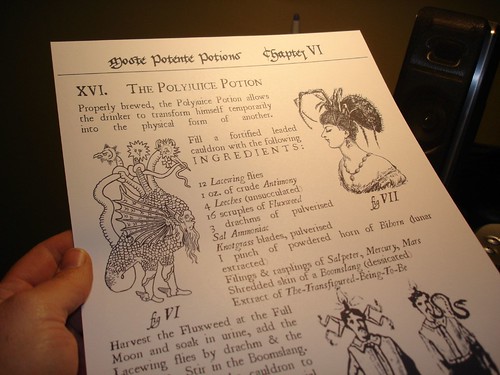
Here's mine:
115523562_5ac821bf9e.jpg


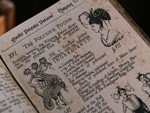
Here's the movie version:
115523586_95543f0443.jpg


Opinions welcome.
 
Very nice Tif. The lines on the original monster look a bit thicker than yours then again, you may just have to print it darker. Apart from that, can't really see anything else.
 
Fantastic job. :thumbsup

The only thing I noticed was the creature in fig. IV, it needs a shading line in the tail. You can see it in the screen capture. I hope this helps, keep up the great work.
 
Tif, how about Hermione's basilisk page? It's a key prop, and one I (and I'm certain) others would like to have, even down to the "pipes" in the lower corner. Maybe you could even make the two a "twofer" deal, not in price maybe, but as a packaged deal never the less.
 
I wrote it down as a potential prop, but I didn't do the caps of it -- I probably could do it. Got any pics?
 
aside from the shading that you already pointed out...the only things i can see are the "XVI." should be in italics and the word after "add" and below "Full" is "of" in the screengrab and "the" in your's...i don't think there's anything wrong with the two guys that you say your looking for...they look fine to me...damn nice work....skott
 
Well, there are some other typos -- like the screenshot of the original says "an another" in the first paragraph, and I have to make up all the copy in the bottom paragraph.

The men look very poor in my printout -- I guess you can't tell from the pic I took. They just aren't as crisp-n-clean as the spider woman and the beasty. Good catch on the XVI.
 
Excellent work, Juno (again).

Two little things;

1) The line beginning "1 pinch of powdered horn" I think you have used "I" (capital i) instead of 1.

2) The general line spacing has been much reduced on the original with lines almost touching each other top and bottom.

Aside from that there's just some general details in the beast already mentioned by the others.

Looking very nice.
 
Tell me Juno, where on the DVD did you find your screen grab? The top and bottom of the image you have shown is missing on my DVD. Do you have the fullscreen rather than the widescreen?

I'm looking at chapter 15. Is there a better shot later?

Thanks, Kevin :thumbsup
 
Is it really sad that I have both the Fullscreen and Widescreen editions?

I think that shot is from the Fullscreen.
 
Not sad at all.

Darn it, PM when these are ready for sale. :)

Beautiful work, by the way.

Matt


Originally posted by juno@Mar 21 2006, 07:00 PM
Is it really sad that I have both the Fullscreen and Widescreen editions?

I think that shot is from the Fullscreen.
[snapback]1210477[/snapback]​
 
Well....I'm honestly debating it. I can't make these as fast as the tickets -- I have to wait for the paper to dry.

Also, the paper is a wee bit wrinkly, which I can attribute to it being from an old book, but I don't want anyone to be expecting a perfectly flat piece of paper. Any ideas on how to make it PERFECTLY flat (as opposed to mostly flat)?

Once I build up my stores I'll post in the junkyard. I am offering them on eBay as a "free gift" with my Polyjuice bottles. My ID is juno10. But I would wait for the JY -- they'll be cheaper there.
 
This thread is more than 8 years old.

Your message may be considered spam for the following reasons:

  1. This thread hasn't been active in some time. A new post in this thread might not contribute constructively to this discussion after so long.
If you wish to reply despite these issues, check the box below before replying.
Be aware that malicious compliance may result in more severe penalties.
Back
Top