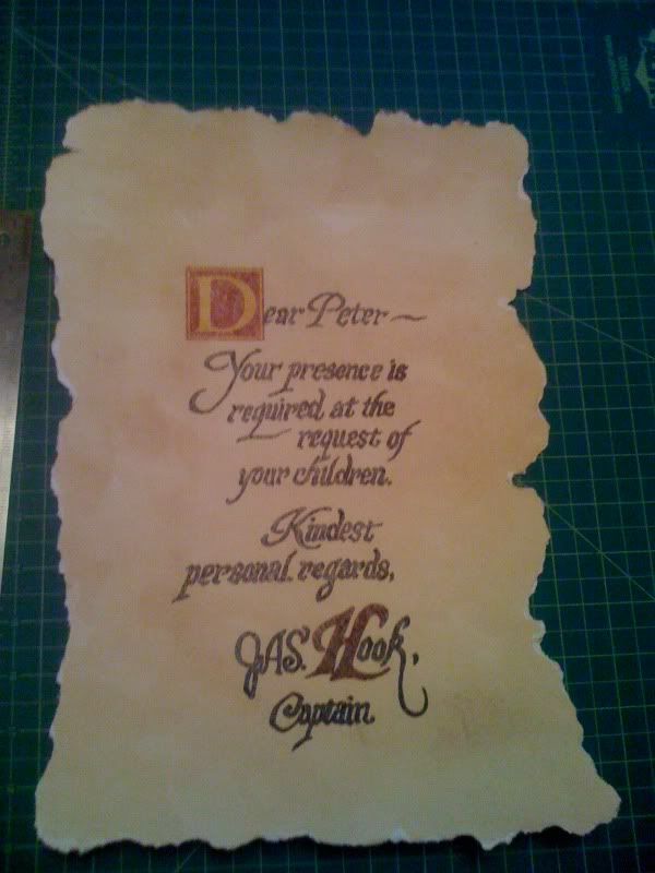
hook

Looks pretty good.

Would someone want to take a crack at adjusting letter spacing and word sizes? Maybe do an overlay of the original to see exactly where the words are, how big they are, and the thickness of them.

This does look good, but I know so many people on here are sticklers for complete accuracy.


View attachment 28490
 
Awesome work Orange_Blend! I do agree with Moviefreak though, some tweaking is needed. I went ahead and tweaked the spacing. I hope you don't mind.

hook.jpg


And here is an overlay comparison. Pretty spot on now!
hook2.jpg
 
Awesome work Orange_Blend! I do agree with Moviefreak though, some tweaking is needed. I went ahead and tweaked the spacing. I hope you don't mind.

hook.jpg


And here is an overlay comparison. Pretty spot on now!
hook2.jpg

AWESOME!! Yes, that was great work Orange_Blend... I meant no disrespect by critiquing it. I just knew that the sticklers out there would want it to be spot on.

Nice work in the adjustments CaptainEO!!
 
Looks pretty good.

Would someone want to take a crack at adjusting letter spacing and word sizes? Maybe do an overlay of the original to see exactly where the words are, how big they are, and the thickness of them.

This does look good, but I know so many people on here are sticklers for complete accuracy.


View attachment 28490
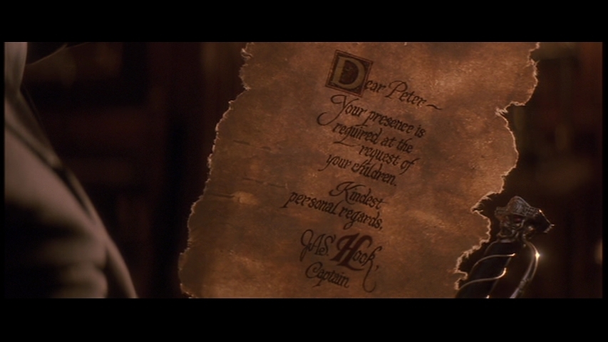
Actually the pic you used to overlay in your original post was another replica that wasn't even remotely accurate. I traced this from an adjusted screen grab as seen here:

Hook-hook-11964916-853-480.jpg


The spacing really comes down to how you correct the perspective from the screen grab. For instance here's an overlay of my original:
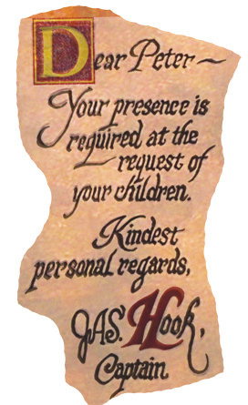
4763408842_746b08255f.jpg


Fits perfect. But if you adjust the perspective differently it'll look way off. Whatever floats your boat. :)
 
Actually, it looks like animal skin...the rough edges and the way it looks when the light shines through it hint at that. Could be a heavy linen rag though.
 
Actually the pic you used to overlay in your original post was another replica that wasn't even remotely accurate. I traced this from an adjusted screen grab as seen here:

Hook-hook-11964916-853-480.jpg


The spacing really comes down to how you correct the perspective from the screen grab. For instance here's an overlay of my original:

4763408842_746b08255f.jpg


Fits perfect. But if you adjust the perspective differently it'll look way off. Whatever floats your boat. :)

Great job. I meant no offense by it :thumbsup
 
Great job. I meant no offense by it :thumbsup

No offense taken. Just explaining why it looked so incredibly off in your overlay.

So what size of paper are we thinking is correct? It looks fairly large and thick, like canvas.

I'm with tk5378, looks like parchment to me.
 
So what size of paper are we thinking is correct?

Judging from the wide shots in the Phil Collins scene I'd say about 11x15. My original image is more than big enough to go that size and still look clear.

I wish I could find a dagger close to the original so i can display it on the wall.

That would be awesome. IIRC there was a thread looking for that dagger a while back with no success...
 
Here a picture of a note in a planet hollywood... near the niagara falls.

I don't know why the D of Dear is not in red...


431365880ynwirtph.jpg

even the torn edges arte not screen accurate. Maybe it is a replica that they figure no one will really question??
 
here is mine that i made last week, i made the letters a little to big, im planing on doing a run in a few weeks pending interest of the hook dagger with ransom letter. this was my first attempt my 2nd will have the letters scaled down even more accruate.
Sean

003.jpg
 
Last edited:
Good Job ! How did you teinted the paper?
I found a better picture of the planet hollywood note.
It's certainly a prototype for the final note typographic researches or something like that.


noteh.jpg
 
Last edited:
Good Job ! How did you teinted the paper?

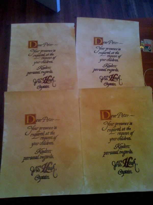
i filled up my guest bath tub with 40 tea bags and let it soak over night. it turned it from bleach white to a light light brown, then i brushed it with a more concentrated tea and applied 10 coats of tea stamped... heres another picture, i made 4 copies, im not satisified with how it turned out so i only finished 1, i will remake them all from scratch in a few weeks for a more accurate version

001.jpg
 
This thread is more than 3 years old.

Your message may be considered spam for the following reasons:

  1. This thread hasn't been active in some time. A new post in this thread might not contribute constructively to this discussion after so long.
If you wish to reply despite these issues, check the box below before replying.
Be aware that malicious compliance may result in more severe penalties.
Back
Top