thefirstavenger
New Member
look fantastic! love it. would u mind emailing me a pdf if i dm u an address?
Awesome work Orange_Blend! I do agree with Moviefreak though, some tweaking is needed. I went ahead and tweaked the spacing. I hope you don't mind.

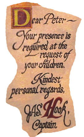
And here is an overlay comparison. Pretty spot on now!

Looks pretty good.
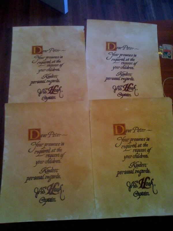
Would someone want to take a crack at adjusting letter spacing and word sizes? Maybe do an overlay of the original to see exactly where the words are, how big they are, and the thickness of them.
This does look good, but I know so many people on here are sticklers for complete accuracy.
View attachment 28490
")
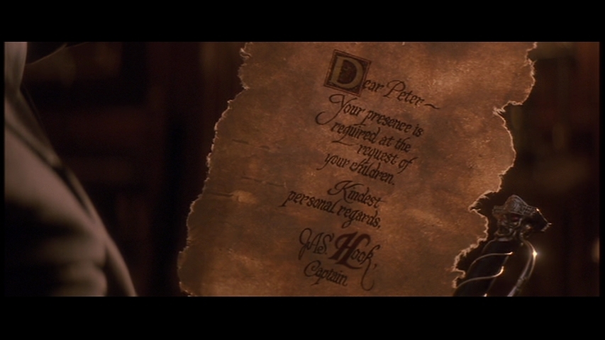
Actually the pic you used to overlay in your original post was another replica that wasn't even remotely accurate. I traced this from an adjusted screen grab as seen here:
The spacing really comes down to how you correct the perspective from the screen grab. For instance here's an overlay of my original:
Fits perfect. But if you adjust the perspective differently it'll look way off. Whatever floats your boat.
Great job. I meant no offense by it :thumbsup
So what size of paper are we thinking is correct? It looks fairly large and thick, like canvas.
So what size of paper are we thinking is correct?
I wish I could find a dagger close to the original so i can display it on the wall.
I wish I could find a dagger close to the original so i can display it on the wall.
Here a picture of a note in a planet hollywood... near the niagara falls.
I don't know why the D of Dear is not in red...

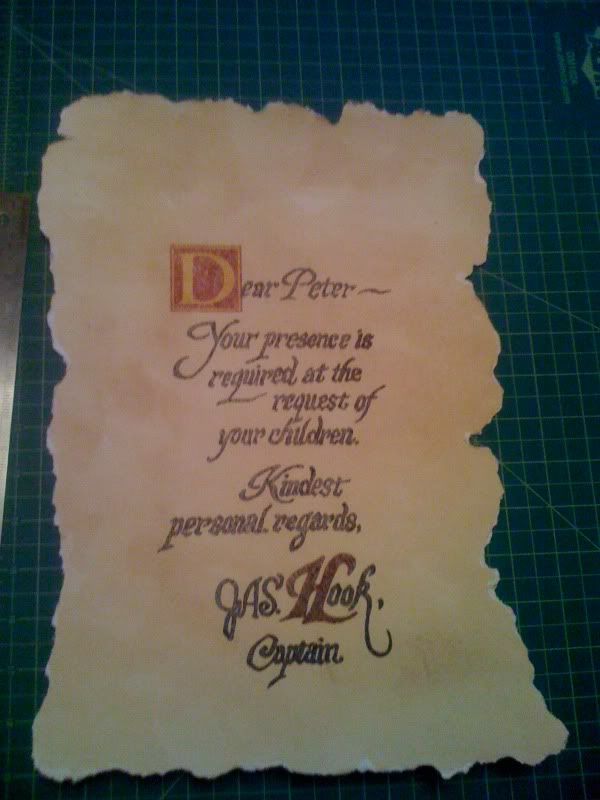
Good Job ! How did you teinted the paper?