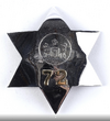
My inclination is that these are two different props based on the apparent difference in separation between seal and number. But regardless, I do agree that the seal is raised in both, and that there is a border around the seal and the ribbon. So, I'm thinking to strike a balance between the two pics/props as follows:
1- raise the seal and add a border to it as per the new, clearer pic above. I think maybe make the overall seal just a little bit bigger but keep some separation from the number and ribbon.
2- add the border to the ribbon as per the new clearer pic. My guess is the letters will need to shrink a little to preserve the overall size of the ribbon and spacing.
3-it looks to me from the new pic that the star has a more discernible curvature than I have my print. The existing design has some curve but I think it may need a bit more.
4- The font of the letters in the new clearer pic appears to be Arial or something like it. In the print, the font is more of a Times New Roman. I actually think the font in the original screencap look like TNR (note the D and also the drops of the edges on the Ts).

However, since the first pic is so blurry and pretty hard to make out definitively, I’m going to change the font to match the new screencap.
1- raise the seal and add a border to it as per the new, clearer pic above. I think maybe make the overall seal just a little bit bigger but keep some separation from the number and ribbon.
2- add the border to the ribbon as per the new clearer pic. My guess is the letters will need to shrink a little to preserve the overall size of the ribbon and spacing.
3-it looks to me from the new pic that the star has a more discernible curvature than I have my print. The existing design has some curve but I think it may need a bit more.
4- The font of the letters in the new clearer pic appears to be Arial or something like it. In the print, the font is more of a Times New Roman. I actually think the font in the original screencap look like TNR (note the D and also the drops of the edges on the Ts).
However, since the first pic is so blurry and pretty hard to make out definitively, I’m going to change the font to match the new screencap.
")