Defined Green Lantern Comic Rings

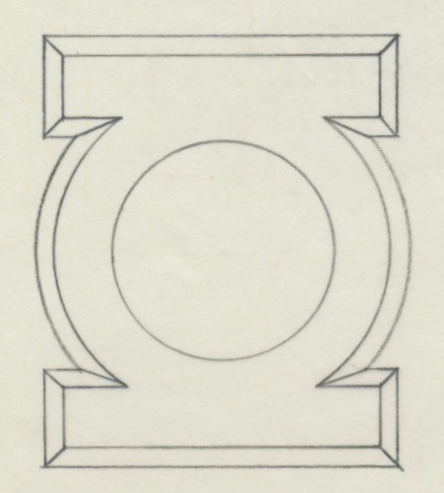
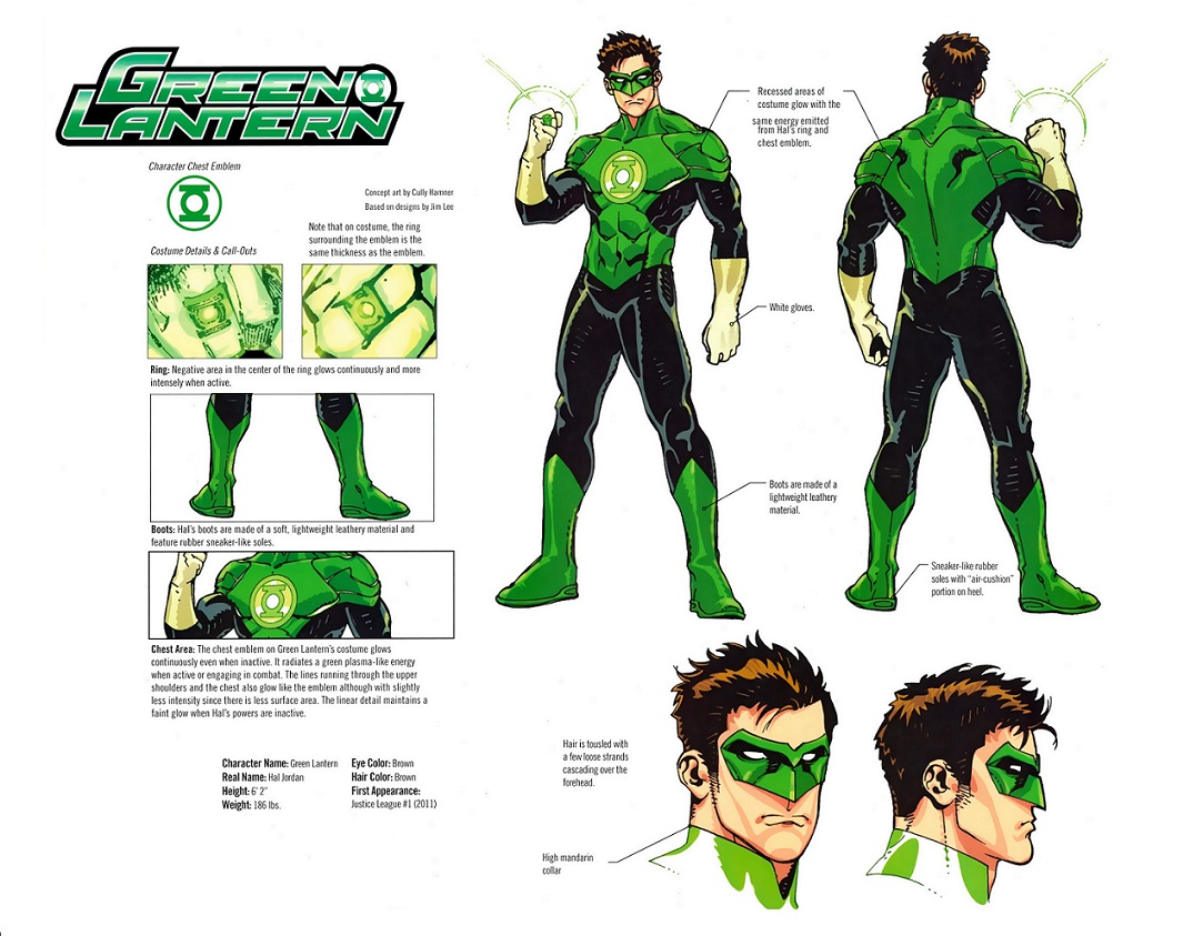
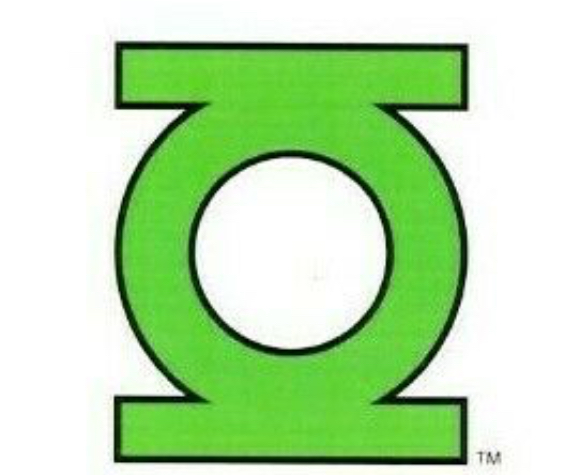
Received more trade paperbacks in the mail, including Geoff Johns’ New 52 run. Among the bonus materials are the New 52 Hal Jordan model sheet, drawn by Cully Hamner, based on designs by Jim Lee. And here we see the new official GL symbol, which is essentially a return to the classic/licensing design, but with longer (and once again straight- edged) sidebars that now horizontally extend some distance past the outer edge of the central ring section. This is essentially the same look as the aforementioned symbol added to the GREEN LANTERN logos for the New 52 relaunch books.


1E31F241-8269-42F4-BC96-B0F8945141B4.jpeg


So, in terms of official/licensing symbols stretching across the decades, we have...


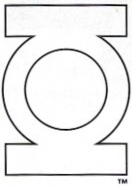
DC Style Guide (1982, by far the most-used and prominent version):

B692A844-EE6E-46DC-B739-DB9F57FE17CE.jpeg


Late 1980s-1990s alternate licensing symbol:

7E8621BE-873F-4ED0-ABC2-E8FCBAE417FE.jpeg


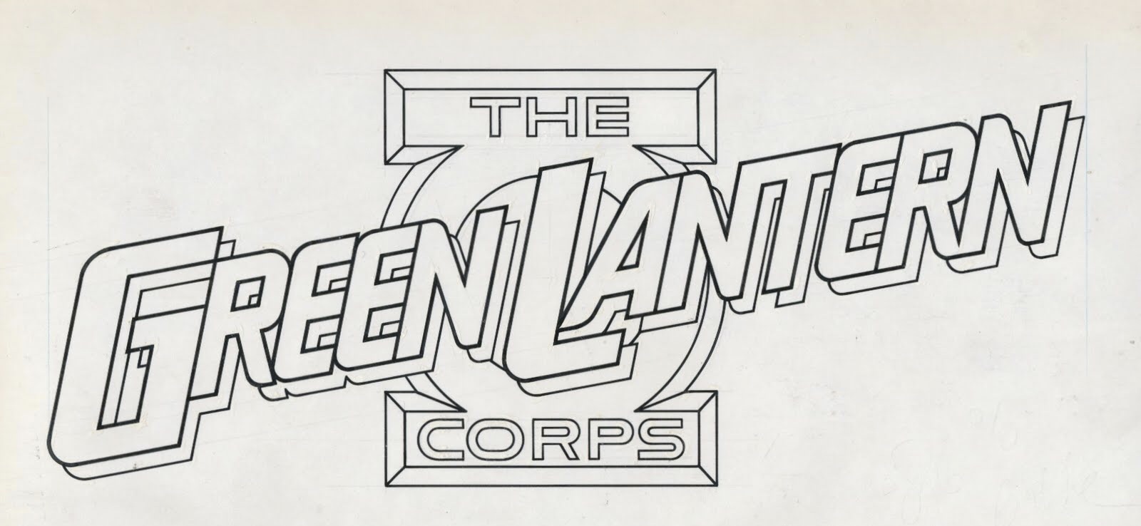
GREEN LANTERN CORPS cover logo version (1986):

903A068D-2DF2-43B0-9778-F183A19B5DA4.jpeg


88C29C46-677B-4164-B826-FD123BF769D4.jpeg


There’s also this version, which appears to have been specifically created for the short-lived GREEN LANTERN CORPS QUARTERLY (1992):

A991FCA6-06AE-4928-B9A0-9EA427AA118F.jpeg


REBIRTH redesign (2004):

B43B3ACC-1958-4D68-9734-BF5C487232BD.jpeg


BLACKEST NIGHT redesign (2009):

F72A699A-DC10-457B-BD41-DD076E987C05.jpeg


New 52 redesign (2011):

C93147C0-30D9-490A-8A09-BFEF6BC14C3E.jpeg


...and the more robust New 52 cover logo variation, with thicker sidebars and central ring (definitely not the same artwork as the model sheet symbol):

6F28CF1C-8258-4D89-BD0E-E4032641E76E.jpeg
 
Last edited:
Working on a subtle change to the REBIRTH ring. On the previous iterations, the sides of the upper band curved up and inward, toward the symbol-disc. However, on many real-world signet rings (as well as the BLACKEST NIGHT PVC promo rings), that curve flares out slightly, and transitions into a flatter, steeper angle, which creates a wider “crown”/platform for the face of the ring (or, in this case, the symbol-disc).

On the left is the previous iteration. On the right is the new version. You can see the new construction lines showing the transition, which subtly changes the shape of the upper band. This revision also allows for a bigger symbol-disc.

63D9AF26-5547-4595-ADAD-5CDF71A33281.png


And here are some STL shots, which give a better idea of what the design looks like without the construction lines.

B95ACAE0-E037-4A8D-BDC5-3CF0CFE91AF7.png
4EE323C3-4D31-46AD-9242-579E8FF72ECC.png
1588BDFC-D89B-42E4-A881-D249705A495F.png
C167B671-A4F5-4AAC-A261-EBA3209DCD75.png
 
Last edited:
More tweaking. I’ve come back to the V1 and applied the REBIRTH flairing trick to the top of the band as an experiment. This version is a sort of Alex Ross-ish/idealized Gil Kane. Looks kind of similar to the DC Direct Planet Krypton/Hal Jordan mini-bust licensed replica.


01AD7BF1-08DE-4745-849E-40ED670C580C.png
8DF1E5B3-D7D6-437D-ACC1-5901B5E3B314.png
B4E8D994-CA3E-434E-8280-533C4E5C2C9D.png
CDC25E27-0BC7-4161-941D-E50589B7CF2A.png
 
Continuing my obsessive quest to perfect the V1, we have (from left to right)...


1. 25mm symbol-disc, but with a thicker and more robust band than previous versions, which peeks out from behind the disc in top view.

2. Alex Ross-style (curved upper band variant) with a 23mm disc, and the bottom of the disc snuggly fitted to the top of the band (yet with a clear separation line between them).

3. Sleeker, smaller variation of the above, with a defined/separate (21mm) symbol-disc atop the band, allowing the disc to slightly overhang the band.

4. Same as the previous one, but with a 23mm disc.

5. Same as above, but with a 24mm disc.


A551B4A2-0355-4AC1-81EB-E7CF6E5FA778.png
411BBE08-9D96-4698-ADB5-B6EB38B0D714.png
404A6F48-4FE2-44E8-BC0B-0CBC9EDDAE09.png
 
More V1 band experiments. Trying to match the look that Kane went with a number of times, where the band is essentially parallel, then flares out near the top (about 3/4 up) and attaches to the bottom of the symbol-disc. Most designs I’ve made feature a more organic look, with the band curving pretty much down its entire length.

The results are encouraging, particularly the design on the right. The band/shank is very skinny and parallel, for the most part (only 6mm wide at the bottom), then flares out at the top.

4E24E2A8-87B3-42D5-8968-A2736155E5C3.png
4556B927-A25A-4A0F-B198-8B0EBAF41F7D.png
3EA436E3-553E-4F6C-9B64-A1E7D6546D58.png
7EABA663-04F3-4164-92D5-EED152BA847C.png
C668019C-CB33-4494-B279-4484E7D3BDEC.jpeg
D1D64313-62BB-4E1A-902A-5F77598AAC9C.jpeg
01B06B5C-4740-4229-B88B-0D65BD24A13E.jpeg
E17167A9-03EE-4534-AE52-EFF8D478E39A.jpeg
6A5B797A-D573-4288-98A8-9FFBCF66C637.jpeg


As I’ve noted, the inherent problem in all this is figuring out the relationship between the band and the disc, and how they connect. Whether or not the disc overhangs the band, sits flush, or is smaller than the outer diameter of the top of the band. There’s a lot of variance in Kane’s work, and others who followed his work (Neal Adams, Alex Ross, etc.) clearly had a variety of ideas about it.

And, as I’ve noted, sticking instead with the straight-band V1 (which is arguably the more prominent version of the design) would be a very easy way to sidestep all of this. The only real concern there would be whether to not the symbol disc should sit low enough to intersect the band’s finger-hole or not.
 
Last edited:
STL files of the current revisions. I’m very pleased. The trick all along has been making the designs smaller, sleeker, and more streamlined. Looking back at those early test prints from last year, and it’s almost shocking to see how big and clunky they are.

1E407721-4D41-454F-9EDA-968CD5841696.png
75D3C8C7-85D8-4020-A15E-A4D0C82CD70E.png
 
Continuing to play with the V1. I sometimes wonder if anyone even finds all of this obsessive tweaking interesting, yet I keep logging it here out of habit (...and so I can go back and review my progress).


I have an Alex Ross-style (curved upper band) pretty much locked down:

E07C1E61-7CE9-4504-9B38-49B4D4658D06.png


And I’m playing with variations on the Gil Kane-style band’s surface thickness (which causes changes in the band’s overall width and curvature).

Here are the 24mm symbol-disc’s band variants...

2A17E59F-F1AF-4EF6-9F1F-882521886A84.png


...and some 23mms...

8A6C294B-B440-4FF0-84DD-B37F3797ED13.png


...and the usual 25mm.

BDE27DD1-1A0E-41B6-BA7A-F6DE806D65CC.png
EC184F88-A094-4724-ACD3-05A15DBB26F4.png


And here’s a group shot (23, 24, and 25mm, from left to right). The 23mm is closest to the Ross look (which, as noted, I’ve devoted a separate design to), while 25mm is more in line with Kane.

82A0912A-7F68-47EB-95C6-8CB9257CBFD6.png


I’ve been putzing around for months trying to find a proper balance between wildly divergent comic book art, real-world practicality, and my own sense of aesthetics. Kane usually—but not always—drew a BIG symbol-disc, with no sign of the band in top views. Having a large-diameter disc which totally eclipses the sides of the band in top view has been a goal of mine, but, in the final analysis, it may not really be practical or aesthetically-pleasing. Heck, it may not even be what Kane was going for, since much of comic book art boils down to artistic shorthand/shortcuts, rather than accurate depictions of real objects. Kane may simply have not usually bothered to show the band on either side of the disc when drawing the ring in top view.

Same with the version with the thin band that flares out at the top and connects to the disc. It looks fine on the printed page, but kinda...dinky in reality. Whereas the more proper signet ring band that smoothly curves all the way down is sleek, elegant, and gives the design some visual balance. As noted, Kane’s drawings of the band varied considerably, so there’s definitely wiggle-room.

And, speaking of visual balance, I tend to think that some combination of the curvier band and the smaller disc may be the most balanced, overall. Something akin to the third design in the second image posted above feels right, with a smaller disc and a band that’s not TOO thin or TOO thick.

Fact of the matter is that there’s no real “definitive” V1 design, considering all the variations it had during Kane’s run. To say nothing of the Neal Adams variants, among others. I think it could be argued that the Adams or Alex Ross versions perhaps represent the refined, definitive versions of Kane’s design (the Ross versions are particularly sleek and elegant), but my goal here is to honor Kane while also translating his work into a 3-D object. An object which looks elegant and functional rather than a literal real-world translation that ends up looking cartoonish and disproportionate. That’s why I’ve spent so much time trying to suss out what he was going for, and looking at his disparate drawings and trying to find just the right compromise and the right balance.

It should also be noted that the Kane, Ross, and Van Sciver/REBIRTH designs all come within hailing distance of being essentially the SAME design, at times. But for certain key elements, like the disc diameter/height and the band shape, they’re all in the same ballpark. A number of the Ross variants I’ve made could easily pass for Van Sciver’s, and so on. So, the goal is to retain the flavor of each design by homing in on certain traits which keep them distinctly separate from each other. Distinct, yet stylistically connected.
 
Last edited:
I'm a lurker but I love reading through your posts and seeing your progress. And I'd definitely purchase these rings once you "perfect" them, if you ever decide to.
 
I'm a lurker but I love reading through your posts and seeing your progress. And I'd definitely purchase these rings once you "perfect" them, if you ever decide to.

As previously noted, I have no intent to sell replicas, out of respect for copyright. If and when the designs are “perfect” (and they will be, sooner rather than later), then I’ll look into manufacturing them privately, for myself.

However, the raw data presented in this thread should be more than enough for anyone to go off and design their own rings. A year ago, I’d never done any 3D modeling, so even a novice can pull something like this off.
 
Narrowing down the variants. I should be ordering more test prints, soon.

From left to right...

1. 23mm disc, relatively thick/wide band.

2. 24mm disc, with thinner band.

3. 25mm disc, with more of a Kane-style, straight-then-flaired-at-top band. Interestingly, this one has a band that’s not visible behind the disc in top view.

4. 25mm disc with the band from # 1.

5. 26mm disc with wider band.


Any popularity votes?

6ED205AE-58A9-4BC0-BB32-AB2BEBF29ECE.png
F46F6A3B-F03E-4815-95F3-F193D487B6F1.png
1D48D629-6DE5-45C7-B86C-2DD6595918CF.png
D2809FB3-4712-4A76-A430-BE35B3A32389.png
 
...I think I may have FINALLY cracked the code on the EMERALD DAWN ring. After almost a year of obsessive fixation on this particular problem.


I was pleased with the most recent iteration of the design, but for two nagging problems:


1. The overall width (front view) of the band, necessary to get the band to properly blend into the symbol-disc, resulted in the band being a little too wide to be comfy, and it looked a little disproportionate with the disc in top view.

2. Getting the transition from band to disc to be as seamless as possible. Due to the different curvatures/geometries involved, I tended to end up with more of an uneven transition than a nice horizontal join-line at the point where they meet.


Well, I think I may have finally cracked the code on solving both problems.


Old on left, new on right.

F02D545E-D751-48F0-B7E0-BEB7DBA51E71.png
EBF73922-4975-468A-8ED6-FB05AD4664CB.png


Here’s what I’m talking about with the transition from band to disc. On the old model (left), you can see how the band arcs up at the transition point, and how the chamfered lower edge of the disc protrudes from that arc in a very clunky way. On the new model (right), it’s a nice, horizontal blend, with the chamfered edge of the disc separating from the outer edges of the band as the geometries of the two parts naturally shift away from each other.

1D08A327-30BA-41FA-83EA-992E860AF5E4.png


I also applied these changes to the Gardner ring.

9AAD70F6-F764-4D4C-AD69-8E7C7840E249.png


And here are the STL files, to show what they look like without the distracting construction lines.

01621851-9ACA-4E55-9B12-45E6FA5863A2.png
102F2285-C258-4491-9637-91069DCF9654.png
 
...and now that I’ve figured out the trick for getting the band and disc to mesh properly, I’m refining the shapes so that the band is more properly rounded in front view...but without being too wide on the sides to fit comfortably.

Even with just some minor tweaks, you can see how much more rounded and less squared off the band is where it meets the disc.

5C5CBE61-EABF-40F2-8ECD-80E9E4369549.png


Getting better. This revision features a taller and rounder symbol-disc, along with the curvier band.

7C67DAFE-72E7-4171-8DDC-635A7F456ECA.png
9C84A578-835E-4BFD-BCF7-5CE0F24377CD.png
727AE0D6-6DA3-4D1D-8166-720D543873CA.png
 
Well, I took the plunge, and ordered test prints of the current revisions of the Abin Sur, V1 (straight band, 24mm, 25mm, 26mm, and Alex Ross), V2, V3, EMERALD DAWN, Gardner, and REBIRTH. Should be pretty spot-on, I think. We’ll see. Some of these designs need very little more—if any—tinkering. Just nitty-gritty decisions which need to be made, like whether to keep the subtly tapered telescoping sidebars on the V3, or to make them parallel as they travel down to the bottom of the band. Stuff like that.
 
Thanks!

Here are the revised STLs that are currently being printed, with the exceptions of the two on the far right—the modern/BLACKEST NIGHT symbol-era ring (I’m printing the REBIRTH version that’s next to it, instead) and the Sinestro Corps ring (since the REBIRTH ring is identical, aside from the symbol, it therefore would be a waste of money and resources to print both until the band design is locked down).

You can see the numerous V1 variants with the different disc and band sizes in-between the Alex Ross (next to the V2) and the Abin Sur (far left). You can also see how similar the Alex Ross and the modern/REBIRTH/BLACKEST NIGHT designs are. I took pains to distinguish them by giving the Ross a larger disc, and thicker band, and also a distinct separation line between the disc and the band, all of which are in-sync with the source material.


37966CA9-BE61-4A83-9582-B6CE1E03AD81.png
10D3B8CE-DB46-4ED9-9500-7B70BF195FB6.png
4B3021F1-1C2D-422D-B6DE-644505B75C82.png
790A861D-FBC9-42B0-8C70-6598F69E4D12.png
71A9088C-595E-45C8-9895-901F577E022A.png
9CD28E80-83CC-46D3-8275-54C5DE51DBEC.png
 
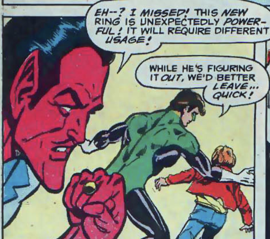
GREEN LANTERN Vol. 2 # 7 introduced the character who would become Hal Jordan’s arch-foe, Sinestro, the renegade Green Lantern. Due to his abuse of power, Sinestro of Korugar, the Green Lantern of space sector 1417, was stripped of his title and his power ring by the Guardians and banished to the antimatter universe of Qward. In his first appearance, he was unarmed, but, the next time he showed up (GREEN LANTERN Vol. 2 # 9), he was armed with a yellow power ring, an evil duplicate of a Green Lantern ring which was constructed for him by the Weaponers of Qward. Unlike a Green Lantern ring, which was ineffective on the color yellow, Sinestro’s yellow ring had no weaknesses, and was charged by siphoning energy from real Green Lantern rings.

In its first appearance, Sinestro’s yellow ring, drawn by Gil Kane, was simply a yellow version of the standard Green Lantern ring (complete with GL symbol), although the band appeared tapered (whereas GL’s ring was usually drawn with a straight band during this era). Hal Jordan managed to defeat Sinestro by transmitting more of Jordan’s own green energy into Sinestro’s yellow ring than it could handle, shattering it.

38009BCA-AF72-4217-94F3-5E7BBC086816.jpeg
B45BC822-6898-4D86-AC29-2F3526C23261.jpeg


Sinestro managed to escape from the prison Jordan constructed for him by using a spare yellow power ring he kept hidden in his boot (GREEN LANTERN Vol. 2 # 11). This time, the ring was drawn as a rather generic design, with a disc and a straight band, but no Green Lantern symbol.

919FAF8B-A2F4-4EB4-90E3-A27522698723.jpeg
1518D8D4-7F23-4A21-972A-24A606211102.jpeg


Jordan again defeated Sinestro, who would continue to escape and then be recaptured several times thereafter (GREEN LANTERN Vol. 2 # 15, 18). Jordan presumably confiscated Sinestro’s ring after each of these defeats, but Sinestro would once again be armed with it each time he reappeared. Whether these were all the same ring or identical duplicates is not clear, but the same generic design remained.


2ACDB3F1-E5DC-4005-8F98-45B0D8A91378.jpeg
8ADC189F-378E-4E8C-9249-24D0AD0325E7.jpeg


In one appearance, Sinestro actually stole the central Green Lantern power battery from Oa and used it to create a small army of evil Green Lanterns to attack Hal Jordan and Alan Scott, and personally attacked them with both his own yellow ring and one of the “evil” Green Lantern rings he’d made (GREEN LANTERN Vol. 2 # 52).

1C2E3627-10FC-43B9-BD19-3A3F1FF28E7B.jpeg


Sinestro would later escape from captivity yet again, and would force the transformation of Carol Ferris—Jordan’s former employer and love interest—into the evil Star Sapphire in yet another attempt to kill Jordan. However, Sapphire ended up turning against Sinestro and battling him. Feigning surrender, Sinestro handed his ring over to Jordan only to then teleport both it and himself away from the scene of the battle (GREEN LANTERN Vol. 2 # 74).


3AF9C8F5-DC7D-4F5A-A84A-34C96FECAA9F.jpeg
67558A1C-B164-47BF-A757-7DE6B21FC46D.jpeg
DD8C499D-8AA0-4E44-84B3-E1967053C823.jpeg


Soon after, Sinestro would ally himself with the Witch Queen in an attempt to banish Jordan to another dimension. He combined his yellow ring with the Witch Queen’s sceptre to accomplish this, but was again defeated. By this time, Neal Adams had taken over from Gil Kane as artist, and drew Sinestro’s ring with a round gem in a small setting.

A3284B47-FADB-4249-8B37-C12D51A9DD47.jpeg


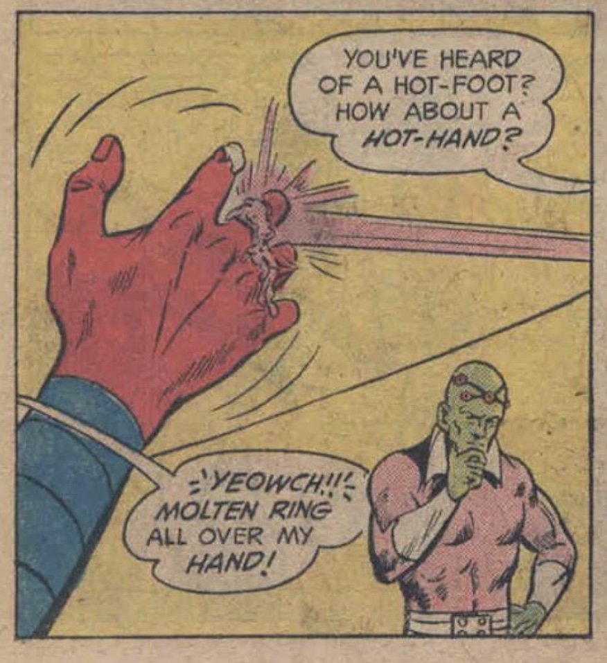
After escaping captivity once again, and working with the Weather Wizard to battle Green Lantern and the Flash (FLASH # 222), Sinestro, along with several other villains, was recruited by the Queen Bee to form an “Anti-Justice League”. However, his power ring ended up being melted by Superman’s heat vision. Immediately after that, he hired two alien assassins to kill Hal Jordan, but it is unclear whether or not he had yet replaced his own power ring (ACTION COMICS # 443-444).
F761D190-FE02-441A-88A4-D16338403BD8.jpeg


Armed with a new ring, Sinestro returned to battle Jordan in space before luring him into a trap. Escaping from Jordan and Green Arrow, Sinestro then used a strange phenomenon called the Silver Twist to transport three three of them to a medieval-like world. Jordan captured him and confiscated his ring, but Sinestro subsequently made use of yet another duplicate yellow ring hidden in his belt (GREEN LANTERN/GREEN ARROW # 91-92). Mike Grell, the artist at this time, drew Sinestro’s ring as more of a traditional signet ring with a round gem on the face, similar to Adams’ version.

899F36FB-4F57-455F-8C3B-3967AAB0A76F.jpeg
BBD59447-01D9-409D-985D-ACE4F10F30E1.jpeg
E4D0671F-9E9A-4060-8989-E137022BDC59.jpeg


Soon after, Sinestro joined the Secret Society of Super-Villains. As initially drawn by Pablo Marcos, his yellow ring included the Green Lantern symbol, but he (and subsequent artists Rich Buckler and Arvelle Jones) would soon continue drawing the same generic ring that Kane usually had (SECRET SOCIETY OF SUPER- VILLAINS # 1-5, 10, DC SPECIAL SERIES # 6).

60E5E4FF-8D47-44FA-9156-2FBB0FA05E77.jpeg

44B0467B-DE23-4A35-8C7F-4D5892603F0D.jpeg
A7BB57DE-252A-4137-BE73-70E6292175BD.jpeg


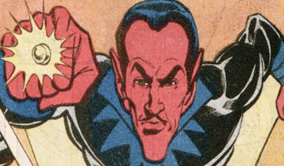
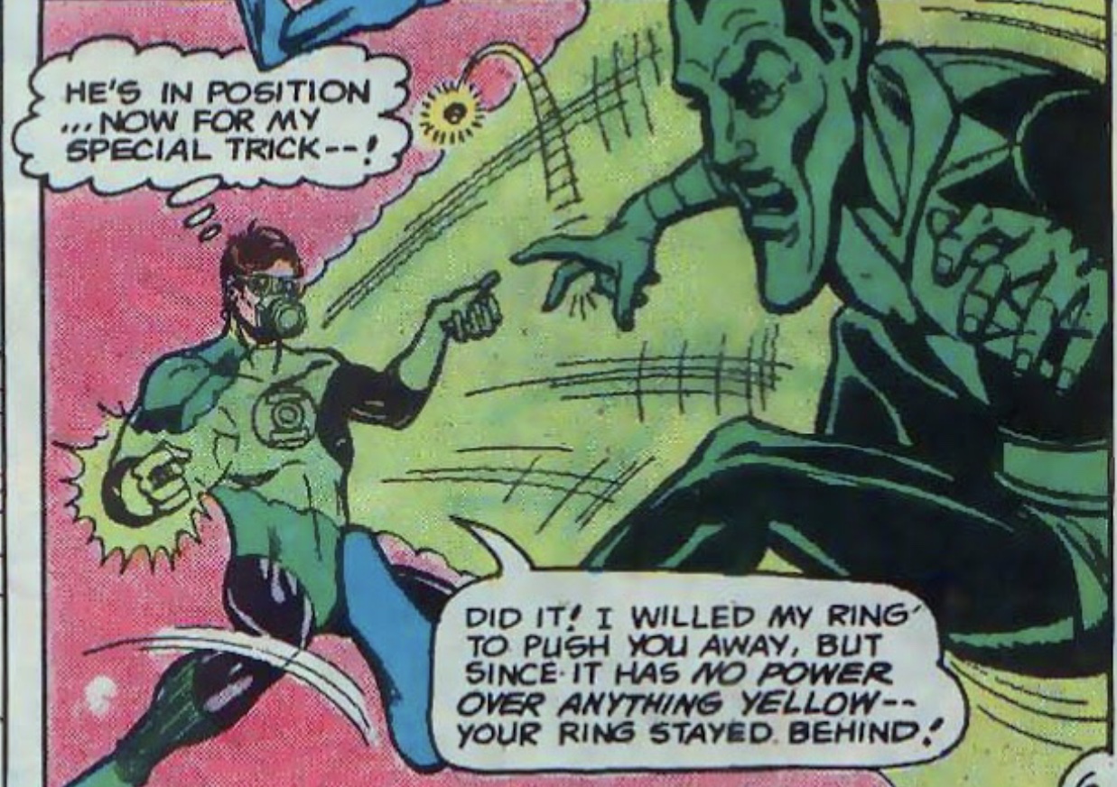
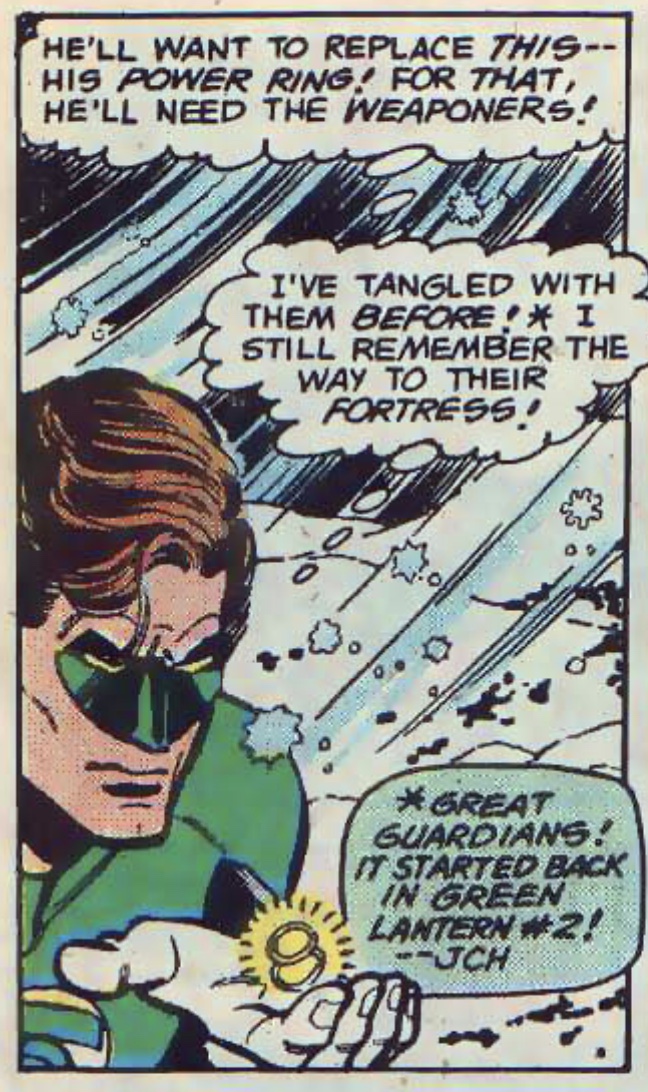
After being sent back to Qward during a battle with Superman and Batman (WORLD’S FINEST COMICS # 254), Sinestro dragged the injured Guy Gardner out of the Phantom Zone and into Qward in order to lure Hal Jordan into a trap. Jordan rescued Gardner, and Jordan and Sinestro pursued each other to Earth, Korugar, back to Earth, and again to Qward. Before Sinestro escaped to Qward, Jordan managed to deprive him of his ring. Sinestro then had the Weaponers create a new and more powerful ring for him. As drawn by Joe Staton, both rings in this story used the same generic design (GREEN LANTERN Vol. 2 # 123-125, 127).
8DD50AB6-4B32-4B26-8B0F-978BE707C679.jpeg
A12332C2-B82D-491B-8D67-17124FCDBE0F.jpeg
A66287F2-40EF-4A81-AF69-982818387987.jpeg
05DD6310-A71A-461F-93F2-2B31817A430F.jpeg


After impersonating a Guardian (THE BRAVE AND THE BOLD # 173-174), Sinestro was again captured. However, by the time of the Crisis on Infinite Earths, he had again escaped, and was again armed with his yellow ring (CRISIS ON INFINITE EARTHS # 5, 9-10, GREEN LANTERN Vol. 2 # 197-198). As drawn by George Perez in CRISIS, his ring had a GL symbol, while over in GREEN LANTERN, Joe Staton drew the generic design.

B5361945-BFEB-40AC-8928-B927312B4FA2.jpeg
FA2A3F25-A3C9-4AA1-99CD-9EDEACE82658.jpeg


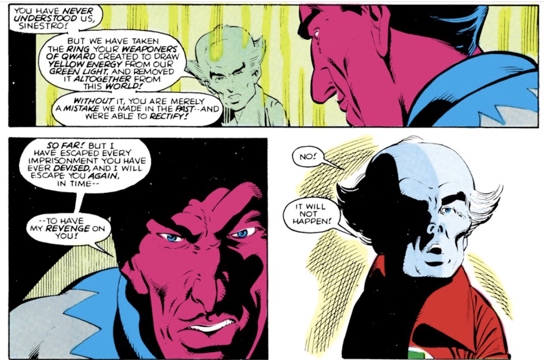
His latest attempt to gain revenge on the Guardians and the Green Lantern Corps was thwarted, and Sinestro was captured by the Guardians and held in a Sciencell on Oa. His ring was once again confiscated.
C469254C-9228-4B30-A447-B3F9704A6A64.jpeg


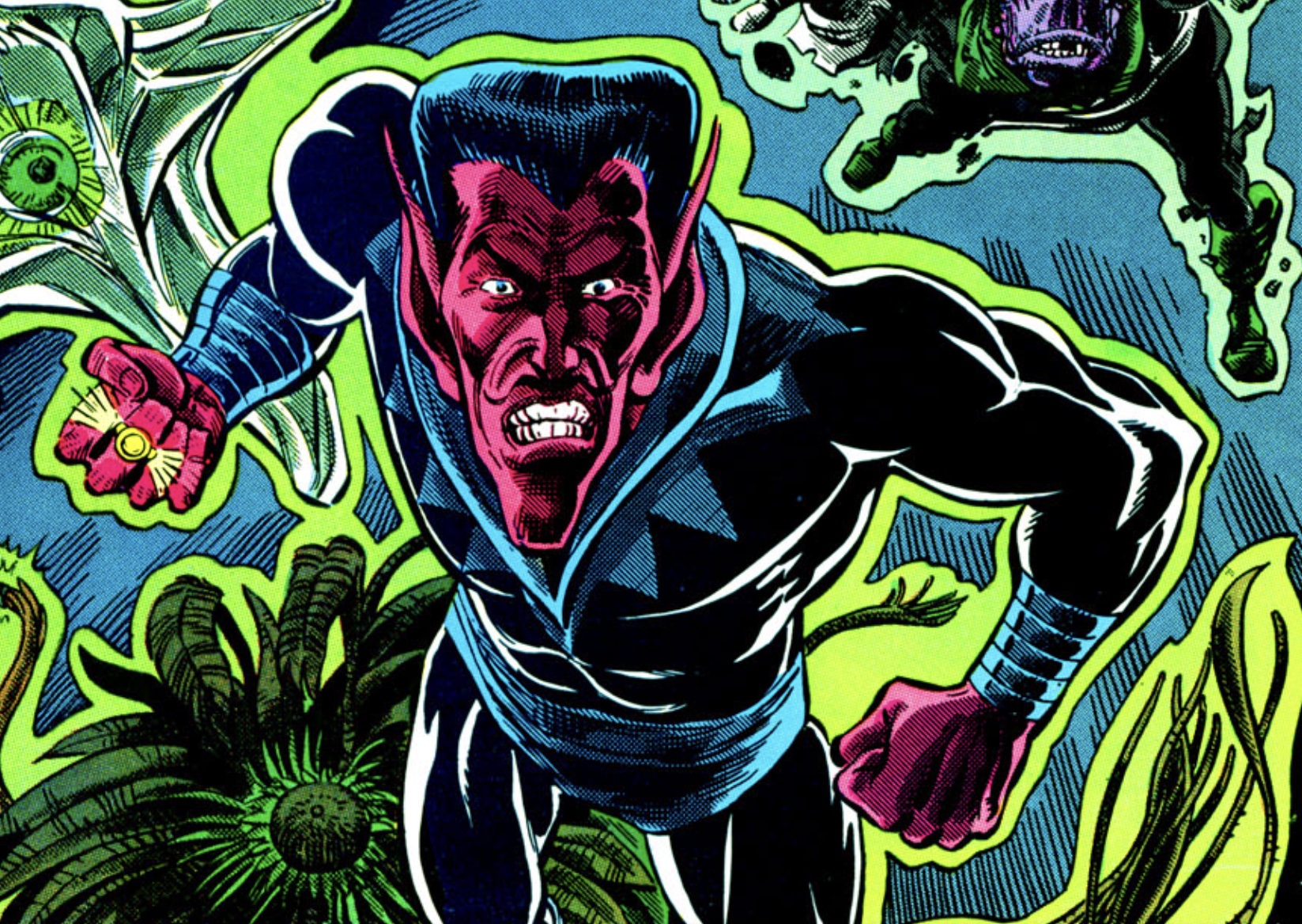
Sinestro would escape one final time with the aid of the MadGod sector 3600, a cosmic entity which literally took up an entire space sector. The pair went on a swath of destruction across the universe, killing trillions. They were defeated by the Earth-based Green Lantern Corps, which had been formed after the Guardians departed for another dimension with their mates, the Zamarons. Fittingly, Katma Tui, the Korugarian who succeeded Sinestro as Green Lantern of sector 1417, landed the blow which defeated him. However, despite having his ring removed, Sinestro managed to free the evil Myrwhydden (another old foe of Hal Jordan’s) from his Sciencell, and the two attempted to battle the Green Lanterns yet again before being defeated (GREEN LANTERN CORPS # 217-221). As drawn by Joe Staton and Bill Willingham, Sinestro’s ring was the usual generic design.
31360F67-E700-4E37-B778-6FC525DDD711.jpeg


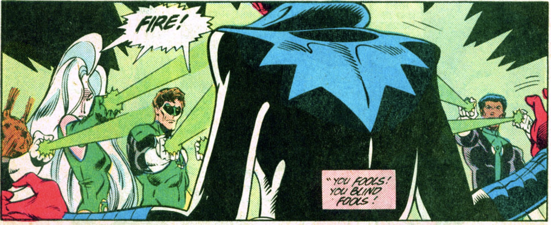
Sinestro was finally placed on trial on Oa and executed by the full Green Lantern Corps (GREEN LANTERN CORPS # 222), which inadvertently set in motion a chain of events that destroyed the central power battery (and most power rings), and led to the dissolution of the Corps. However, Sinestro’s spirit survived within the central power battery, and would later try to take possession of John Stewart on several occasions.
BE4B6CF6-FB1D-4430-A650-036BBFD2D9D5.jpeg


Some time later, after the Guardians returned to rebuild the Corps, Guy Gardner (having been booted out of the Corps) sought a new power source so he could continue as a superhero. Remembering Sinestro’s yellow ring, he traveled to Qward in an attempt to get the Weaponers to make one for him, but was told that there had been only one—Sinestro’s—and that it had used up all of their supplies of the yellow mineral Qwardamite to construct it (...which flies in the face of the many different rings Sinestro used over the years, but, hey, the Qwardians ARE bad guys, and could have been lying).

Traveling to Oa, Gardner snuck into the Green Lantern crypt located beneath the Guardians’ citadel, and discovered that Sinestro’s ring (presumably yet another spare) was still on his entombed corpse’s hand, its invisibility shield having deactivated after his death. Gardner fought Sinestro’s spirt (both possessing the body of John Stewart as well as on its own), and took possession of the ring, using it as a free-agent superhero.

C0D53879-527F-49DD-BC76-4C8D601F9F7D.jpeg
B8BDD45C-7226-4D68-B3E9-E21227312C05.jpeg
3D213A01-26C0-4DF8-907D-911E3449A944.jpeg


Gardner’s version of the ring was essentially the same version Joe Staton had previous drawn, although the size of the signet disc and gem wildly fluctuated, and Gardner’s stylized “G” symbol would only rarely be seen under the gem.

CC39365D-C35C-4F75-9DA8-FD5B0BA1F988.jpeg
C74361C8-B506-4F1A-A1ED-0D80B3BCEE3A.jpeg
CCC08963-C94F-406A-8314-6BD360105E17.jpeg
90B52B17-5EB5-4998-9159-25519B72662C.jpeg


This ring was destroyed when Gardner confronted Hal Jordan—now the evil Parallax—on Oa (GUY GARDNER: WARRIOR # 21).

527802B6-4B4A-4B96-BD9D-2C92E60ED808.jpeg


Prior to this, the Guardians had released Sinestro from the central power battery and restored him to life in an attempt to stop the now-mad Hal Jordan. Armed with a standard Green Lantern ring, Sinestro failed, and his neck was broken by Jordan, who proceeded to absorb the power of the central battery and kill the Guardians.

However, this was later revealed to be untrue. Sinestro had been pulling the strings all along, had faked his death, and caused Jordan’s possession by the fear entity called Parallax (GREEN LANTERN: REBIRTH # 1-6). He proceeded to found his own Corps of warriors powered by the yellow light of fear, and armed with rings bearing a symbol inspired by the Parallax entity. But that’s another story...which I have yet to read!


As an aside, it should be noted that Sinestro’s animated form in the various iterations of the SUPER FRIENDS cartoon retained the original concept of a yellow version of the standard Green Lantern ring. Sinestro’s ring in the cartoon is identical to Hal Jordan’s except that it’s yellow with a blue Green Lantern symbol (whereas Jordan’s was white with a green GL symbol).

B8D89B1D-5173-4117-B8CE-77BB7437ED8B.jpeg


Alex Ross would follow suit, consistently depicting a yellow version of the standard Green Lantern ring.
B6D4C84B-1D48-499B-AC4D-30DCABD5E5E7.jpeg
46474EB6-2CA9-45E9-939A-86FE8B11A5EA.jpeg
 
Last edited:

Your message may be considered spam for the following reasons:

If you wish to reply despite these issues, check the box below before replying.
Be aware that malicious compliance may result in more severe penalties.
Back
Top