You are using an out of date browser. It may not display this or other websites correctly.
You should upgrade or use an alternative browser.
You should upgrade or use an alternative browser.
Defined Green Lantern Comic Rings
- Thread starter Gregatron
- Start date
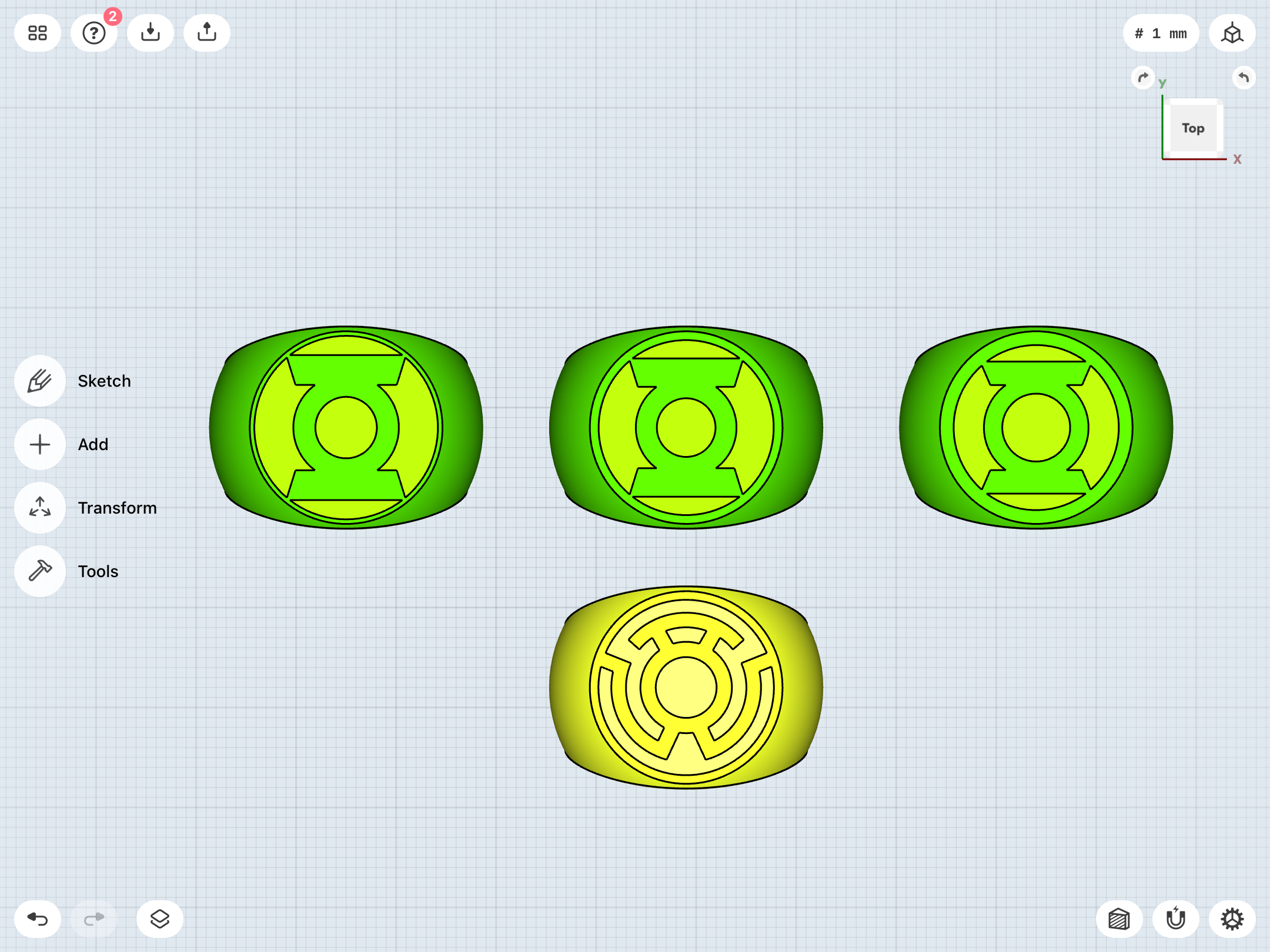
Tweaked the REBIRTH ring to slightly thicken the symbol-flange. I made it the same width as that of my Sinestro Corps ring, for consistency.
Here it is (center) with the previous version (left), alternate symbol version (right), and Sinestro ring (bottom).
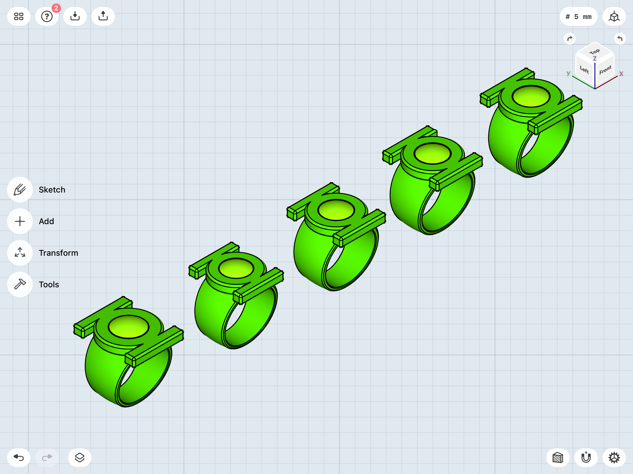
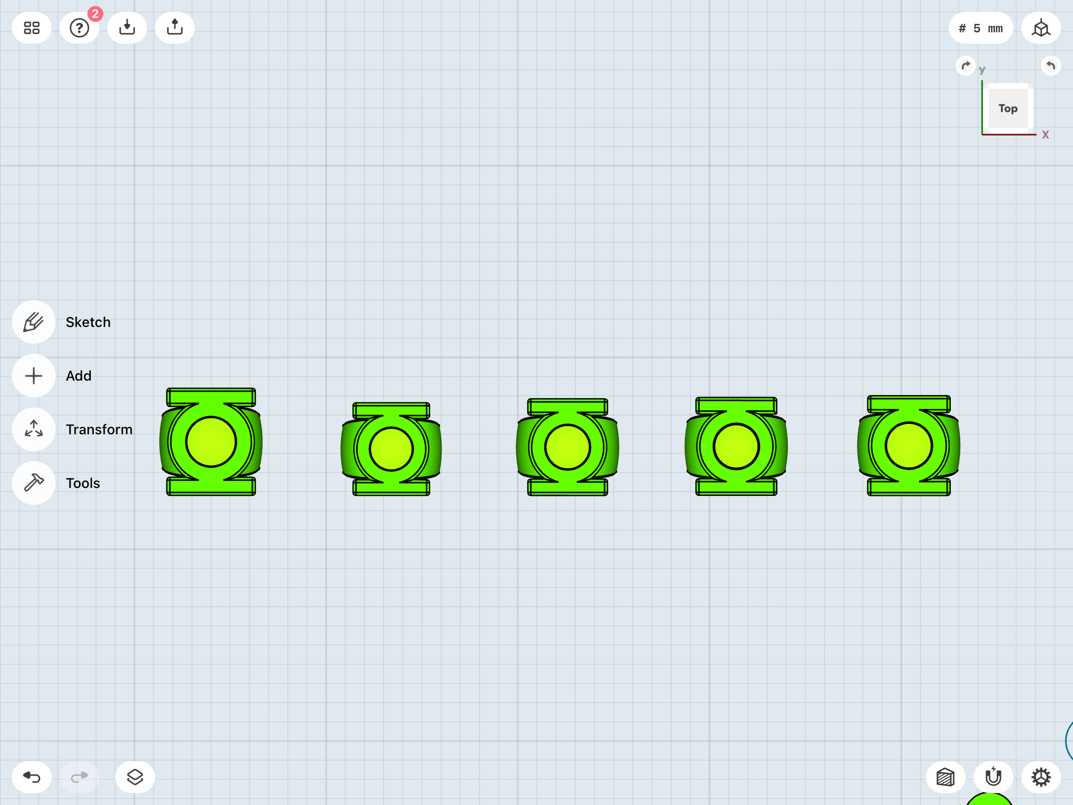
I’ve also had a nagging feeling that the V2 is slightly too big, and that the band tapers a little too sharply. Been creating some variants to see if I can streamline it ever so slightly.
Original on left, compared with these new variants:
Here it is (center) with the previous version (left), alternate symbol version (right), and Sinestro ring (bottom).
I’ve also had a nagging feeling that the V2 is slightly too big, and that the band tapers a little too sharply. Been creating some variants to see if I can streamline it ever so slightly.
Original on left, compared with these new variants:
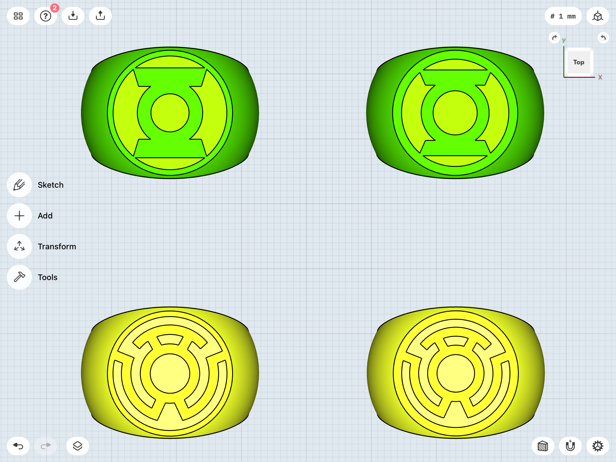
Upon further investigation, it seems that the Sinestro Corps symbol may have variations, not unlike the modern GL symbol. The version I’ve been using has a thinner flange/ring around the symbol, not unlike the REBIRTH version of the GL symbol. However, it seems that a revised version with a thicker outer ring has become the default version for licensing, as with the GL symbol.
As noted, the modern era is a blindspot for me, but not for too much longer. I get the impression that, perhaps around the time when the entire spectrum of Lantern Corps were being devised, it was decided to unify the symbols in terms of their basic design.
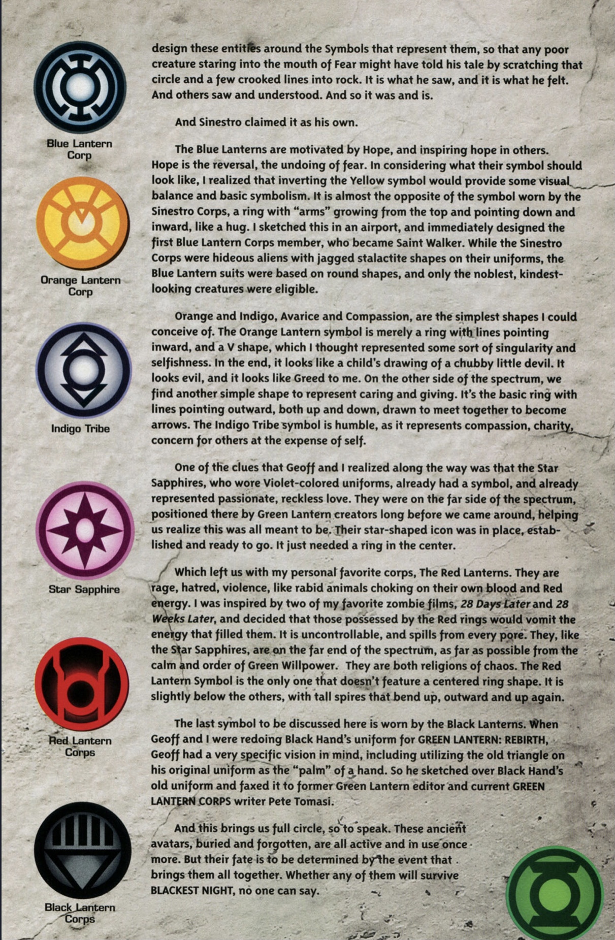
This BLACKEST NIGHT-era text piece by Ethan Van Sciver, which explains his designs for the symbols, shows all of the official symbols used for licensing. There is indeed a uniformity to them, in terms of overall styling and thickness of their outer rings.
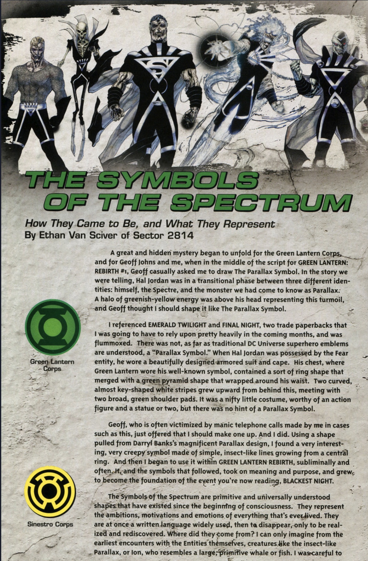
So, as a result, I’ve modified the Sinestro ring with a thicker outer ring to match the alternate/licensing GL symbol.
As noted, the modern era is a blindspot for me, but not for too much longer. I get the impression that, perhaps around the time when the entire spectrum of Lantern Corps were being devised, it was decided to unify the symbols in terms of their basic design.
This BLACKEST NIGHT-era text piece by Ethan Van Sciver, which explains his designs for the symbols, shows all of the official symbols used for licensing. There is indeed a uniformity to them, in terms of overall styling and thickness of their outer rings.
So, as a result, I’ve modified the Sinestro ring with a thicker outer ring to match the alternate/licensing GL symbol.
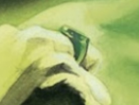
Still playing around with Alex Ross-style designs. There’s a lot of variation in his depictions of the ring, which seems par for the course.
Some art appears to go with the “disc on top of band” look (and is possibly based on the DC Direct toy ring which came with various action figures, since it occasionally has the disc-with-downward-sloping edge, which is unique to the toy replica):
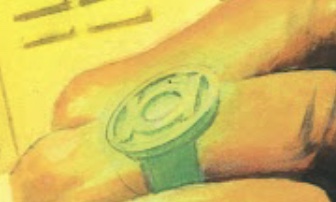
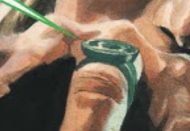
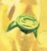
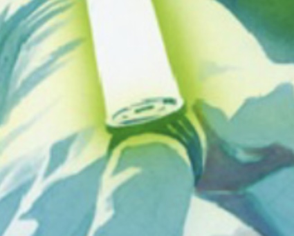
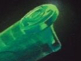
Other art goes with more of a traditional signet ring look, with a curved upper band and a smaller symbol-disc that doesn’t overhang the band:

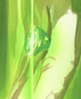
And there’s also the variant with a conical symbol-disc:
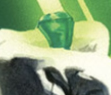
There’s the chunky, straight-sided signet ring...
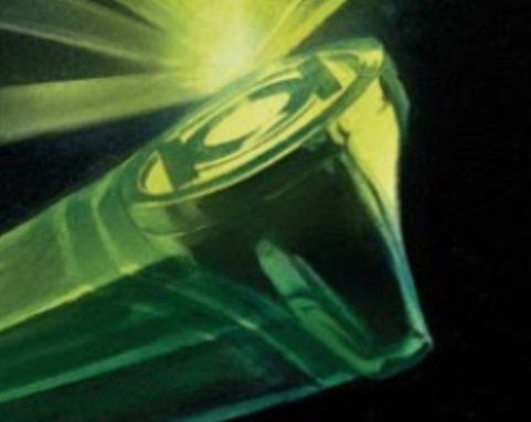
...as well as the signet ring without a separate symbol-disc, and the symbol simply engraved on the face of the ring:
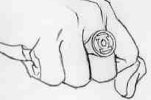
And there’s also this odd version, with all sorts of bevels.
Some art appears to go with the “disc on top of band” look (and is possibly based on the DC Direct toy ring which came with various action figures, since it occasionally has the disc-with-downward-sloping edge, which is unique to the toy replica):
Other art goes with more of a traditional signet ring look, with a curved upper band and a smaller symbol-disc that doesn’t overhang the band:
And there’s also the variant with a conical symbol-disc:
There’s the chunky, straight-sided signet ring...
...as well as the signet ring without a separate symbol-disc, and the symbol simply engraved on the face of the ring:
And there’s also this odd version, with all sorts of bevels.
Last edited:
Green Lantern Power Ring
Green Lantern Power Ring Green Lantern Power Ring A word about the wedding bands. The grooms is a replica of a Green Lantern Power Ring, a super hero from DC Comics charged with policing space. Green Lantern
intimategardenweddings.com
More tweaks, resulting in some new STL files.
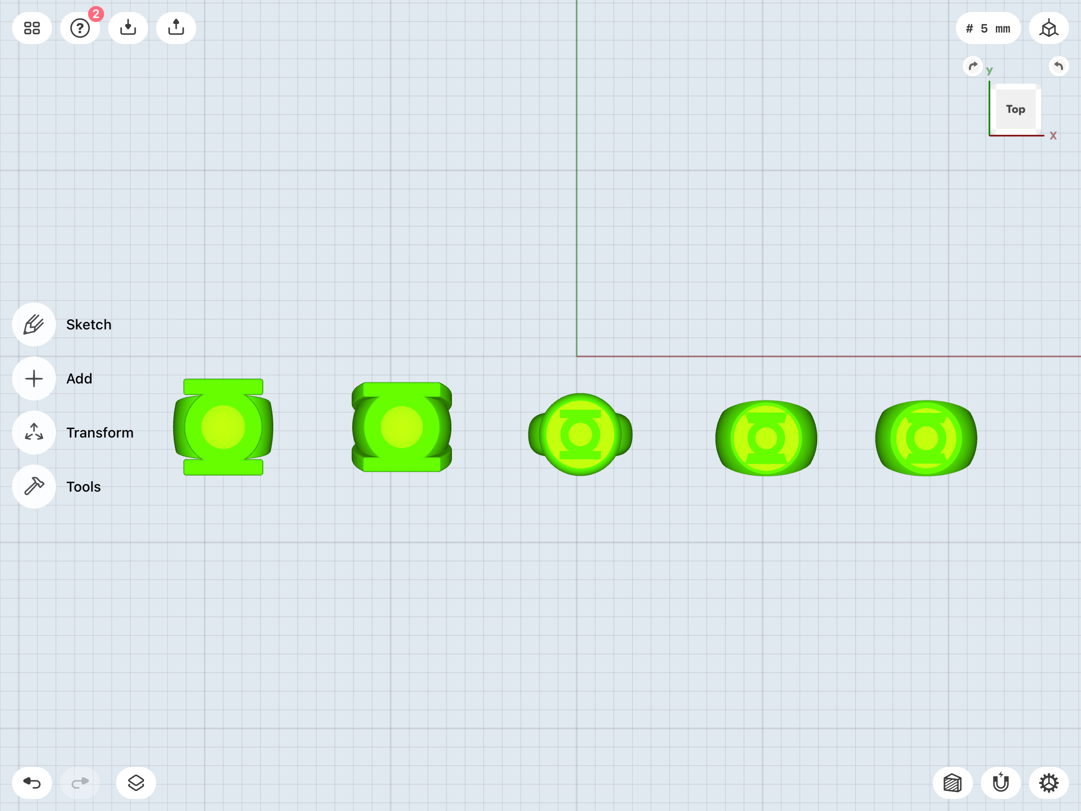
I modified the V2 to make the symbol about 2mm shorter, resulting in the tapering of the upper band being a bit less steep.
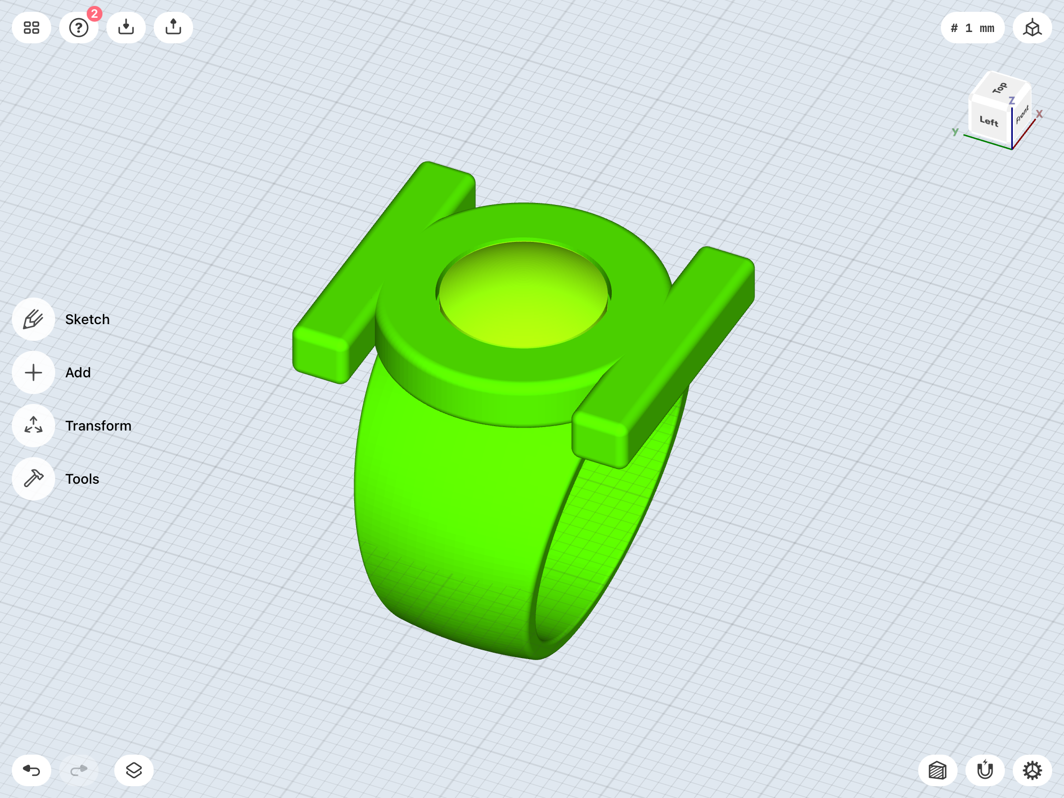
The V3 is now slightly thicker/taller between the finger-hole and the face.
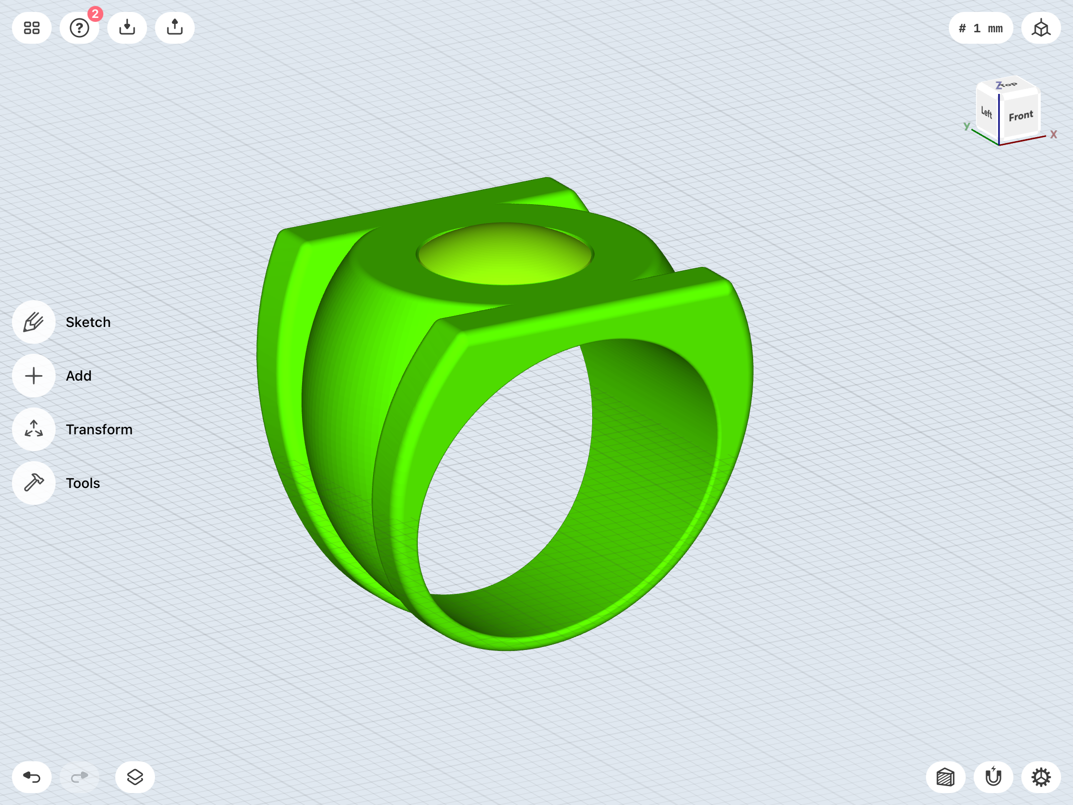
The EMERALD DAWN ring has been slightly slimmed down, as the current test print is a little too wide on the sides to be properly comfortable.
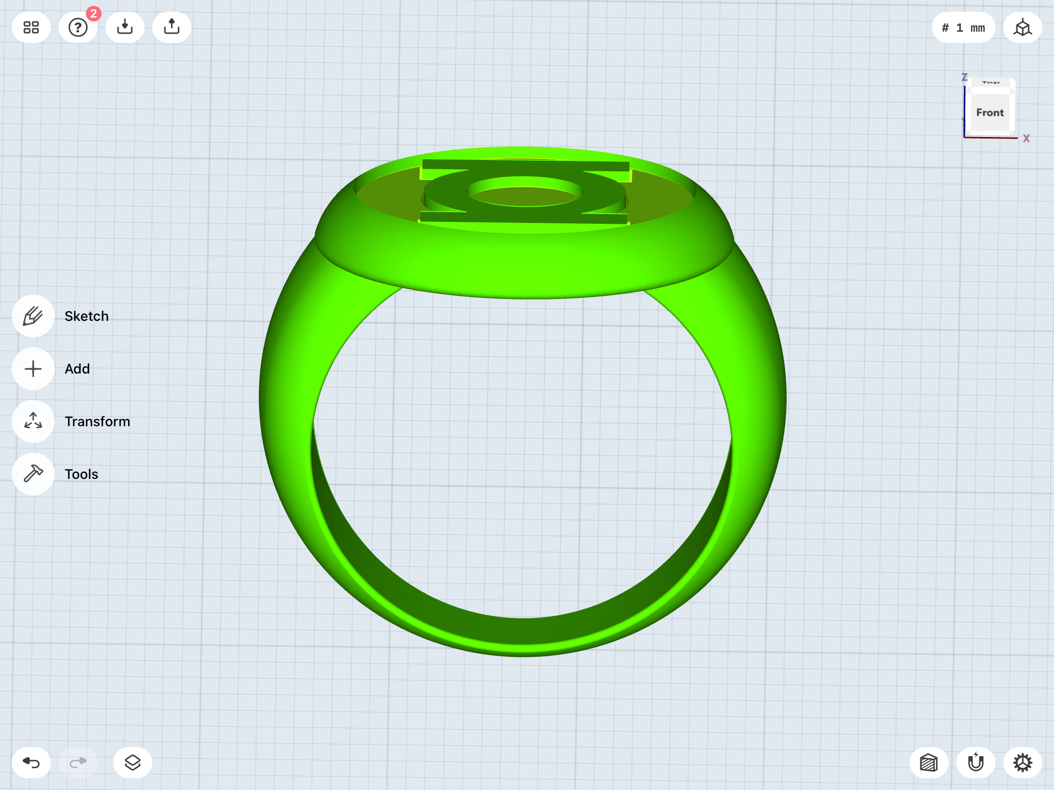
And here are both versions of the modern ring, with the REBIRTH symbol and the alternate version.
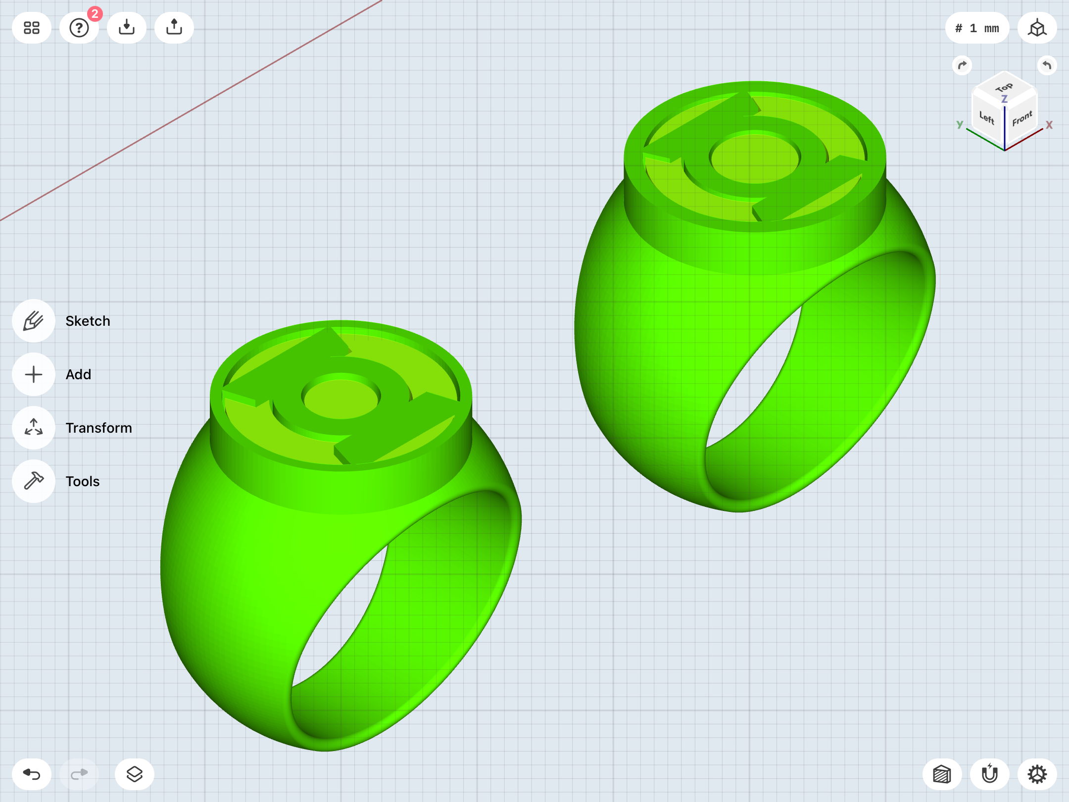
I also currently have a batch of silicone rubber curing over the resin insert master I made for the EMERALD DAWN ring, during the last round of test prints. Since the size of the symbol itself has not been altered with the revisions I just made to the model, I can proceed with casting the insert in resin.
I modified the V2 to make the symbol about 2mm shorter, resulting in the tapering of the upper band being a bit less steep.
The V3 is now slightly thicker/taller between the finger-hole and the face.
The EMERALD DAWN ring has been slightly slimmed down, as the current test print is a little too wide on the sides to be properly comfortable.
And here are both versions of the modern ring, with the REBIRTH symbol and the alternate version.
I also currently have a batch of silicone rubber curing over the resin insert master I made for the EMERALD DAWN ring, during the last round of test prints. Since the size of the symbol itself has not been altered with the revisions I just made to the model, I can proceed with casting the insert in resin.
More tweaks on the Abin Sur, as well as the creation of a new iteration of the straight-band V1.
Really, this version is so much less of a headache than the curved-band version. I should probably tally up the numbers, but I do wonder if this simpler version of the design wasn’t actually featured in more Gil Kane-drawn stories (as well as flashbacks to that era, guest-appearances, etc.) than the more elaborate, curved-band version I’ve been working with.
Realistically-speaking, the straight-band variant may well be the more prominent (...and—Dare I say?—iconic) version of the original Hal Jordan ring. Who knows? Maybe I’ll end up sticking with that version. We’ll see.
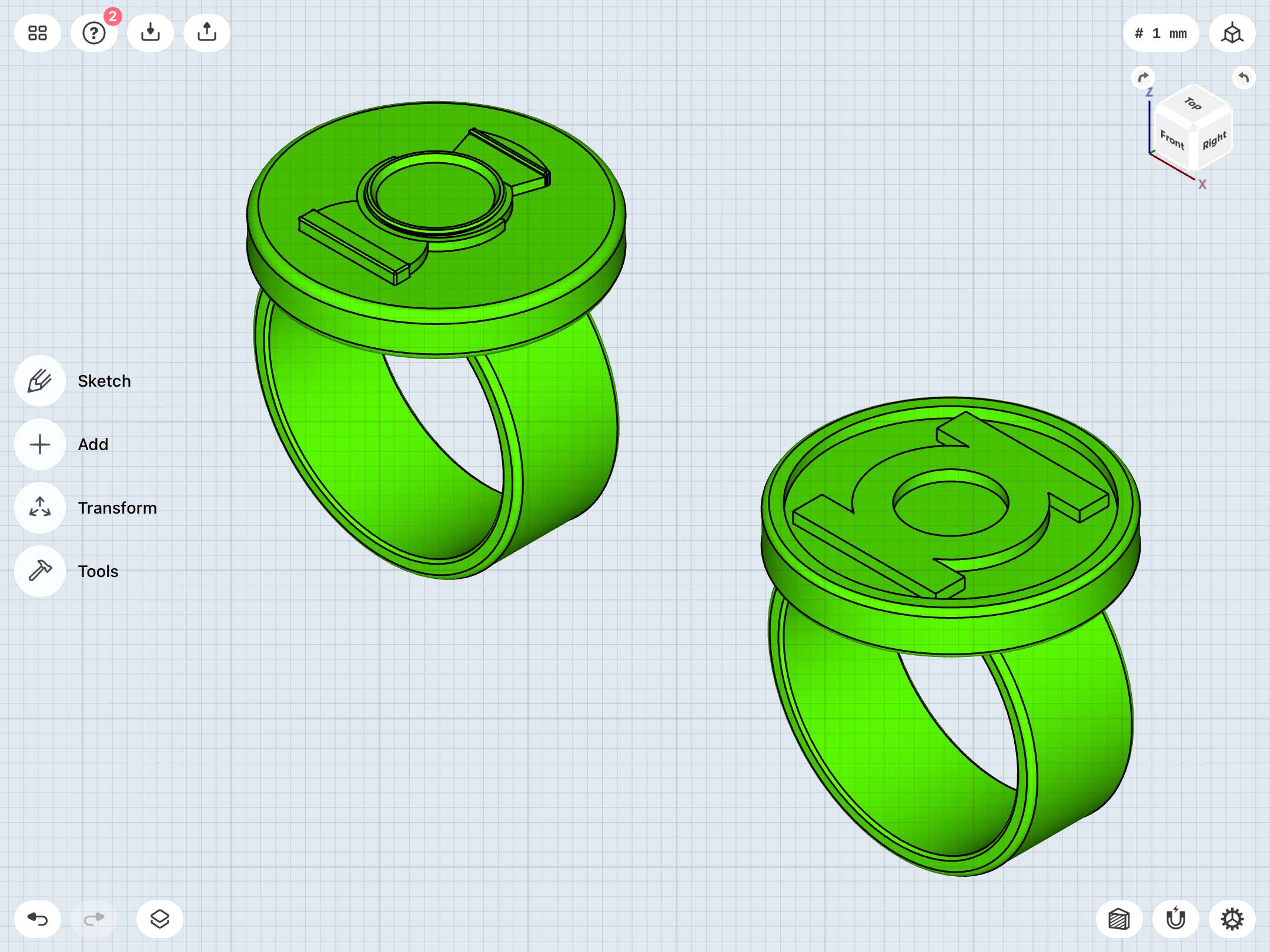
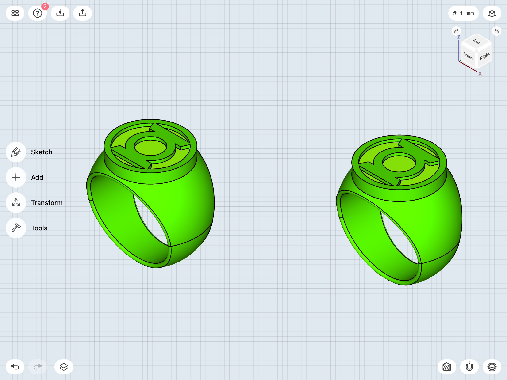
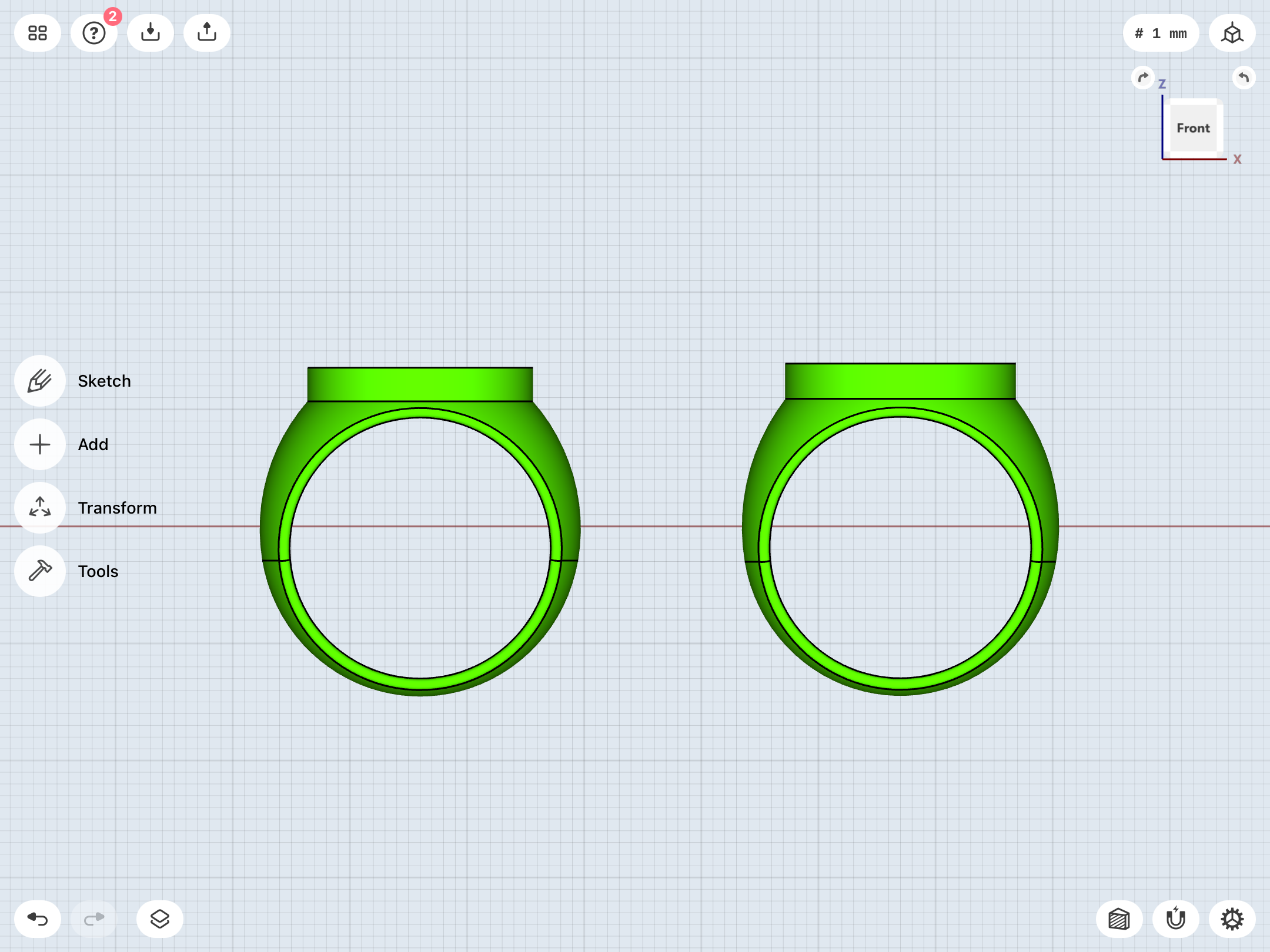
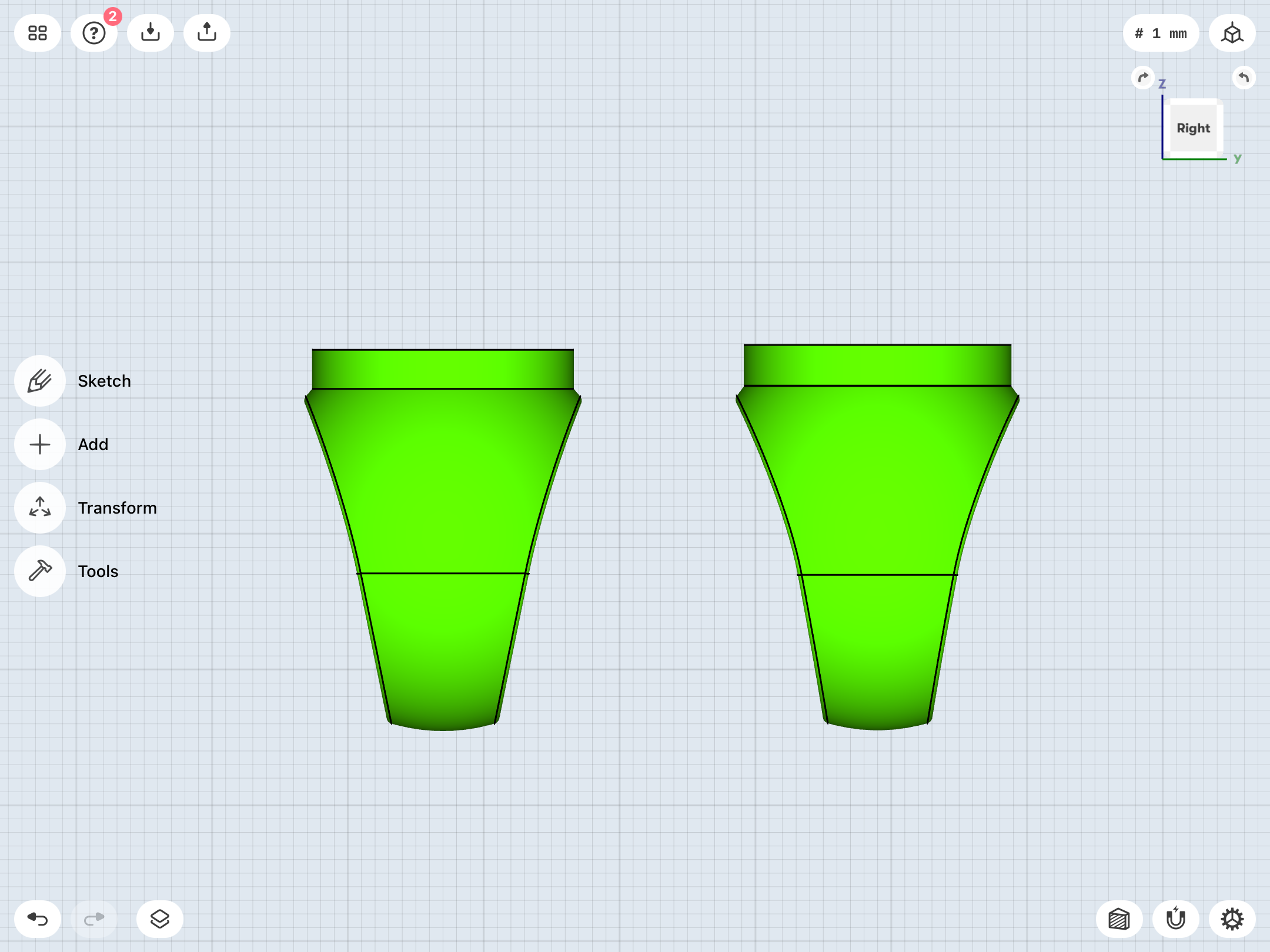
Been doing a lot of subtle work to tweak the modern ring’s band. The one I’ve been working with is just a little too wide/bulbous on the sides to fit comfortably. Also, the upper band could stand to be a little more vertical/steeper, which is a better match to the reference material.
Here’s the current revision. I really like the “V” shape of the band as seen in profile on the previous iteration, and keeping that look without getting too curvy—and also achieving the goals stated above—has been tricky. As a bonus, the symbol-disc is now also slightly larger.
Old on left, new on right.
Last edited:
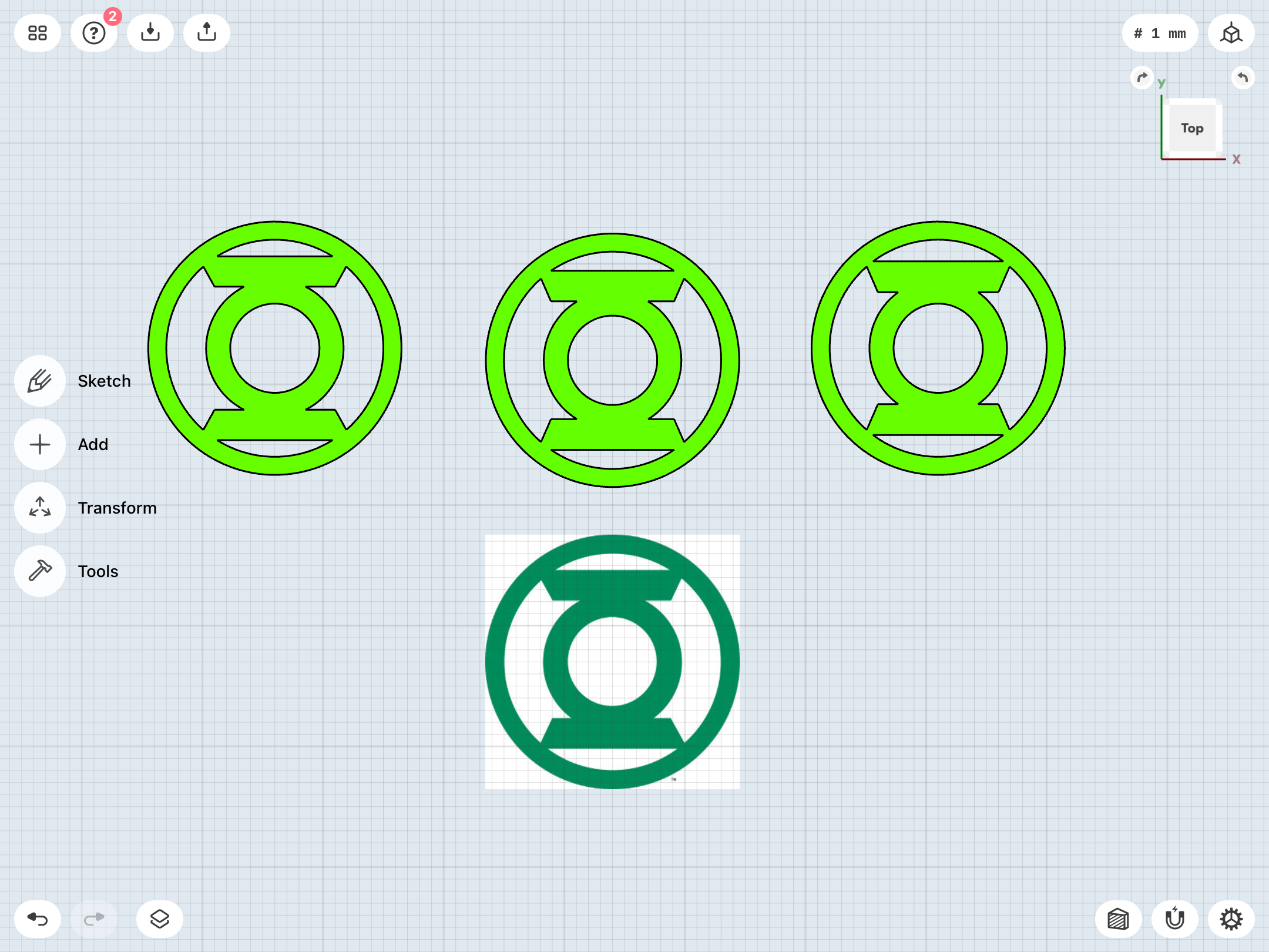
As noted, the modern GL symbol used for licensing is asymmetrical, with the shape/height of the top and bottom sidebars noticeably differing. I sincerely doubt that this was a deliberate creative decision.
For my recent modeling, I’ve been using a mirrored version of the thicker (lower) sidebar, but I’ve now calculated out and created a compromise version which is exactly halfway between the two sidebars’ measurements. I still haven’t decided whether I’ll just use the asymmetrical version or one of my modified variants. We’ll see.
In the meantime, here are my previously-shown, idealized/mirrored versions (left/mirror of top sidebar, right/mirror of bottom sidebar) alongside my new, in-between version (center), as well as the actual, asymmetrical symbol (bottom). My previous, mirrored versions just seemed a little “off” in one direction of the other. The thin sidebar version looks a little scrawny, and the thick sidebar version looks a little stocky. I think the new, in-between version strikes a nice balance between the two, and also captures the flavor of the actual symbol while adding symmetry.
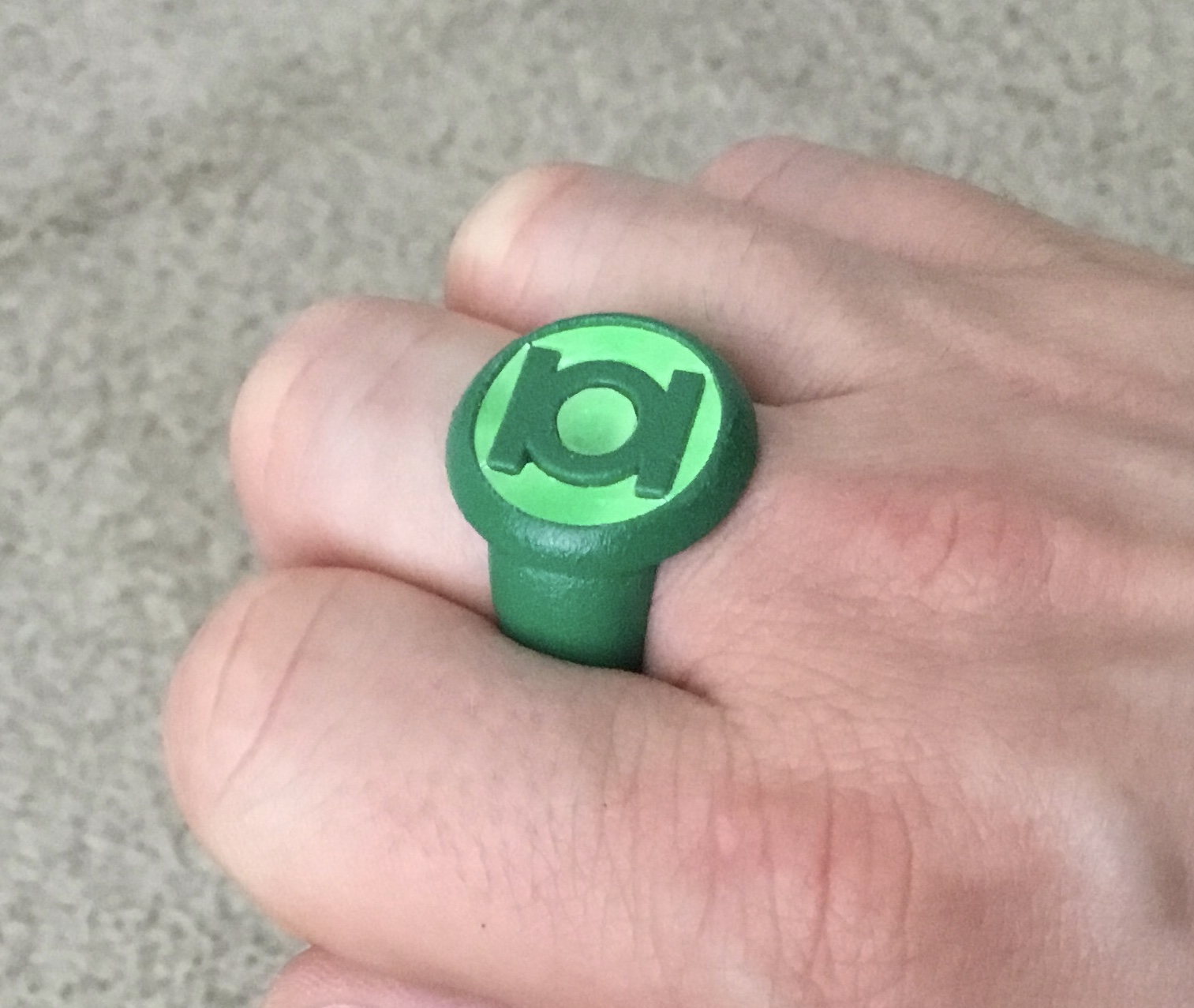
Still working on test-casting resin inserts. Some of them come out more rubbery than others.
The latest test involved sanding off the backing disc/sprue, then inserting the resin pieces. This test went pretty well, but for the fact that the resulting pieces are a little thin (I’ll have to adjust the models, I think) and that, despite having frosted backsides from the sanding, the emerald green paint color of the ring itself can be see through the insert in spots. The resin also went a bit rubbery due to the friction-heat of sanding.
Looks like I’ll have to paint the rear of the insert pieces to make them less translucent, or perhaps thickening the parts will help.
Anyway, here’s the result of the EMERALD DAWN ring test.
Last edited:
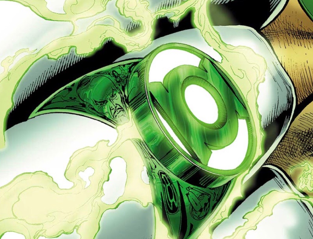
Continuing to the tweak the modern ring. Playing with different band shapes, differing symbol-disc diameters/heights, etc. My current model is a actually very close in shape and size to the BLACKEST NIGHT licensed promo ring, but with a much shorter symbol-disc and a much smaller space between the disc and the finger-hole. Those promos rings are really chunky, but otherwise quite nice.
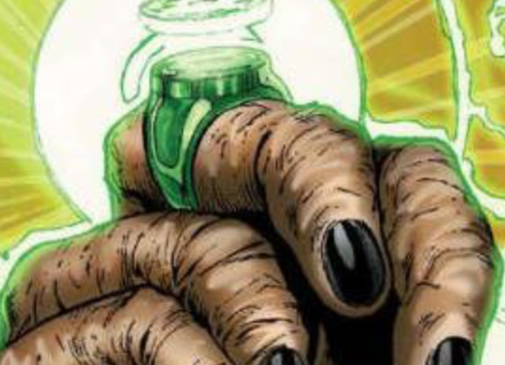
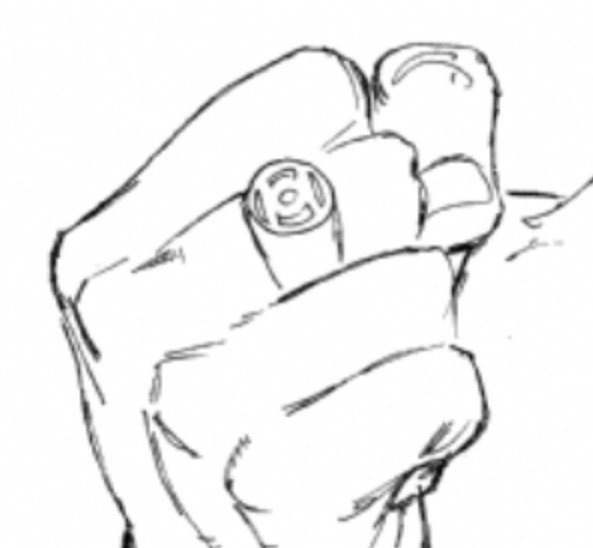
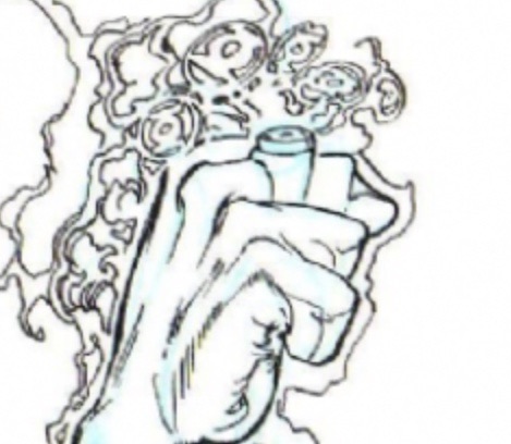
Pinning down Ethan Van Sciver’s design is tricky, because there’s a lot of variance. Sometimes, the upper band appears to be straight-sided (and the same diameter as the disc), sometimes very curvy, with a small disc on top. Sometimes the disc is tapered, sometimes not. Sometimes it’s very thick, and sometimes not. And so on.
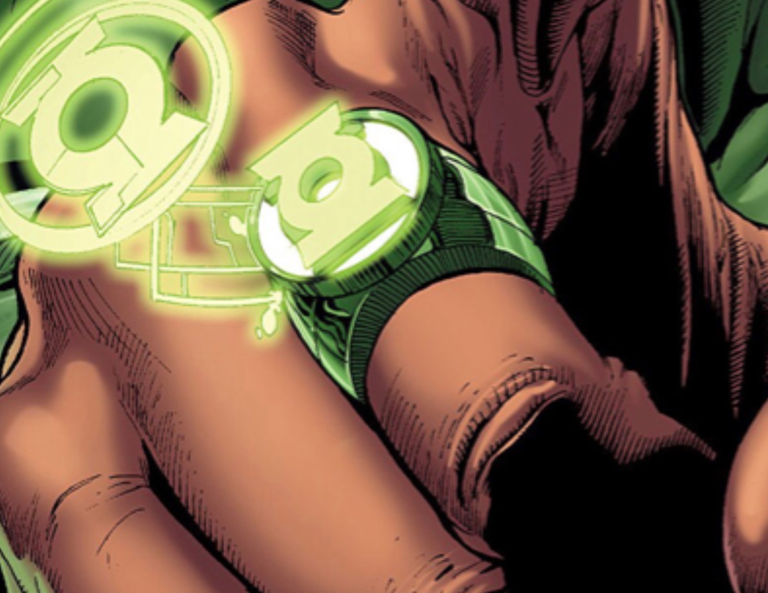
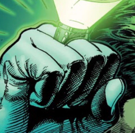
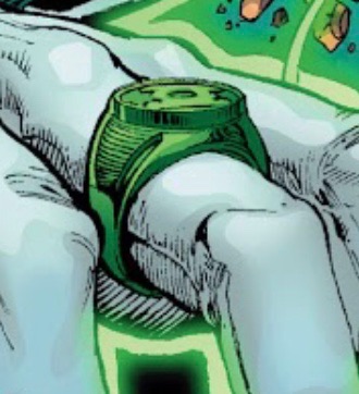
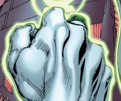
On the left is the official symbol (asymmetrical) and on the right is my idealized version.
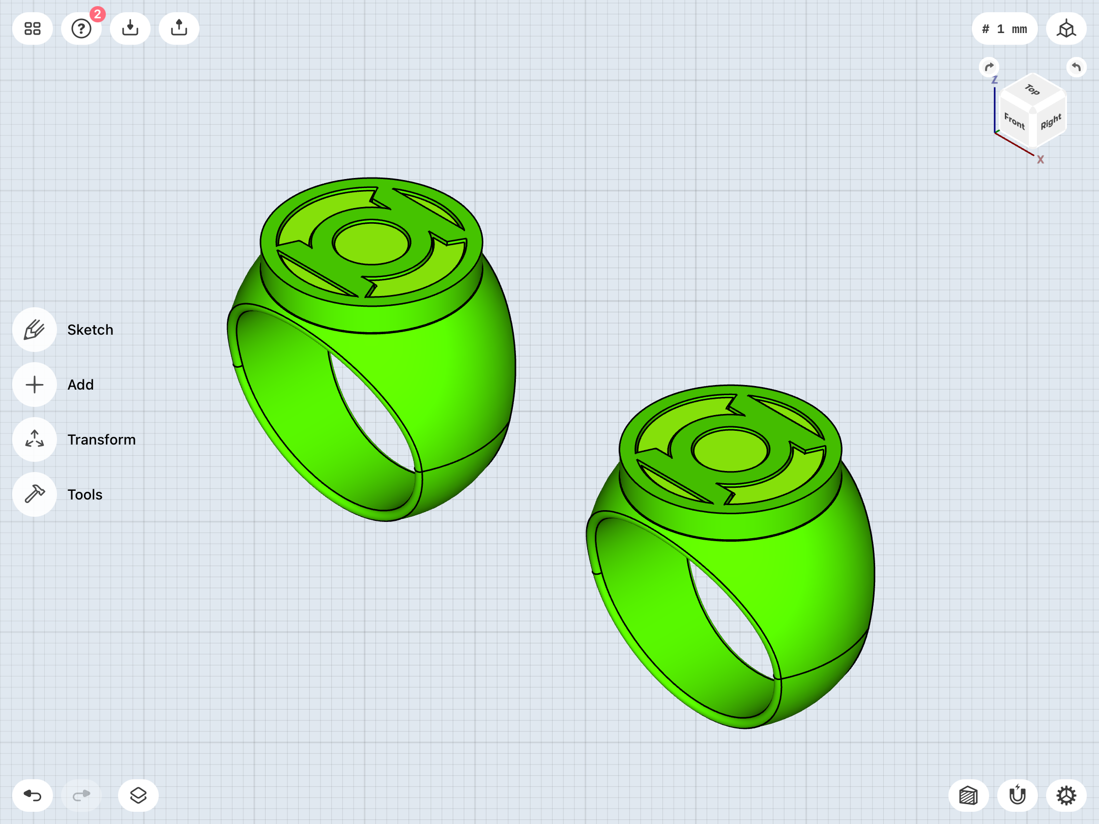
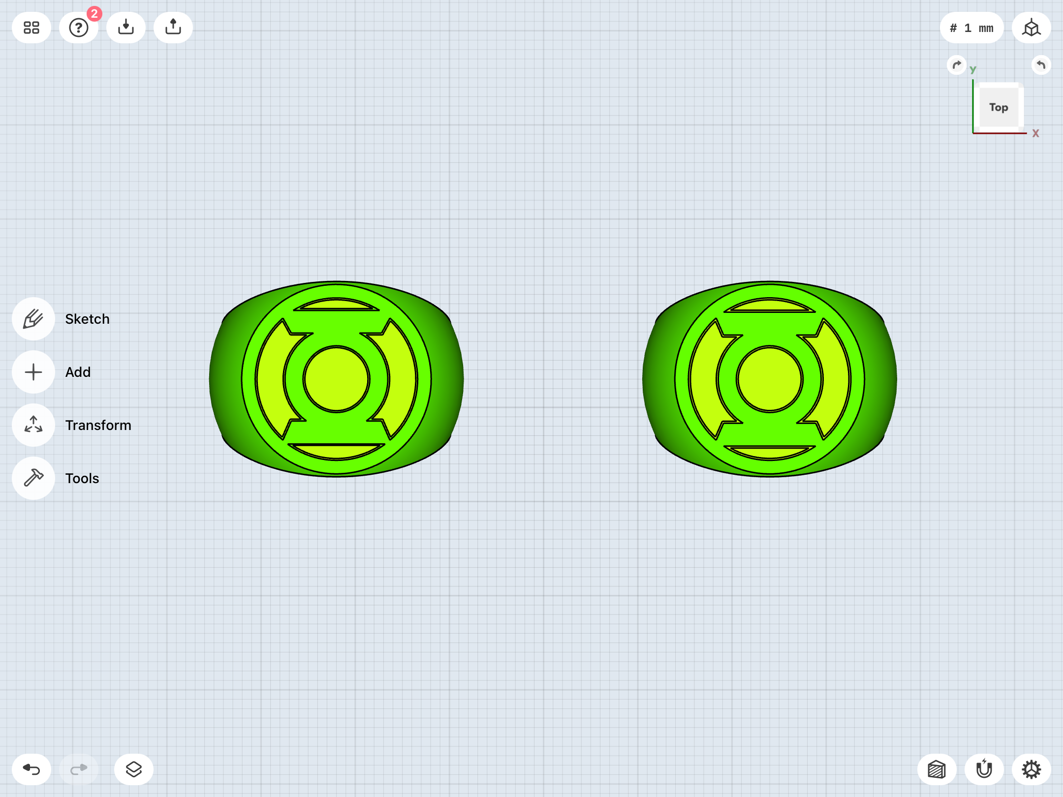
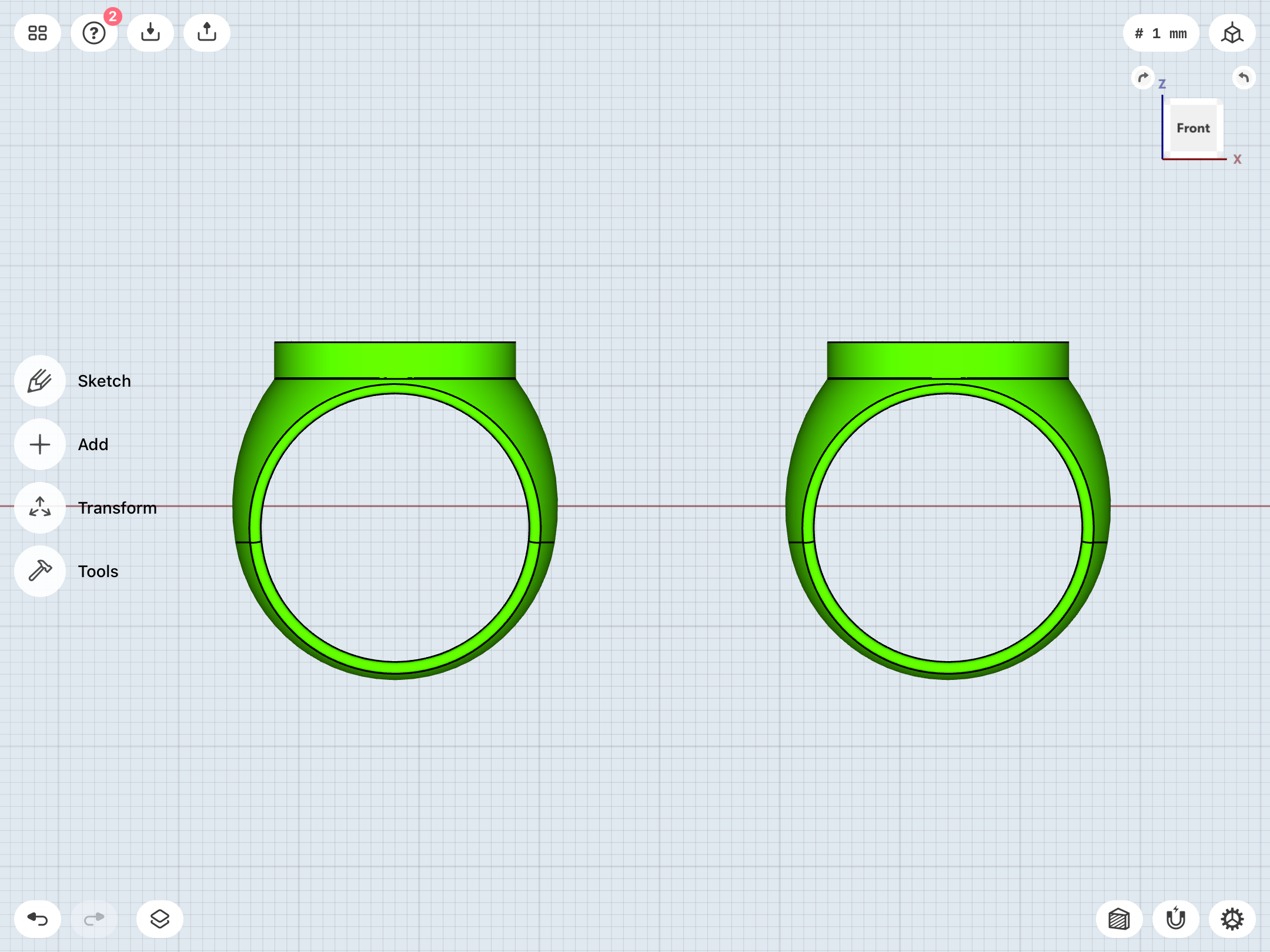
Pinning down Ethan Van Sciver’s design is tricky, because there’s a lot of variance. Sometimes, the upper band appears to be straight-sided (and the same diameter as the disc), sometimes very curvy, with a small disc on top. Sometimes the disc is tapered, sometimes not. Sometimes it’s very thick, and sometimes not. And so on.
On the left is the official symbol (asymmetrical) and on the right is my idealized version.
So, I’m slowly receiving trade paperbacks of the Geoff Johns-era material in the mail, and, as I flip through them, I see that the Van Sciver design didn’t actually last all that long. Other artists came and went, with Ivan Reis sticking around for quite some time. And, his version of the ring seems to go back to more of a Neal Adams and/or Mark Bright look, with a (tapered/conical) symbol- disc blending into the band. There’s also a symbol change, with a streamlined (yet more dimensional) look very similar to the animated JUSTICE LEAGUE version of John Stewart’s symbol.
More research is necessary, but it’ll be awhile before I get around to actually reading these stories. In terms of my mega-read-through, I’ve managed to slog through ACTION COMICS WEEKLY, and will soon be reading EMERALD DAWN, GREEN LANTERN (Vol. 3), MOSAIC, and GUY GARDNER.
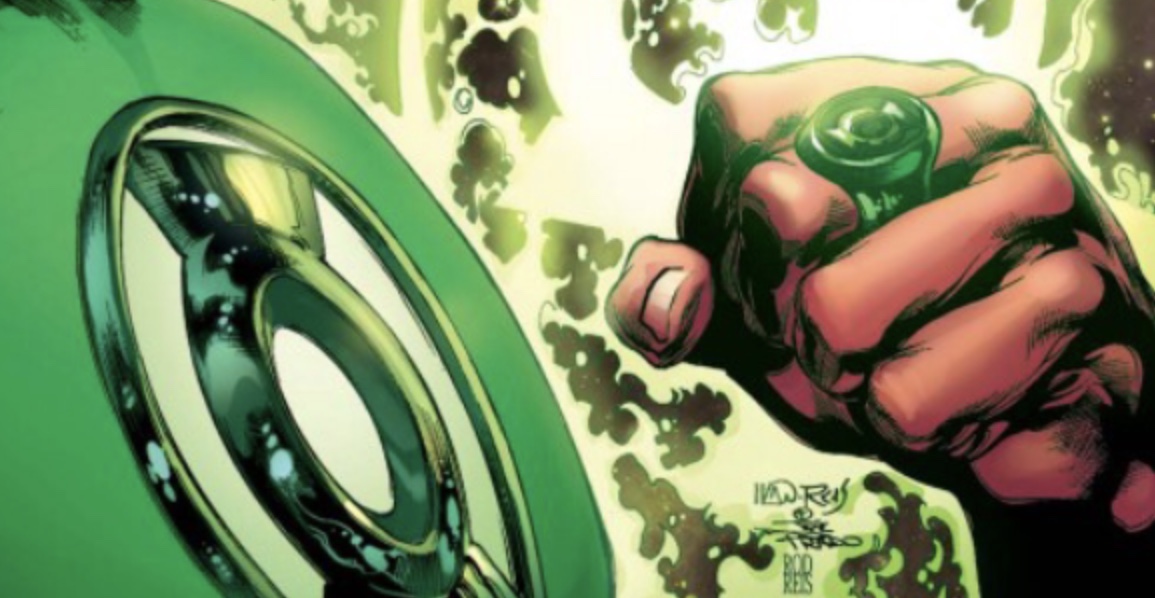
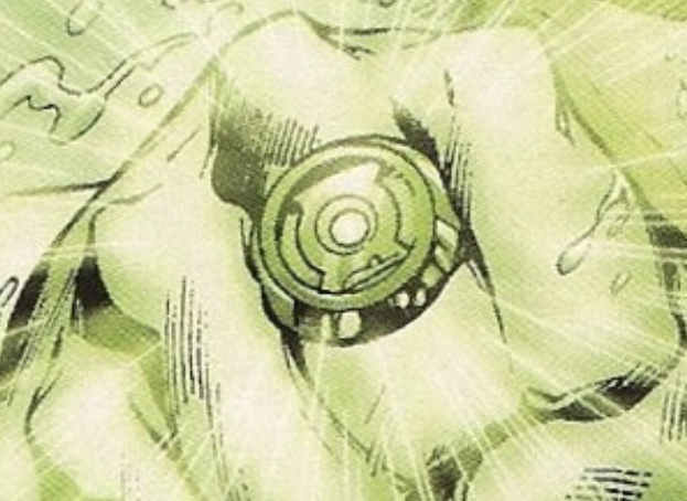
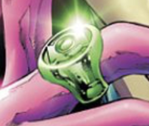
More research is necessary, but it’ll be awhile before I get around to actually reading these stories. In terms of my mega-read-through, I’ve managed to slog through ACTION COMICS WEEKLY, and will soon be reading EMERALD DAWN, GREEN LANTERN (Vol. 3), MOSAIC, and GUY GARDNER.
Upon a bit more research, it does indeed appear that the REBIRTH iteration of the GL symbol was used up until the creation of the various other Lantern symbols for BLACKEST NIGHT, when the GL symbol was reworked into the one which became predominant in licensing. However, the REBIRTH version still continued as part of the cover logos for both GREEN LANTERN and related series, such as GREEN LANTERN CORPS.
As can be seen here, both versions of the symbol even coexisted on various covers during this period.
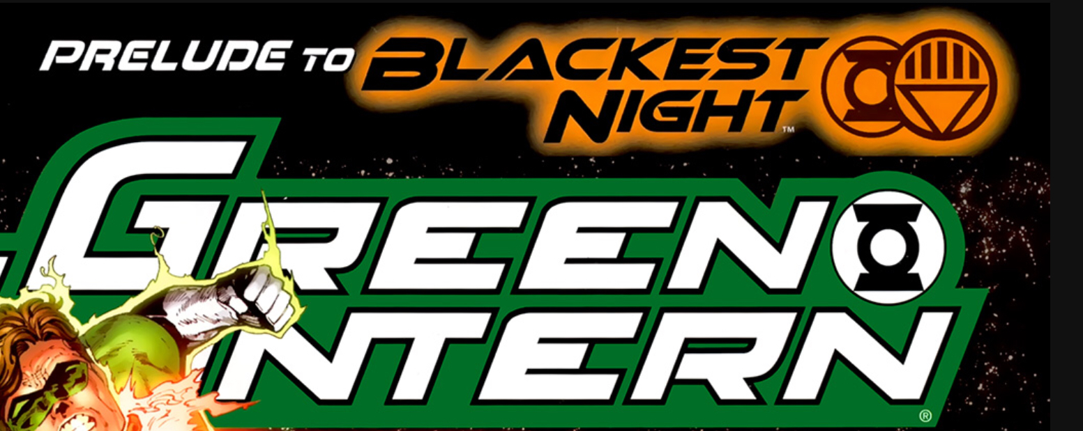
After the end of GREEN LANTERN vol. 4, the books were relaunched as part of DC’s New 52 publishing initiative, and the logos were reworked to incorporate a new version of the traditional (non-angled sidebars) GL symbol.
Before:

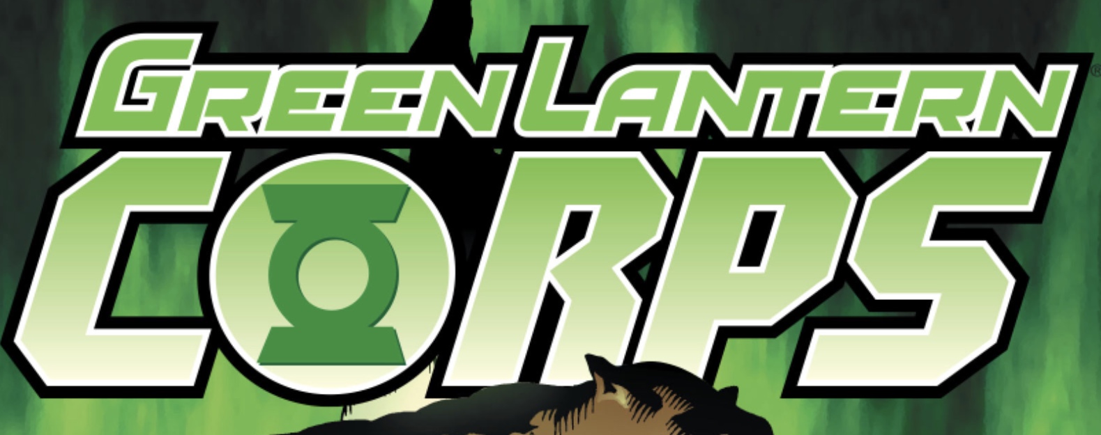
After:

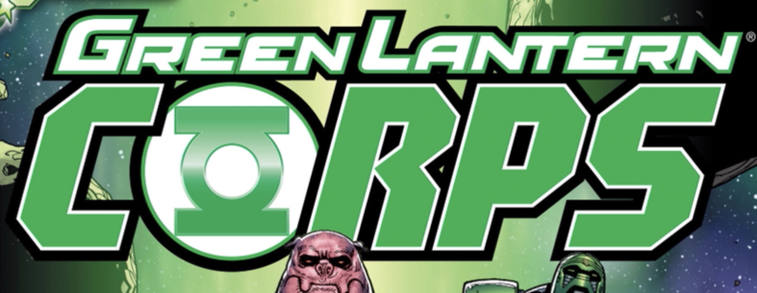
Again, I haven’t even read these stories, yet, but a quick glance indicates that the continuity of the symbols is ALL over the place, with the series’ cover logos often conflicting with the actual interior art. A single issue might include the REBIRTH symbol, the classic GL symbol, and Ivan Reis’ “hourglass”/JUSTICE LEAGUE (animated)- style variant, all at the same time.
Anyway, logic dictates that since Van Sciver’s ring design had been superseded by Reis’ by the time of BLACKEST NIGHT (and the creation of the revised licensing symbol), I should therefore stick to the REBIRTH version of the symbol for my model based on his work.
As can be seen here, both versions of the symbol even coexisted on various covers during this period.
After the end of GREEN LANTERN vol. 4, the books were relaunched as part of DC’s New 52 publishing initiative, and the logos were reworked to incorporate a new version of the traditional (non-angled sidebars) GL symbol.
Before:
After:
Again, I haven’t even read these stories, yet, but a quick glance indicates that the continuity of the symbols is ALL over the place, with the series’ cover logos often conflicting with the actual interior art. A single issue might include the REBIRTH symbol, the classic GL symbol, and Ivan Reis’ “hourglass”/JUSTICE LEAGUE (animated)- style variant, all at the same time.
Anyway, logic dictates that since Van Sciver’s ring design had been superseded by Reis’ by the time of BLACKEST NIGHT (and the creation of the revised licensing symbol), I should therefore stick to the REBIRTH version of the symbol for my model based on his work.
Looking at the merchandise of the era also shows a lot of mixing and matching when it comes to the symbols.
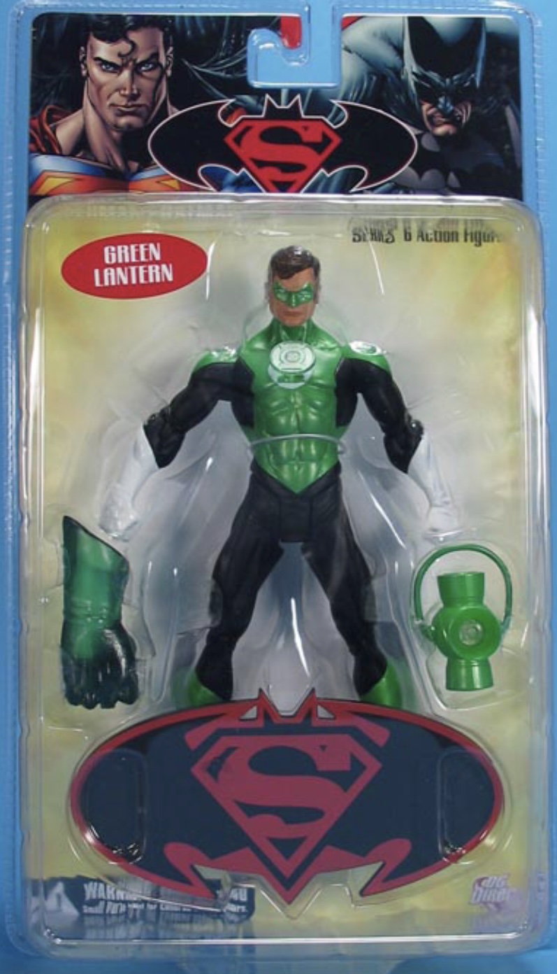
The 2008 SUPERMAN/BATMAN: ENEMIES AMONG US Hal Jordan figure (designed by Van Sciver) features the REBIRTH symbol on his chest...
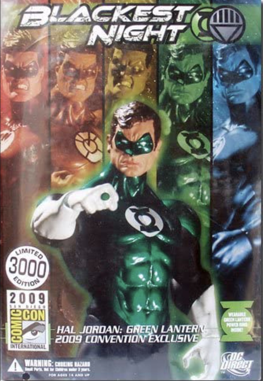
...as does the 2009 convention exclusive repaint (along with a display base using the same symbol).
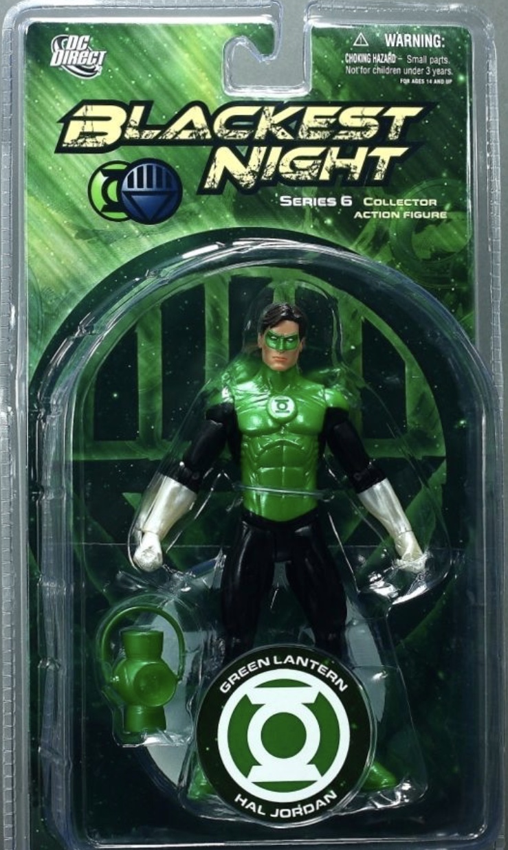
Them, we have the actual BLACKEST NIGHT (2009) figure, which is based on the art of Ivan Reis. It has a chest symbol that doesn’t really match any of the licensing ones, reuses the REBIRTH symbol for the display base, and has the revised symbol on the packaging.
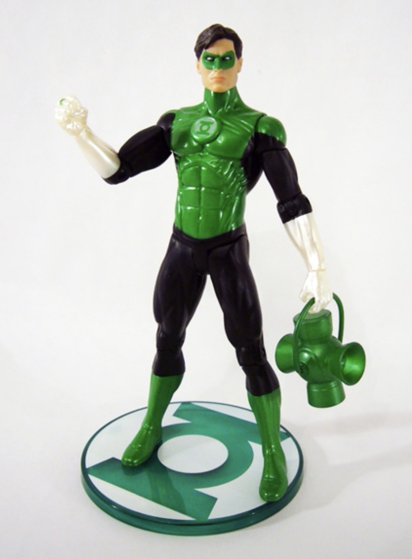
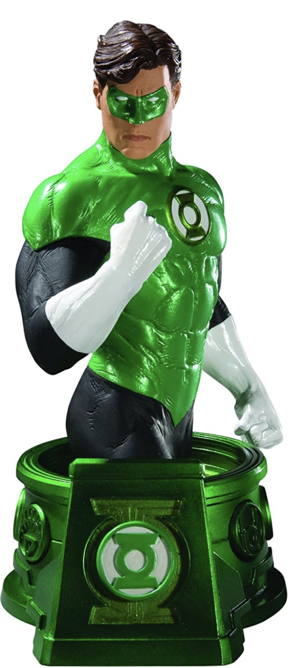
And this BLACKEST NIGHT Jordan statue (also based on Reis’ art) features Reis’ “hourglass” version of the symbol, but has the REBIRTH version on the base.
So, yeah, lots of mixing and matching with the licensed products.
The 2008 SUPERMAN/BATMAN: ENEMIES AMONG US Hal Jordan figure (designed by Van Sciver) features the REBIRTH symbol on his chest...
...as does the 2009 convention exclusive repaint (along with a display base using the same symbol).
Them, we have the actual BLACKEST NIGHT (2009) figure, which is based on the art of Ivan Reis. It has a chest symbol that doesn’t really match any of the licensing ones, reuses the REBIRTH symbol for the display base, and has the revised symbol on the packaging.
And this BLACKEST NIGHT Jordan statue (also based on Reis’ art) features Reis’ “hourglass” version of the symbol, but has the REBIRTH version on the base.
So, yeah, lots of mixing and matching with the licensed products.
Last edited:
More tweaks. Despite being mostly drawn by different artists (Mark Bright, Joe Stalon) in their respective series during the early 90s, the EMERALD DAWN/GL Vol. 3 and Guy Gardner rings are quite similar in overall design. Both have a convex symbol- disc and tapered bands which appear to blend into the disc.
Until now, I’ve been tackling both designs independently. This time, I used my revised EMERALD DAWN ring as a basis for revising the Gardner ring. There is a certain logic to this, since the yellow Sinestro ring was originally designed as an evil copy of the Green Lantern rings. Indeed, the initial Sinestro ring (from GREEN LANTERN Vol. 2 # 9) even had the GL symbol on its face, which is something that Alex Ross later carried over to his version, although that idea was quickly dropped after Sinestro’s early appearances in favor of the generic ring (with a gem) that Gil Kane, Joe Staton, and others subsequently drew. I really need to do an assessment of all the Sinestro designs.
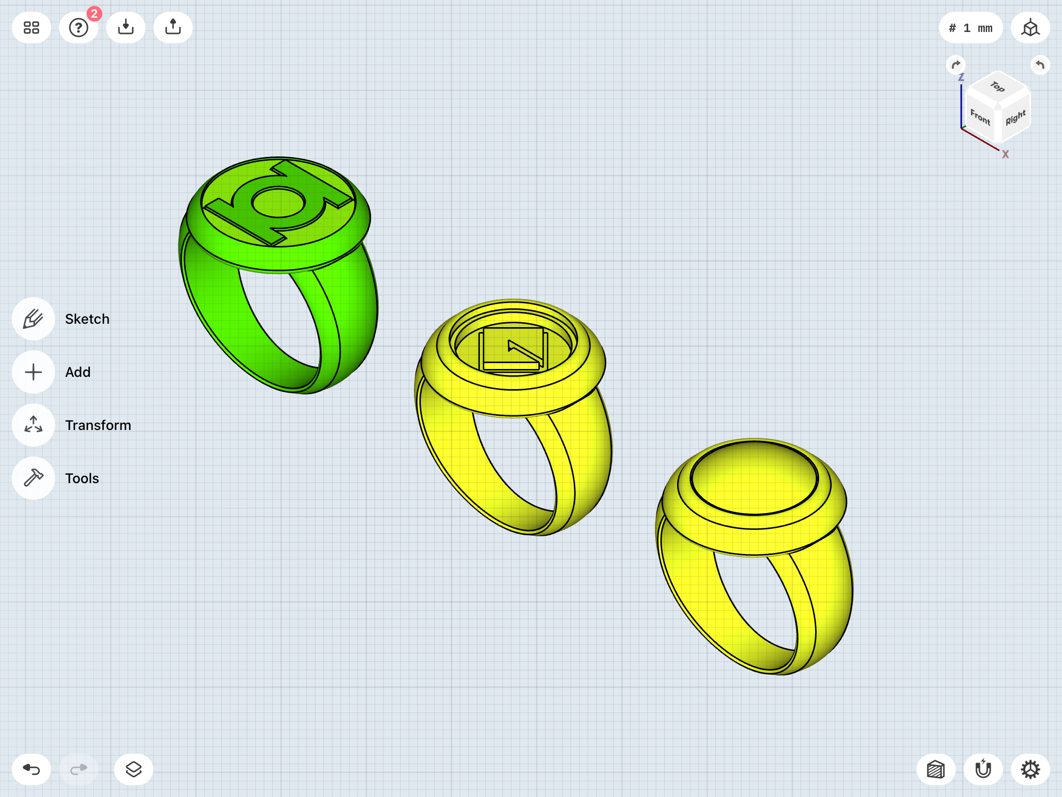
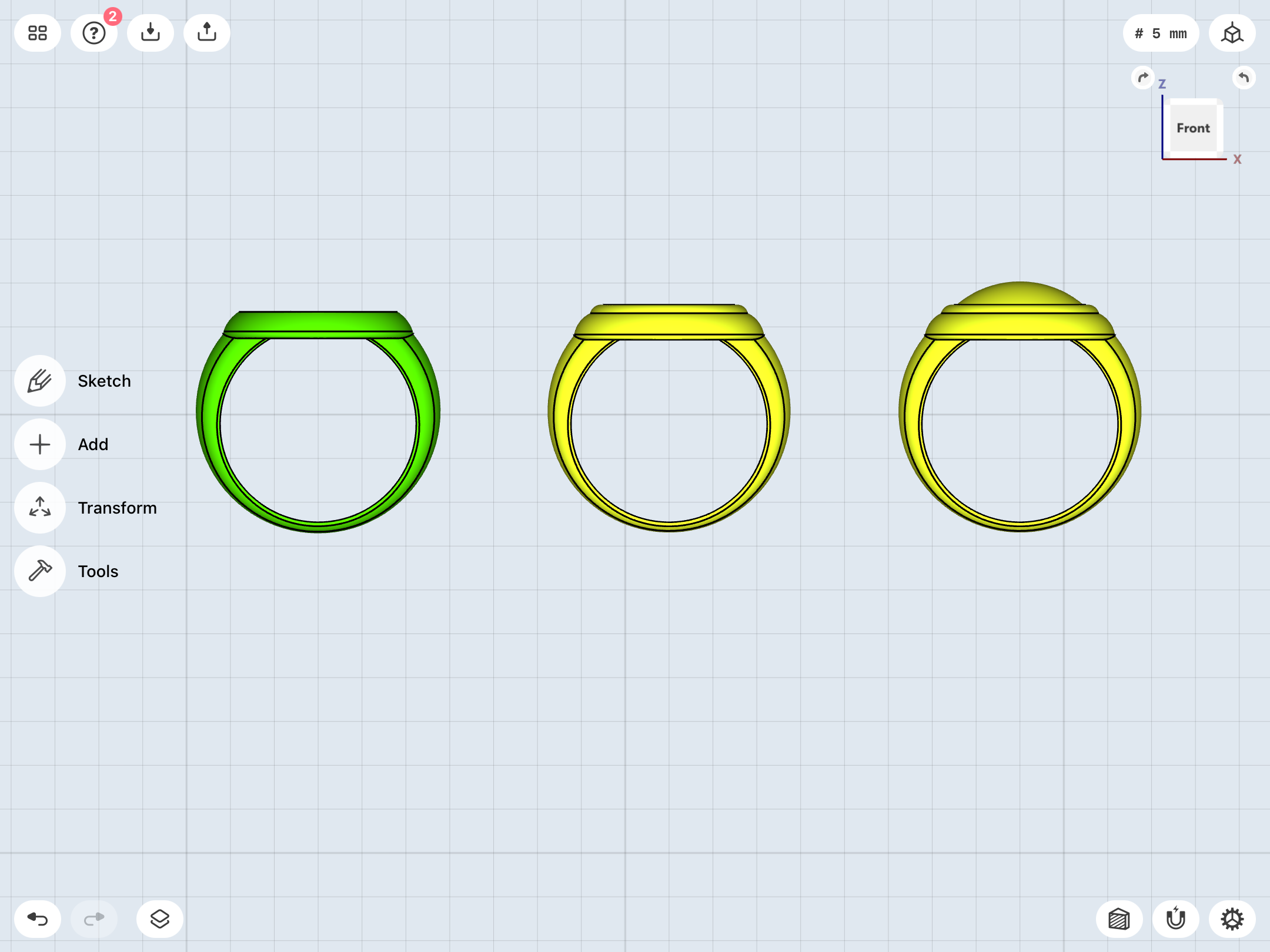
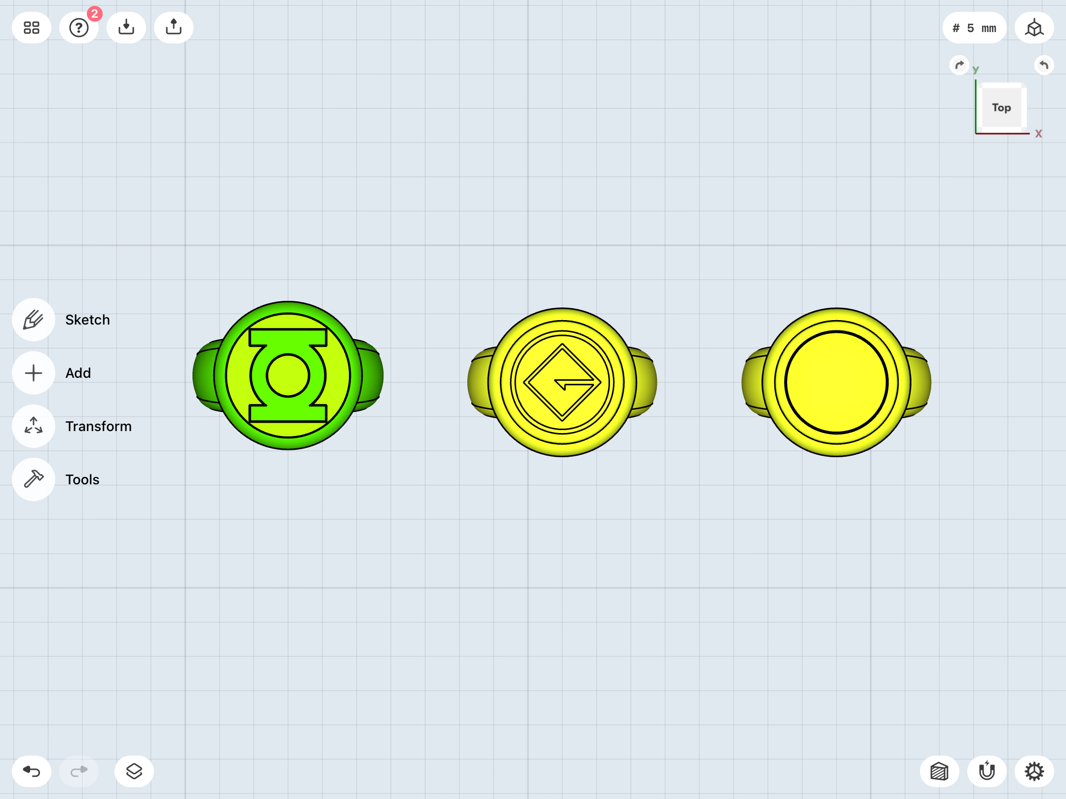
Until now, I’ve been tackling both designs independently. This time, I used my revised EMERALD DAWN ring as a basis for revising the Gardner ring. There is a certain logic to this, since the yellow Sinestro ring was originally designed as an evil copy of the Green Lantern rings. Indeed, the initial Sinestro ring (from GREEN LANTERN Vol. 2 # 9) even had the GL symbol on its face, which is something that Alex Ross later carried over to his version, although that idea was quickly dropped after Sinestro’s early appearances in favor of the generic ring (with a gem) that Gil Kane, Joe Staton, and others subsequently drew. I really need to do an assessment of all the Sinestro designs.
Last edited:
Similar threads
- Replies
- 0
- Views
- 934
- Replies
- 0
- Views
- 503
- Replies
- 2
- Views
- 1,153
