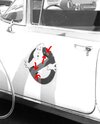
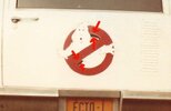
I wanted to share something I’ve been working on. This is the GB logo correct to the Ecto-1 from 1984.
What makes it correct? Not a huge amount! We know the logo itself appeared in slightly altered forms throughout the movie, eg title graphics, overall patches, firehouse sign etc. They’re all a little bit different and the version found on the Ecto-1 is a little bit different again. The most common version of the logo is what you’ll see on just about everything GB related – all of the merchandising, all of the marketing etc since 1984 up to the Ecto seen in GB:Afterlife. That logo is pretty much the “Official” logo.


Here’s the ’84 Ecto-1 version from a screenshot of the movie versus a scan I took from the cover of the Visual History book (the “official” logo). Ignoring the scan artefacts, the major difference is Mooglie’s right hand is shaped differently in the fingers and in the webbing between thumb and forefinger. There are very slight differences in the facial features and some linework. This is the only version of the logo I have seen on the 84 Ecto-1.
Here are some more examples from stills and a screencap from a promotional video:
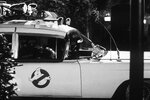

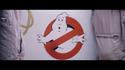
So, with that history lesson over, I present my replication of the ’84 Ecto-1 logo! I haven’t seen this reproduced anywhere else – not even on an enthusiast’s Ecto-1 replica!
First is a scalable vector graphic (attached as a zip file) and a super-duper-hi-res-but-small-file-size png generated from the svg.
png:

The important thing to note about those is that the white of the ghost is a solid white, whereas the white background is actually transparent. If you want a version with a transparent ghost for turning into a decal or whatever, just edit the svg and delete the layer with the ghost.
I hope this is useful to someone. Use it how you wish - the IP of the logo doesn't belong to me. Only the effort put into recreating it is mine, so I hope it doesn't show up on some Etsy store for a fee.
I realise this logo is probably all highly esoteric to a lot of people but it would be cool to see it reproduced on an Ecto-1 model or perhaps even a replica!
What makes it correct? Not a huge amount! We know the logo itself appeared in slightly altered forms throughout the movie, eg title graphics, overall patches, firehouse sign etc. They’re all a little bit different and the version found on the Ecto-1 is a little bit different again. The most common version of the logo is what you’ll see on just about everything GB related – all of the merchandising, all of the marketing etc since 1984 up to the Ecto seen in GB:Afterlife. That logo is pretty much the “Official” logo.


Here’s the ’84 Ecto-1 version from a screenshot of the movie versus a scan I took from the cover of the Visual History book (the “official” logo). Ignoring the scan artefacts, the major difference is Mooglie’s right hand is shaped differently in the fingers and in the webbing between thumb and forefinger. There are very slight differences in the facial features and some linework. This is the only version of the logo I have seen on the 84 Ecto-1.
Here are some more examples from stills and a screencap from a promotional video:


So, with that history lesson over, I present my replication of the ’84 Ecto-1 logo! I haven’t seen this reproduced anywhere else – not even on an enthusiast’s Ecto-1 replica!
First is a scalable vector graphic (attached as a zip file) and a super-duper-hi-res-but-small-file-size png generated from the svg.
png:

The important thing to note about those is that the white of the ghost is a solid white, whereas the white background is actually transparent. If you want a version with a transparent ghost for turning into a decal or whatever, just edit the svg and delete the layer with the ghost.
I hope this is useful to someone. Use it how you wish - the IP of the logo doesn't belong to me. Only the effort put into recreating it is mine, so I hope it doesn't show up on some Etsy store for a fee.
I realise this logo is probably all highly esoteric to a lot of people but it would be cool to see it reproduced on an Ecto-1 model or perhaps even a replica!

