bttf 2 mr fusion artwork for decal..please give your opinion

steveo3002

Sr Member
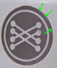
a new rpf member has offered to help make an accurate mr fusion decal , possibly available to purchase if they turn out nice

how does this look to everyone..looks good to me

let me know if you spot any mistakes

MrFusionSTICKERartwork_zpsd9c68de5.jpg
 
Looks great so far. Just four things that I would change:

1) the 4 lines of the logo a little bit thicker
2) the white outline in the circle a little bit thinner
3) the "®" should be larger
4) the two gaps between the words "HOME" and "ENERGY" and the words "ENERGY" and "REACTOR" should be wider. You could just decrease the gaps between the single letters in the words "HOME" and "ENERGY" to get more space between the words.
 
The 'home energy reactor' kerning is fine I think? As is the spacing between the letters (the font is Eurostyle light extended, the genuine one - with 2 spaces as opposed go 1 in between the words) & I originally had the R circle half the size of the N, but changed it because I thought it was too big!

The lines on the inside of the logo, ive made on top of the logo itself so should be there or thereabouts, I think the circle is the same width as the inside lines which I forgot to change :p

Ill change them and re-jpg!
 
Looks great so far. Just four things that I would change:

1) the 4 lines of the logo a little bit thicker
2) the white outline in the circle a little bit thinner
3) the "®" should be larger
4) the two gaps between the words "HOME" and "ENERGY" and the words "ENERGY" and "REACTOR" should be wider. You could just decrease the gaps between the single letters in the words "HOME" and "ENERGY" to get more space between the words.

was hoping you would chime in hehe
 
For Part 1 There is no gray background for the upper logo. It's a hand painted white graphic on the clear window of the Krups Grinder.

-Gary
 
Roland I think you're right matey, think it needs 3 spaces as opposed to 2

- - - Updated - - -

For Part 1 There is no gray background for the upper logo. It's a hand painted white graphic on the clear window of the Krups Grinder.

-Gary

I know mate, was easier to depict the white on the grey
 
For Part 1 There is no gray background for the upper logo. It's a hand painted white graphic on the clear window of the Krups Grinder.

-Gary

I agree, it's white paint on a clear background. But I'm not sure if they did that directly on the window. Look at the screen cap and my green marks. You can see a small gap as if there's a sticker. Couldn't it be that they painted on a transparent sticker just in case they mess it up?

bttf-2-mr-fusion-artwork-decal-please-give-your-opinion-mrfusion_circle.jpg-201933d1372269820


Roland I think you're right matey, think it needs 3 spaces as opposed to 2

I've just checked the size of the letters. I put the "C" of "REACTOR" twice over the "O" in "FUSION". As you can see, the "MR. FUSION" letters are exactly double size of "HOME ENERGY REACTOR". I did the same with your graphic - it's difficult too say, because it's small, but I think the letters of your second line are more than half size of the first line. Maybe if you decrease the letter size to half size of the first line, you will get more space between the three words.

bttf-2-mr-fusion-artwork-decal-please-give-your-opinion-mrfusion_lettersize.png-201934d1372269821
 

Attachments

  • mrfusion_circle.jpg
    mrfusion_circle.jpg
    11.8 KB · Views: 485
  • mrfusion_lettersize.png
    mrfusion_lettersize.png
    7.1 KB · Views: 363
Increasing the spacing between the words with elongate the line, so make the line the same length as the top text in proportion will take it down to 2:1
 
There is a small gap/ledge between the molded plastic of the window and the body. I'm pretty sure that's what you are seeing.

-Gary
 
There is a small gap/ledge between the molded plastic of the window and the body. I'm pretty sure that's what you are seeing.

-Gary


Yes, there's a gap. It's on my Krups too, so you could be right. It's difficult to say. No matter how I turned the window into the light for making this photo, I wasn't able to give it the look of the gap on the screen cap. The gap is much smaller on my Krups.

bttf-2-mr-fusion-artwork-decal-please-give-your-opinion-mrfusion_gap.jpg-201944d1372273371
 

Attachments

  • mrfusion_gap.jpg
    mrfusion_gap.jpg
    48.9 KB · Views: 646
This thread is more than 10 years old.

Your message may be considered spam for the following reasons:

  1. This thread hasn't been active in some time. A new post in this thread might not contribute constructively to this discussion after so long.
If you wish to reply despite these issues, check the box below before replying.
Be aware that malicious compliance may result in more severe penalties.
Back
Top