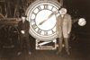
Back to the Future

Oh yeah, still had this lying around ;). It's a high res version of the Clock picture. Better resolution than the pictures from the Profiles in History site.

In fact it's the same picture as seen on the outatime website (this one: http://www.outatime.net/misc/2-6.jpg), but without the watermark... (don't ask me where I got it, just enjoy...)

If someone can make a good frame for it, that would be great!
 

Attachments

  • Doc and Marty 1885 Picture - Sepia.jpg
    Doc and Marty 1885 Picture - Sepia.jpg
    2.2 MB · Views: 360
You can clearly see the digital modifications, where the logo was before, if you take a closer look. ;)
Might be. But I'd have to say I'd prefer this version over yours to be honest (no offence!). The beams and gears seems better "reconstructed" in this one. A bit sharper, and a bit more detail. In fact, I don't really see any digital modifcations in this one (Maybe I'm not watching good enough). I do see them in your version. But If I didn't had this one, yours would defenitely be my favorite! ;)
 
Might be. But I'd have to say I'd prefer this version over yours to be honest (no offence!). The beams and gears seems better "reconstructed" in this one. A bit sharper, and a bit more detail. In fact, I don't really see any digital modifcations in this one (Maybe I'm not watching good enough). I do see them in your version. But If I didn't had this one, yours would defenitely be my favorite! ;)

Unfortunately I have to agree with Tom, Roland. if you have a difference filter on your image editor program you can see it. Tom's better, the sepia is also a bit warmer.
 
It's not a competition. Roland has made some great props here. I think he has definetely made the biggest contributions to this thread, all of great quality!

Back on track now... anybody has some ideas about the fonts for the can label?
 
Unfortunately I have to agree with Tom, Roland. if you have a difference filter on your image editor program you can see it. Tom's better, the sepia is also a bit warmer.

Yes, you're right. The one, that Tom posted, is better than mine. But it's nothing else than a watermark removing. Not that great. ;)

By the way: for my clock frame I will use the Profiles in History image. It has no watermarks that need to be removed and it has a more than adequate quality for a screen accurate frame.
 
It's not a competition. Roland has made some great props here. I think he has definetely made the biggest contributions to this thread, all of great quality!

Back on track now... anybody has some ideas about the fonts for the can label?

I know, it's just a statement, I like the cogs and pillar, which are perfectly aligned and not so obviouly doctored. The only thing that might tarnish the pic would be the slight glare on the face of MJF. I agree Roland has brought a fresh wind into the BTTF section :) ;)

Yes, you're right. The one, that Tom posted, is better than mine. But it's nothing else than a watermark removing. Not that great. ;)

By the way: for my clock frame I will use the Profiles in History image. It has no watermarks that need to be removed and it has a more than adequate quality for a screen accurate frame.
Does somebody of you two know the correct print size of the picture?

BTW: I merged the two of your pics together to get the best out of both - Tom's better pillar and cog part and Roland's non glared face of MJF.


Last edited:
The part of the photo, that is visible in the frame, is 6.69 x 4.15 inch (16.98 x 10.54 cm). But you have to crop the original photo.
Indeed, the posted picture is too big. Or you can say it's the correct size, but part of the photograph will be under the frame. Maybe someone can post a high-res screencap to show what part of the photograph is seen on-screen. (I think I have a screencap of that at home. If nobody posts it, I can do so this evening.)
 
Indeed, the posted picture is too big. Or you can say it's the correct size, but part of the photograph will be under the frame. ...

If you take a closer look at the screen cap, you can clearly see, where's the border of the photo under the passepartout.

... Maybe someone can post a high-res screencap to show what part of the photograph is seen on-screen. (I think I have a screencap of that at home. If nobody posts it, I can do so this evening.)

In the BTTF III thread a HD screen cap of the frame has been already posted.
 
Here you go:
View attachment 88630
*EDIT - Sorry, somehow missed Roland's note about it being in the other thread

I'm sure one of you mad genius' can overlay the high-res photo and work out the exact dimensions.

BTW Roland, once again, keep up the great work. The do-it-yourself Almanac sounds insane (in a good way). Are you sure you can do it?
Why not just buy one from the junkyard?

Also, should we divide the 3 movies back into 3 threads again? Or are we just combining them into this one thread now??
 
Last edited:
... I'm sure one of you mad genius' can overlay the high-res photo and work out the exact dimensions. ...

I already did that. But I don't want to publish it. Not yet. ;) It's for the frame that I'm making for sale. :)


... BTW Roland, once again, keep up the great work. The do-it-yourself Almanac sounds insane (in a good way). Are you sure you can do it?
Why not just buy one from the junkyard?

I already have one of Markpoon's Almanacs.

First reason, why I want to make my own: It's cool to have a professionally printed book, but I'm not happy with the graphical job. The cover has a few inaccuracies and the inside pages are bad scans of copies. I will completely redesign the cover and use the original source for the inside pages.

Second reason: I love it to make people happy with my free stuff. :)


... Also, should we divide the 3 movies back into 3 threads again? Or are we just combining them into this one thread now??

Good idea. There's no reason to have three threads. The paper props from the Harry Potter movies also have only one thread.
 
Roland, glad to here you're still planning to do a run of the frame. I'd be really interested in that one! You were planning to have it in real wood (except the ornaments off course), if I remember correctly, no?
 
Roland, glad to here you're still planning to do a run of the frame. I'd be really interested in that one! You were planning to have it in real wood (except the ornaments off course), if I remember correctly, no?

Yes, real wood and real pewter ornaments. Maybe 1 or 2 month, then it's finished. :)
 
Technically this isn't a paper prop, I just wanted to show you guys what I've done with the Doc & Marty photo (Rolands version, thanks again mate!)
I found an antique style frame at a department store (Big W for anyone in Oz). It's actually one piece molded black plastic. I painted it with a wood grain effect and silvered the ornaments.

View attachment 88688

It's a fraction smaller than what it should be but I shrank the photo a little and made the writing from a screen grab.
Also, I know it's not accurate, but looks good enough to keep me satisfied.

Just thought I'd share to inspire anyone on a budget.
 

Your message may be considered spam for the following reasons:

If you wish to reply despite these issues, check the box below before replying.
Be aware that malicious compliance may result in more severe penalties.
Back
Top