Anti-Shark Spray

Polsnulspace

Sr Member
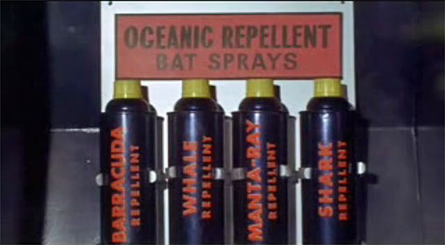
Hi guys!! A friend of mine asked me to look out for one of these chaps on my cyber-travels.......
aaa1.jpg


aaa2.jpg


Has anyone done one of these before or know where I could atleast look next? Any help or pointers would be much appreciated...thanks guys!!!

Paul:)
 
I've never seen this one done before, but it's a great idea. I hope someone can provide a lead. :)
 
There are probably other products that come in the same can, but i got this new can of smooth-on mold release last week, which looks like a match to the can used as a base

moldrelease.jpg
 
Yup, exact match.
FYI, the screen cap on top and the pic on the bottom, the cans aren't the same. The can on the bottom was part of a press kit given away to promote the movie, not the movie prop.
 
Yup, exact match.
FYI, the screen cap on top and the pic on the bottom, the cans aren't the same. The can on the bottom was part of a press kit given away to promote the movie, not the movie prop.

Ahhhhh... I was wondering for a minute what was up with the logo and the "Starlog" font! :lol

-Sarge
 
Can somebody ID that font? The right one.

These would be super easy to make, once the graphic is done.
 
So do we go for the screen used version or the press kit version?
 
I'd go for the screen cap version. The press kit can looks too over-cool with that fancy font and giant red bat from the DVD box.

Without a clearer screen cap to compare it to I'd say that Franklin Gothic Heavy is a pretty good match to the screen can's text.
 
Great finds on the spray cans. :thumbsup

I'd definitely go for the screen-seen version, too. :)

Interesting to note that, in addition to the different paint scheme, font, and point sizes, the text on the press kit version says "repellant" (with an "a") while the screen-seen version uses "repellent" (with an "e"). Both are correct, but "repellent" is much more common.
 
I agree. It does look like Futura.
Also, any guesses on how the lettering was applied? At first I thought they just covered the sides of the cans with a large "sticker" of sorts that wrapped around the entire can. Now I'm thinking the spray painted the entire can black and the red letter are (I'm guessing) vinyl lettering, though this seems like a lot of work. My reason for thinking this is take a look at the color black around the can and then on top of the can around the lid. The color black looks to be identical.

As my girlfriend looks over my shoulder, she's laughing and rolling her eyes.
"Seriously??? Are you guys going to research THIS piece to death? I mean, THIS?"
:lol
 
Unlikely to be vinyl letters in 60's. Not to say we couldn't do them that way now.

Not Futura. The A has a flat top. Futura doesn't have that. The Franklin Gothic is real close but I only have the Medium. If I had Heavy that might do it.
 
Last edited:
Guys, thank you so much for the interest and input.......I'll watch this thread with a keen eye and keep my friend informed!!:cool:thumbsup
 
Back
Top