A New Look for the RPF!

Why can't the tagline just be "Replica Prop Forum"?

If you are brand new to the site, you will have no idea what RPF stands for, since it does not say it anywhere in the logo and header. The way the current site is, and looking at meta data, "The Replica Prop Forum" text is not noticeably present anywhere. I'm sure this was done with reason (maybe leftover from the hack), but instead of skirting around the fact and hiding it, I say embrace the name.
 
The more I experiment with the new logo, the more I like trying to find textures to overlay on it. The clean, graphical nature lends itself well to various textures as well as colors.

attachment.php


There are endless possibilities.

-Nick


Damn nick that is awesome.


.
 
Why can't the tagline just be "Replica Prop Forum"?

If you are brand new to the site, you will have no idea what RPF stands for, since it does not say it anywhere in the logo and header. The way the current site is, and looking at meta data, "The Replica Prop Forum" text is not noticeably present anywhere. I'm sure this was done with reason (maybe leftover from the hack), but instead of skirting around the fact and hiding it, I say embrace the name.

As Art has said in the past already, the full name was left behind intentionally several years ago. This is The RPF.
 
Interesting, mine says "the RPF" :lol

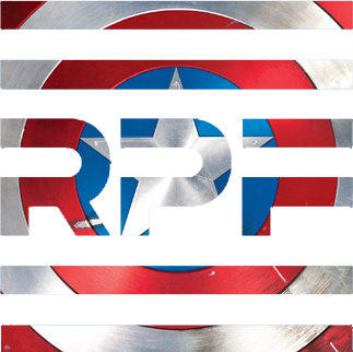
Thought I would lend my hand at this... Nick is absolutely right regarding texture. The logo takes it very well. It however doesn't do straight pictures/backgrounds well... At least not completely. Here, the "RPF" gets lost in my mind

RPF-Cap.png
 
you know I can see a animated version of this where you are going down the trench run like in Star Wars, at the end fly out to an overhead view of the entire logo.


The more I experiment with the new logo, the more I like trying to find textures to overlay on it. The clean, graphical nature lends itself well to various textures as well as colors.

attachment.php


There are endless possibilities.

-Nick
 
And here is the Matrix version of the logo. Give it a little time to load - it's an animated GIF (930 kb). :)

attachment.php
 

You're right, images don't work...I already tried to make a logo with Chubbs overlaid. :lol (Don't worry, Art, the experiment was a failure)

But textures from images do. I used a shot of the cap shield, and basically unrolled it as much as possible to pull out the textures. I've attached the result. I think it looks pretty cool, if you ask me.

-Nick
 
I'm not sure if Art touched in it yet on why not the Replica Prop Forum? But I can see several reasons. We aren't just about replica stuff. There is a lot of screen used goodies on here as well as some just completely custom things "inspired" by and not actually in a movie, TV show, video game etc. Also there are a lot more than just props on here too! There are models, costumes, etc. So as with some of the other tag lines suggested, Replica Prop Forum tends to box us into just replicas of props.
 
You're right, images don't work...I already tried to make a logo with Chubbs overlaid. :lol (Don't worry, Art, the experiment was a failure)

But textures from images do. I used a shot of the cap shield, and basically unrolled it as much as possible to pull out the textures. I've attached the result. I think it looks pretty cool, if you ask me.

-Nick


That Captain America treatment is VERY cool!
 
I'm not sure if Art touched in it yet on why not the Replica Prop Forum? But I can see several reasons. We aren't just about replica stuff. There is a lot of screen used goodies on here as well as some just completely custom things "inspired" by and not actually in a movie, TV show, video game etc. Also there are a lot more than just props on here too! There are models, costumes, etc. So as with some of the other tag lines suggested, Replica Prop Forum tends to box us into just replicas of props.

I agree and the forum seems to have evolved quite a bit over the years from what I've read.
 
Whoa...you keep topping yourself Roland. Thanks for doing that Matrix version, looks so freaking cool in motion. Hopefully we can have a static version for wallpaper as well.

The Cap shield colors looks great Nick. If monthly contests for RPF logo themes are ever held from next year, you guys would already be at the top of your game.
 
Whoa...you keep topping yourself Roland. Thanks for doing that Matrix version, looks so freaking cool in motion. ...

Thanks, Vivek. To be honest: the Matrix animation itself is found on the Internet. I just put the new logo over it. ;)
 
Back
Top