A nice prints.. I hope its cool if I can give a few tips.
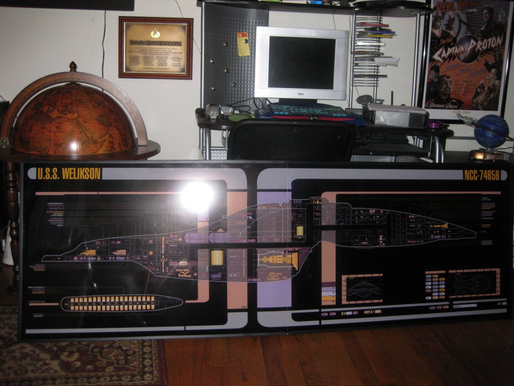
1. The frame..If I was you, I would try to get one large clear plex. You can see a ling in the middle of the graphic. (It Takes way from your work)
2.) I have done a few backlits, and I did the same mistake that is in this graphics. I would leave some black space around the graphic. The graphiclooks boxed in..Trust me I did that for a backlit and was not happy, I had to get it redone.. I would double the space around the graphic.
3.) I would thicken the line around the ship.
4.) colors.. I am not sure if its the photo, but some of the colors seem off. I did this msd of the prototype of Voyager and used a print By Rick S to match up the colors.
Again A nice print.