You are using an out of date browser. It may not display this or other websites correctly.
You should upgrade or use an alternative browser.
You should upgrade or use an alternative browser.
Silent Running - Valley Forge Cargo Module Logos
- Thread starter lunadude
- Start date
lunadude
Well-Known Member
lunadude
Well-Known Member
Got an update. I contacted Spacelabs Healthcare. They were known as Spacelabs Inc. back in the '60s and '70s. They sent me some images, and the logo's fonts are all over the place.


Last edited:
DigiGal
Active Member
I'm tracking down all the logos used on the cargo modules from Silent Running. The film was made using studio money and donated services and materials (in exchange for brand placement in the film).
And here are the ones that have eluded me. Naturally I'm looking to match fonts and colors, but some are too blurry to even make out.
View attachment 596941
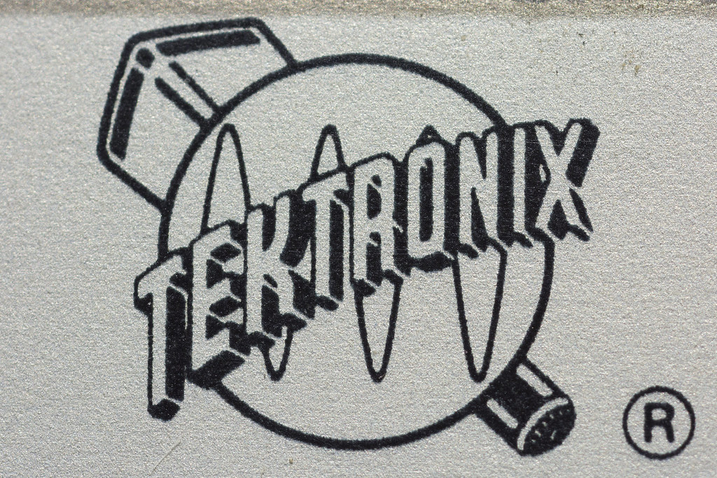
Here's one of your missing fuzzy's (Tektronix)...

There were variations, this one on a piece of equipment is a closer match.

Last edited:
lunadude
Well-Known Member
Here's one of your fuzzy's...
http://www.chiark.greenend.org.uk/scopes/images/teklogo.jpg
There were variations, this one on a piece of equipment is a closer match.
https://c1.staticflickr.com/1/733/20610996401_382ce8d0e9_b.jpg
HOLY CARP!! Nice. Thank you DigiGal!
This was the closest I was able to get.

DigiGal
Active Member
You are welcome, glad to help! I have an old Tektronix 'scope cart that has the logo on it so I see it every day and it jumped right out at me from the blurry picture. So 23 of the 24 are identified, should make it easier to find the last one.
p.s.: I'd be interested in buying a Tektronix one from you if you make an extra, please lmk.
p.s.: I'd be interested in buying a Tektronix one from you if you make an extra, please lmk.
DigiGal
Active Member
After enlarging your capture, the graphic looks more like a woman's face/head rather than a man's but still wearing a corn cob hat or maybe it's just curls but I'm thinking it's an agriculture related industry.
douglastrumbell.com gives a gmail address that may reach him directly but it might be filtered through his website representative. I'm guessing he'd remember and would be willing to provide you with the info and he'd probably be flattered by your reproduction of these.
Were your captures taken from a blu ray or DVD?
If these are physical models, I'm seriously interested in purchasing one from you if possible.
BTW, I recently discovered the font used on the "Geosylva Telopor" triangle is NOT Futura as most people think... it is in fact "Souvenir."


lunadude
Well-Known Member
True that the logo has Futura on the version on the miniature where the camera pulls away from Lowell in the window. But on the cargo pods, it's Souvenir. Note the thicks and thins.


Blurred to simulate the video image, the serifs start to get lost.


Blurred to simulate the video image, the serifs start to get lost.

Last edited:


