Doc Brown's 2015 Red Chinese Shirt

Indy Magnoli

Master Member
RPF PREMIUM MEMBER
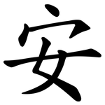
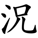
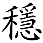
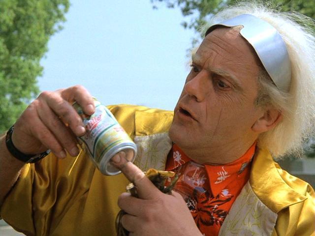
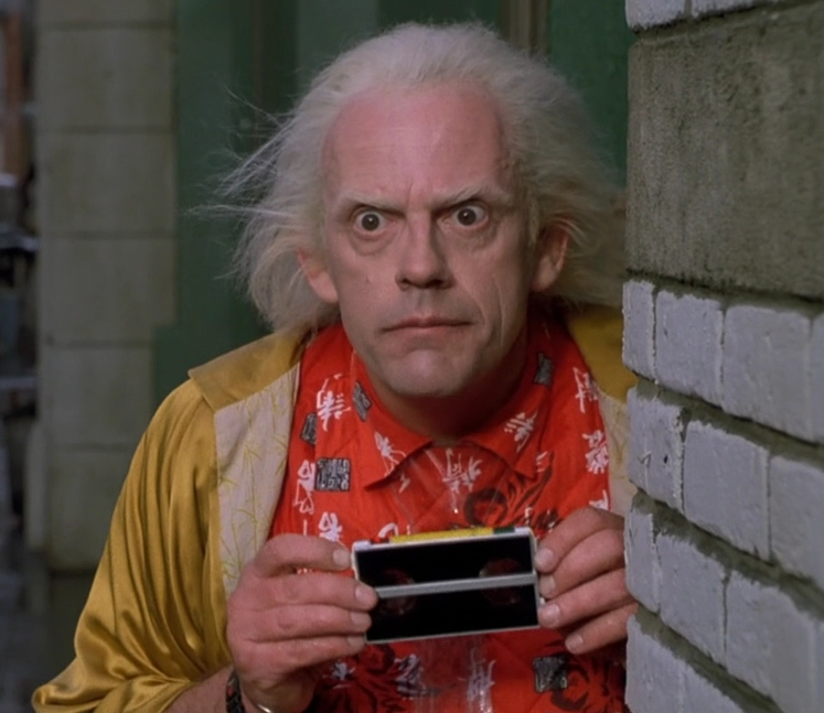
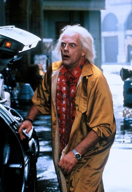
I'm trying to reproduce the designs on Doc's red 2015 shirt:

docbrown2011_02.jpg


The photo above is from the recent ads, but the costume seems original (as discussed elsewhere: http://www.therpf.com/f24/back-future-doc-brown-126432/).

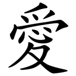
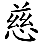
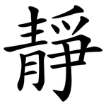
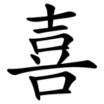
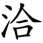
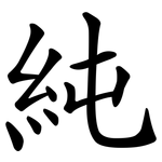
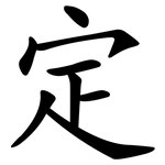
In any case, I was able to isolate some of the characters on the shirt, one of which is Chinese for Love:

doc-love_zps1492217e.jpg


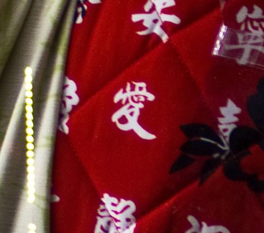
I found the identical character (meaning, the exact same image/font/whatever) on this page: http://earlywomenmasters.net/tao/ch_10.html:

love_ai.png


There must be a font somewhere with all of these characters as I've found this image pop up on a few other websites, but no one sources their origin.

If anyone is interested in helping recreate this, let me know. I'll be making one shirt for a customer, after which I can offer these to anyone else interested.

Kind regards,
Magnoli
 
Here's a font file (in my attached ZIP file). I'm too lazy to search for the exact symbols from Doc's shirt, but the style of the symbols seems to be exactly the same. Good luck! ;)
 
Super, thanks! Do you have the HDZB_25 font? I think that might be the one used in the black squares.

Kind regards,
Magnoli
 
Well... I just went through the font and couldn't find a single character from Doc's shirt. It's a needle-in-a-haystack scenario when you don't know Chinese, so I've sent this to a couple of friends, one of which is a native of China. Maybe we'll get lucky. If anyone would like to join the search, let me know and I can send you some high-res shots of the characters we're looking for...
 
in the columns it has repeat every 5 characters. As in the row, I counted 7 and still not repeating. Therefore at least 35 characters.
Not including randomly placed other characters with black outline.

I wonder where the buttons are, probably at the back.
Or this was just front half of the shirt
 
Love 愛
_kai.png

friend, in this case friendship 友
_kai.png

good/well 好
_kai.png

serenity 寜
_kai.png

tranquil 安
_kai.png

kind/benevolent/charitable 慈
_kai.png

I guess this 況 is condition/situation as far as I can read the calligraphy
_kai.png

stable/solid/firm/steady 穩 (or other writing "simpler" variation 稳)
_kai.png

quiet/still/motionless/gentle 静
_kai.png

be happy/happiness 喜
_kai.png


These are what I can read so far. I gotta see the lower shirt part in a better resolution, there are other words I see not listed here.

EDIT: adding new logograms
be in harmony 洽
_kai.png

This is a guess, but would make sense: pure/clean/simple 純
_kai.png

decide/settle/fix 定
_kai.png


There are still at least 2-3 missing words I can't read because of the low resolution, I have to identify them, how the words are composited.
 
Last edited:
Searching for the words that YenChih Lin listed, I found the following images. They are all from the same font, but only a few of them matches the characters on the shirt exactly. I found it on www.cinske-znaky.cz. Tell me if you need it as vectorized graphics!

attachment.php


attachment.php


attachment.php


attachment.php


attachment.php


attachment.php


attachment.php


attachment.php


attachment.php


attachment.php


attachment.php


attachment.php


attachment.php
 
Damn! There's not bigger picture of Doc's shirt and some fonts don't comply to CJK standard under Ubuntu, so I have the clerical font but can't apply on inkscape :angry
 
Last edited:
Interesting… the shirt of the commercial is different than from the movie, the word on his left collar is different, the words are diffrent, even the black/white chinese seal is a different one. It seems that the pattern is much more plastered with the seals.
Back-to-the-Future-back-to-the-future-8229441-640-480.jpg

Docholdingbinocularcard.PNG

Doc-BRown-back-to-the-future-23823055-530-768.jpg


Seems the 2011 shirt has been re-tailored from scratch in the style of the 1989 shirt. The quilting of the '89 isn't as heavy as the '12.

Supplemental: There are two different seals on the 2012 shirt as opposed to the '89, which seems to have only one kind of seal as far as I can tell.

Supplemental 2: The writing style is also different, not a clerical style but a calligraphy style.

Supplemental 3: The words are mostly upside down in the 89 shirt. The '12 shirt must be made by someone, who at least know what to do.
 
Last edited:
Great work guys! That last shot shows the front flap closure, so at least I know how it is constructed. What about the Flower designs? Anyone want to tackle that?

-Magnoli
 
Great work guys! That last shot shows the front flap closure, so at least I know how it is constructed. What about the Flower designs? Anyone want to tackle that?

-Magnoli


I made my own a few months ago.
And here is the drawing for the flower that i used (huge picture :
blomma.jpg
These are the symbols that i was able to find on the shirt
mrken.jpg

48060392.jpg


Mine on the left , real on the right
36200323.jpg


I guess you have this picture ?:
tiny1.jpg


I made stamps from hobby foam:
65805666.jpg


dsc03276g.jpg
 
Last edited:
Great work guys! That last shot shows the front flap closure, so at least I know how it is constructed. What about the Flower designs? Anyone want to tackle that?

-Magnoli

Should this be a reproduction of the screen used shirt or the 2011 replica? The flowers are different on both shirts.
 
This thread is more than 10 years old.

Your message may be considered spam for the following reasons:

  1. This thread hasn't been active in some time. A new post in this thread might not contribute constructively to this discussion after so long.
If you wish to reply despite these issues, check the box below before replying.
Be aware that malicious compliance may result in more severe penalties.
Back
Top