Retro JJPrise

Aztek Dummy

Well-Known Member
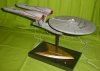
I've always had the opinion that with a few tweaks the new Enterprise design would have been more accepted

so I took a new Enterprise kit and painted and lit it in the classic colors

I'm happy to say this will be featured in the next volume (32) of Sci-fi and Fantasy Modeller, but I've been permitted to post this sneak peek

Enjoy
 

Attachments

  • webshot.jpg
    webshot.jpg
    154.5 KB · Views: 2,834
This is very nice indeed. I never really connected with the look of the new enterprise but this would have been a good direction for jj to have gone its new but familiar at the same time. Nice work.
 
The colours and signage are much nicer, and make a much bigger difference than I'd have expected... but nothing will ever detract from those oversized nacelles.
 
That design looks like it was meant to be gray from the start. I didn't notice how oversized the nacelles were until you guys mentioned it.
 
The nacelles don't bother me. The thing that gets me is the weird contours of the secondary hull.

I really do like these colors though. I don't think the color of the official one is bad, but I definitely like this take.

--Alex
 
Very nice work as it blends things together quite well. Its almost like seeing a new Dodge Challenger done in retro style paint. The subtle aztec work on the saucer complete with the "rust ring" is also a nice touch. Only thing I might see to add would be the yellow starfleet "boomerangs" to the straight stripes on the nacelles. They seem kind of naked without them. I also like the orange/amber coloring of the bussards.
 
Jay,
that bugged me too. to put that stripe up where it should have gone would have had it overlapping the hood. I wanted to put the yellow "boomerang" there but it would have been too crowded. I tried a couple configurations before I realized I had to leave it off. as it was I had to go with the numbers above the red pennant rather than thru the middle. it was an unfortunate compromise
 
To be honest the main thing that bugs me about the JJprise isn't the nacelles, it's the neck. The anorexic body might look alright if the next wasn't so squat. Anyway you've done a great job, I really really like it!
 
Aztek Dummy, that is very nice! Actually it could have worked in the movie, I think maybe better than the excesive cleanliness of the actual JJprise... is kind of bland for my taste. I get that they were aiming for a hybrid between the TOS and the refit, but at the end it looks like a flying iMac... too white for my taste.

Your repainting bring back some of that warm and cheerful quality that the TOS Enterprise have, but at the same time does not look too cartoony... I think that the red striping in the top part of the nacelles may be a little too much, but looks good anyway...

Could you please post more pictures from other angles?

Cheers!
 
Okay, I see your point on the stripes. In any event, this looks A LOT better than I was expecting it to. Now you have me tempted to perhaps do one in TNG/DS9 style duck egg and azure blue colorings, complete with the yellow DS9/Voyager style starfleet arrowheads on it (which I prefer to the TNG white ones with the ellipse underneath). This is certainly what makes model building fun, the ability to take what you've got and build/paint it as you see fit.
 
This thread is more than 9 years old.

Your message may be considered spam for the following reasons:

  1. This thread hasn't been active in some time. A new post in this thread might not contribute constructively to this discussion after so long.
If you wish to reply despite these issues, check the box below before replying.
Be aware that malicious compliance may result in more severe penalties.
Back
Top