"BATA" HLMF / HRMF Decals 90% done (95% hasbro parts HRMF build)

All I can say is ,... AWESOME!!!

This is ONE of the ONLY times in my ad career were "DESIGNING BY COMITY" has actually paid off.

Great job everyone involved!

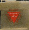
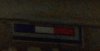
I'm going through the posts organizing the corrections for text and graphics per Decal.

Any decal that we still are unsure of on some part of it I will do the known corrections showing the parts still in question in Magenta text or outlined graphic in Magenta.

As my paying job limits my time to some extent, I'm thinking some time next week (2/17-21/15) I will try and post a revision sheet of JUST the corrected decals.

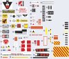
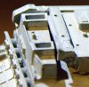
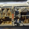
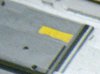
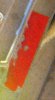
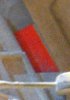
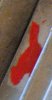
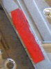
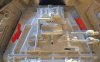
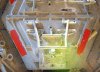
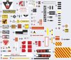
I'm currently working on the "were do the decals go?" graphic, which will be most likely a photo top / bottom / quarter panel style. I'm thinking of using PhotoShop to drop the decals into position as flat no# graphics using the Hasbro Legacy Falcon as the comp test bed. (I have a slightly modified non decal version ,.. soo) example below:

LHMLF_08.jpgLHMLF_08b.jpgLHMLF_08d.jpgLHMLF_08g.jpgLHMLF_08h.jpgLHMLF_08i.jpgLHMLF_08j.jpg

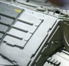
And yes I know the cockpit tube and cockpit are WWAAYY out of scale.:) I think for an FPO (for position only) were the decals go, this will work for now.

I know the 5ft does NOT match for position of MOST of the decals but it seems to be what a large no# of falcon builds incorporate as most of the Hasbro falcons use more of the 32 features.


Again,.. THANKS for all your input:)

Best regards,
 
I think I have found what is needed over in the Studio Scale section, using a search parameter of "Millennium Falcon pictures" - believe it or not!
http://www.therpf.com/f10/star-wars...sandcrawler-208673/?highlight=Falcon+pictures
Huge collection of 5 footer hi-rez images from a 2013 Indianapolis exhibit... I expect this will be a primary resource for resolving any decal mysteries!
R/ Robert

Robert,

THIS was / is the reference I used to start with. I got about 2/3rds of the way through pulling reference and had to stop when my eye decided that enough.:)

LOTS of really good shots.


Thanks for all your work by the way!
 
Hey, retiredadguy, glad to help! I can say personally I am enjoying the "hunt" & I too am glad it is a group effort. If I understand correctly, you want to use images of the Hasbro vice the 5 footer as a placements map? Also, if you could simply number the designs, it will help with referencing and reduce confusion. I'd also recommend applying a 'version number' to your "sheet" as we go along, so we can not only see where we're at but also see what came before. I plan on putting the data into a spreadsheet linking the sheet designs with Stephen's image files (by name) so I can quickly find things later. Perhaps your listing can serve to leverage that effort as well.

Ideally, we would use the original 5 footer as the baseline and then builders can 'interpret' locations as they wish when 'mixing' with the 32" version & other variations, including the HasBro model. However, coming up with such views of the studio model would be tricky (though we might find someone has build a SS MF of the 5 footer?) However! There is a finely scaled set of plans of the "core" MF in the SS forum that could be used as the basis for a scale placement map. Plus, in the course of measuring the relative sizes using the images (once we're ready to move to that stage), we can also establish pretty precise location measures.

But whatever we do, I am glad to assist you (since it helps us all, eh?)
Regards, Robert
 
News! I found several of the decals are from the Fruehauf trailer kit from AMT; a review over on Britmodeler forum has an image of the kit decal sheet showing the Pennsylvanio & Kansas state stickers, the prorate tax plates and also what I think are the below graphics (of a Fruehauf logo & yellow sticker) from the underside of the starboard mandible (beneath the 'Rescue arrow group') visible in Stephen's file [2333_SWI_9846.jpg]:
Update - The Fruefhauf logos on the current Round 2 reissue don't match the one in the image; the "F" is larger than the remainder of the name on the kit sheet. However, I'm pretty sure the red & white graphic is 'FRUEFHAUF' and not 'freightliner' (too long...)
UPDATE: Numbered these 61 & 62 respectively on the spreadsheet.
 

Attachments

  • fruehauf logo.jpg
    fruehauf logo.jpg
    61.9 KB · Views: 121
  • fruehauf trailer sticker under mandible.jpg
    fruehauf trailer sticker under mandible.jpg
    39.5 KB · Views: 121
Last edited:
An example of the numbered sheet might look like this:

Regards, Robert
Update: I've put together a spreadsheet to keep track of the decals. Message me your email if you want a copy.
 

Attachments

  • HLMF_Decal_1b_numbered.jpg
    HLMF_Decal_1b_numbered.jpg
    429.3 KB · Views: 2,465
Last edited:
Oh,.. there's only a couple decals on the Falcon right? What?? You mean there are more than 75 and counting different decals?,.. BINGO!

I'm really liking the fact that you (every one involved) are finding NEW Falcon decals! Head shake,... as I'm surprised THIS apparently hasn't been done yet.

I'm starting on the REV A. version of WHERE they all go using my as issued "MARK 1 eyeball" and your reference photos along with my photos.

It's faster than using measurement at this point and can be adjusted as needed later.

as I've said before,.. awesome job!! Looking to do a really accurate decal package (sheets, at least 4 - 8x10.5 at this point:))

Thks!

Best regards
 
EM, here a bit for the ejection seat triangle (image 8) that shows the verbiage in the center as "EJECTION SEAT / & / CANOPY"
Also, a nice clear image of no. 3 (the KANSAS sticker...
R/ Robert
 

Attachments

  • No_3.JPG
    No_3.JPG
    65.8 KB · Views: 117
  • No_8.JPG
    No_8.JPG
    107.3 KB · Views: 117
EM, another update - for image no. 80; should be the numbers "302041"; this is appears to be in the same font and colors as image no. 25 already on the sheet. Also, Image 25 should be changed to read " 3020" to match the numbers on the Dish base. Obviously (duh! just figured this out) these are the same thing, just one was trimmed... included locator views as well.
R/ Robert
 

Attachments

  • no_25.jpg
    no_25.jpg
    63.2 KB · Views: 138
  • no_25_locator.jpg
    no_25_locator.jpg
    115 KB · Views: 152
  • no_80.jpg
    no_80.jpg
    23.6 KB · Views: 134
  • no_80_locator.jpg
    no_80_locator.jpg
    90.9 KB · Views: 176
EM, update for image no 36: the blocks are skewed parallelograms, not squared rectangles.
R/ Robert
 

Attachments

  • no_36.jpg
    no_36.jpg
    199.3 KB · Views: 123
  • no_36_locator.jpg
    no_36_locator.jpg
    112.7 KB · Views: 143
EM, image #10 should have no text and be outlined with a thin black line:
R/ Robert
 

Attachments

  • no_10_locator.jpg
    no_10_locator.jpg
    69.4 KB · Views: 132
  • no_10.jpg
    no_10.jpg
    62.2 KB · Views: 131
EM, another update for new decal, #82 on spreadsheet (I will send you updated version tonight...); white character string on deep blue background as in Euro style license plate. Has left end trimmed with a bit of white showing followed by "INH-123". Top of decal above the 'I' missing, makes it appear to have a horizontal member but it is just the background paint.
 

Attachments

  • no_82.jpg
    no_82.jpg
    80.8 KB · Views: 122
  • no_82_locator.jpg
    no_82_locator.jpg
    117.9 KB · Views: 128
EM, now for #51, the yellow 'bar'; one instance confirmed on the fwd wall of the port docking port tunnel;
 

Attachments

  • no_51.jpg
    no_51.jpg
    99.8 KB · Views: 123
  • no_51_locator.jpg
    no_51_locator.jpg
    95.5 KB · Views: 133
These are being included as separate decals because they are are all unique (pretty much) given the tattering they exhibit. The red stripes on the port docking port (DP) starting with the bottom left one then clockwise order: #83 (lower left), #84 (upper left), #85 (upper right), #86 (lower right). Sorry about being obvious, but trying to stay consistent on the treatment of these features (except the little gray blocks everywhere - therein lies madness!)
R/ Robert
 

Attachments

  • no_86.jpg
    no_86.jpg
    269.8 KB · Views: 107
  • no_85.jpg
    no_85.jpg
    176.7 KB · Views: 112
  • no_84.jpg
    no_84.jpg
    226.7 KB · Views: 112
  • no_83.jpg
    no_83.jpg
    396.7 KB · Views: 106
  • no_84_85_locator.jpg
    no_84_85_locator.jpg
    83.3 KB · Views: 139
  • no_83_86_locator.jpg
    no_83_86_locator.jpg
    100.9 KB · Views: 141
Re: "BATA" HLMF / HRMF Decals 90% done (95% hasbro parts HRMF build)

EM, good progress! Thanks very much. To continue with the peer review, I offer the following comments with an updated 'numbered' graphic listing (calling it "2B" for 2nd BETA) for reference:
I like your interpretation of the red smudges on #23 - perfect for the antenna dish. And your "Pennsylvania" tax sticker is awesome. I found a review of the AMT trailer kit over on Britmodeller forum and have asked the author if he can provide a higher rez scan of the decal sheet (because several of the needed designs were on it...) but I think you have far exceeded the detail of the original. I did find another kit that used the same 'tax' sticker decals, which would explain how some look yellow and the one looks reddish.
Some corrections / tweaks -
#1: Nicely done but doesn't have the offset triangle like the original. If you include it, simply slide the triangle and 'Danger' array to the left so the right point is almost in line with the border of the white shield.
#13: The "O" should be a "D", a very squarish character and the "C" is an "E". Also, the background color is white, not gray.
#16: The 'dots' should be reduced by about 1/3 in diameter.
#18: The word 'handle' uses my favorite mistyped spelling; the "L" is out of place. Also, the word 'RESCUE' could probably be a bit more bold?
#29: The text spacing appears too tall; the design should be 'tighter' in the vertical dimension
#67: Turns out to not be "CORN" but "CONN." for Connecticut. Also, the "3" should be a closed up on the "69" so it doesn't look cutoff.

UPDATE: the numbers are "5 - 69" based on the found decal on the Amt Peterbuilt Cabover Long Haul kit sheet. (see below) This is probably the same sticker used for numbers 62 & 63 in the listing.

#82: The "T" should be an "I". It might have been a "T" but that portion of the decal is missing (flaked off) so can only confirm the vertical. Judgement call... The leading white area appeared to have a curve or bulge to it making it twice as thick as the letters' stroke width.

I hope this isn't too "anal retentive" for this effort. Just let me know if I need to back off at all... but talk about accuracy! Great team effort.
Regards, Robert
 

Attachments

  • HLMF_Decal_2b_numbered.jpg
    HLMF_Decal_2b_numbered.jpg
    467.5 KB · Views: 232
  • no_67_confirmed.jpg
    no_67_confirmed.jpg
    4.4 KB · Views: 511
Last edited:
EM, I know you are working on the rectangular 'grid buttons' like the single below which is part of #16. I just noticed that the small design at the top (the diamond on the "sheet") is actually a tiny 'Star & Bar" US insignia, in gray tones.
 

Attachments

  • red warning.jpg
    red warning.jpg
    308.6 KB · Views: 124
Re: "BATA" HLMF / HRMF Decals 90% done (95% hasbro parts HRMF build)

Robert,

Not too "A T" at all.

As I've stated, when doing commercial art for a living one rule I have alway's TRIED to apply is,..." sucks do it over" to all my work.

Deadlines allowing revisions as time allowed. As THIS project has no "deadline" the goal is to be as accurate as is practically possible, bering in mind font restrictions
(my licensed font collection) AND printing. Some art fills too much when printed REALY small and has to be adjusted accordingly. (Cummins Power is a good example)

When I'm creating the torn or scuffed decals I'm going to default to a pristine first rendition. Adding the weathering at a later point in the design process is MUCH easier.

I'm planning on two versions for any of the decals that are illegible (example 26, the spot between the gray balls looks like scraped off text to me) through weathering ect, one clean version and one weathered version allowing the end user the option as to which one they use.

Also keep in mind when it's all said and done, SOME of the decals will be more "kinda sorta close" due to the above mentioned restrictions.

More eye's are better!:cool


ps. Concerning the 13, my reference looks like a "C" not a "D" but,.. crappy reference,..so you might be correct,.. Decal_LFM_18.jpgSCEN_?logo.jpg revision cSDEN_logo.jpg I'm trying to avoid using white decal paper, there are only a few decals that would require it hence a light gray, you need some tint when using clear decal sheets, considering the Falcon it self is mostly some variation of white.

Typo's. I have a slight dyslexia when typing for some reason. Looks normal when I read it and when I think it to type it,..just comes out bas ackwards.:facepalm
 
Last edited:
EM, we're on the same page, mate! RE: image #13, see my post #27 for a closeup showing the text very clearly (click to open the thumbnail, then click again to view original size image file...) even such that JPCO eyeballed what I thought originally was an "O" but really is a "D" (delta). Based on this, I have been searching for logos and such that end in "SDEN" - like "MARSDEN" - but no luck so far. There does seem to be a Marsden racing group, but it appears to be boats... doesn't really matter since we do have a nice clear image of the design to draw from...

RE: white, I follow you. However, I had a thought. Mark Tutton at 'Starfighter Decals' might be a vendor who could take the artwork and turn it into full color screen printed decals. His product line works a niche market and this may actually be a perfect fit for him. He would know all the 'ins & outs' of working with licensed properties, and since this is, in effect, a production of original images not directly related to the Star Wars line, he could market the sheet under a name like "Starship Decal Detailing Set for Hasbro toy #umptey squat" and avoid any conflicts. Lucasarts don't have any ownership of these designs since they were 'gleaned' from kit decal sheets and since you are redrawing the artwork by hand (as in not directly from scanned images) there cannot be any claim to what we're doing here. I will be seeing him at the Old Dominion Open model show in Richmond on the 28th, and so discuss with him his production thresholds & cost numbers (I'm not willing to pay $50 a sheet, so must be a reasonable price point or they won't move...)

I have some experience with this process as our local IPMS Chapter has put on several National Conventions over the years, each with its own original 'souvenir' decal sheet for the attendees. In fact, Mark did our last one this past August (it is actually available through his website...)

Just wondering, can you open / import SVG files from OpenOffice DRAW in your graphics tool? I may be able to assist with some of the artwork if you wish & our tools are compatible. For example, the zillion little 'rectangular grid buttons' that keep showing up everywhere. Just let me know, we can do a test...

Regards, Robert
 
Last edited:
This has been very interesting. Funny how more than 95% of these decals are not evident in the movies. Thank God because identifying a decal as saying "Champion" or "Cummins" would have killed the "reality" of the Star Wars Universe. They used them more as greeblies.
 

Your message may be considered spam for the following reasons:

If you wish to reply despite these issues, check the box below before replying.
Be aware that malicious compliance may result in more severe penalties.
Back
Top